In-Depth
Mono for Android UI Blueprint
A good first impression is critical for an Android app. Learn the principles of Android UI design.
Thanks to Kevin Darty (@kdarty) and Andy May (@MantaMay) for their ideas relating to this article.
There's no doubt about it: Smartphones based on the Android OS are hot. Currently, they're generating 550,000 activations per day. Their market share is at approximately 40 percent, and continuing to rise.
That success wouldn't be happening without a friendly, clean UI. Many times, a user will base their feelings about an application on the UI. In this article, I'll look at the XML layout language for Android, some controls that can be used in Android and the tools that can be used to create a UI -- namely, Mono for Android, which enables you to create native apps in C# and Visual Studio using an open source implementation of the Microsoft .NET Framework. Then I'll talk about how choices can factor in with some of the constraints, such as the battery.
The View
An Android UI is based on the View and ViewGroup objects. A View is the basic building block of a UI component. It's a rectangular region responsible for drawing and handling events. A View is the base class for widgets. These are used to create UI elements like buttons, text output and some other controls.
A ViewGroup is a View that contains other Views, and is the base class for layouts and View containers. We'll see more about what this means shortly. I tend to think of Views and ViewGroups as similar to an ASPX page. There's a form (ViewGroup) with server controls (Views) in it. Within a ViewGroup, there can be child ViewGroups as well, just like in an ASPX page, which can have a Repeater within a form. Armed with that overview, it's time to dive into the specifics of building an Android UI.
XML Language
Android layouts are how Views are displayed on a user's screen. Layouts can be defined with XML or be defined at runtime by instantiating layout elements. We'll look at defining layouts within an XML file. This will allow us to separate the UI from the application logic. Listing 1 shows an example layout defined in XML.
As you can see, a layout is used to display the controls vertically. A label, called a TextView in Android, is displayed, and a button with the id of myButton is displayed below. The key parts to notice are the attributes android:layout_width and android:layout_height. In this case, the width and height of the layout are displayed full-screen, based on the use of fill_parent, which instructs the layout to fill the available space of the parent. The parent is the screen, so the layout will take up the entire screen. Also, note that with the introduction of Android SDK 8, fill_parent has been renamed to match_parent.
Some of the more common layouts are:
- FrameLayout A FrameLayout is the simplest layout available. It's a blank space where a single View is displayed. When the first child View is displayed, it's pinned to the top-left corner of the ViewGroup. As each View is loaded, it's displayed over previous Views.
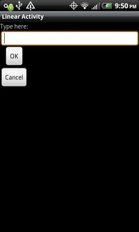
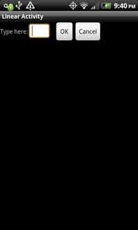
- LinearLayout A LinearLayout, shown in Listing 2, will align its child Views in a direction. This direction can be either vertical or horizontal and depends on the orientation attribute of the layout. A vertical layout choice is shown in Figure 1. The LinearLayout is fairly simple. In this example, the orientation is set to vertical, so the controls are displayed from top to bottom. If the orientation were set to horizontal, and the android:layout_width attribute changed to allow for the content to be displayed, the LinearLayout would result in something like Figure 2. The result is that the controls are displayed left to right. Also, note that I changed the XML so that the content could be displayed on one line.
[Click on image for larger view.] |
| Figure 1. Choosing a vertical linear layout results in controls set top to bottom. | |
[Click on image for larger view.] |
| Figure 2. With a horizontal layout, controls appear left to right. |
|
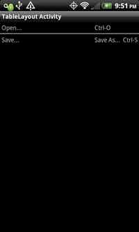
- TableLayout A TableLayout aligns its child Views in a series of rows and columns. Conceptually, this is similar to a table in HTML. Listing 3 shows the TableLayout code, while Figure 3 is the graphical result.
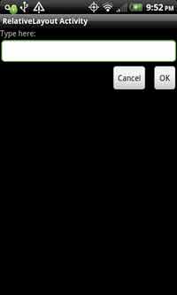
- RelativeLayout A RelativeLayout (Figure 4) is one in which child Views are displayed relative to other Views within the layout. The code is displayed in Listing 4.
[Click on image for larger view.] |
| Figure 3. A sample TableLayout in Android. |
|
[Click on image for larger view.] |
| Figure 4. A RelativeLayout in Android. |
|
Note that with the RelativeLayout, many of the Android controls will support additional layout information, so a developer can associate control positions and align these controls.
Controls
In the Microsoft .NET Framework world, we work with controls; in Android, we have Views. We also have new terms for the Views/controls with which we're already familiar. Android controls include:
- TextView: the Android counterpart to the Label in .NET
- EditText: comparable to the TextBox in .NET
- RadioButton, CheckBox and RadioButtonGroup: comparable to their counterparts in .NET
- Date and Time Pickers: conceptually familiar to .NET
TextView, aka Label
A TextView is a Label type of control. It gives a user a read-only control that can be used to provide some type of information. Some of its properties include:
- .Text: a getter/setter that has the value displayed to the user
- .TextFormatted: a getter/setter that contains not only the information from the .Text property, but also has the formatting information. Along with this, there are a number of properties that allow a program to format the text.
EditText, aka TextBox
An EditText control is the Android equivalent of a TextBox in .NET. The EditText class is subclassed from the TextView, so it will contain many members of the TextView. This control allows users to input freeform data. Its properties include:
- .Text: Like the TextView, this is a getter/setter containing the values that allow a user to enter data.
- .TextFormatted: same as the property in the TextView.
The virtual keyboard is handled via the android:inputType attribute. In this case, we'll define it in the XML layout for the control:
<EditText android:id="@+id/PassWord"
android:layout_width="fill_parent"
android:layout_height="wrap_content"
android:inputType="text|textPassword"
android:hint="@string/PassWord"
/>
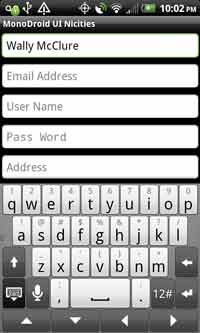
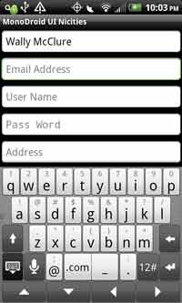
A full and up-to-date list of the various supported inputTypes can be found here. Some examples can be seen in Figure 5, Figure 6 and Figure 7. The android:inputType allows chaining input types together; we combine them via the "|" operator.
[Click on image for larger view.] |
| Figure 5. The default keyboard for the virtual keyboard in Android on an HTC EVO 4G phone. |
|
[Click on image for larger view.] |
| Figure 6. n Internet e-mail-optimized keyboard. Note the buttons with the "@" and the ".com" values are surfaced and the space bar is dramatically reduced. |
|
[Click on image for larger view.] |
| Figure 7. numeric-optimized keyboard with the numbers displayed initially as opposed to the alphabet in the default keyboard. |
|
[Click on image for larger view.] |
| Figure 8. The result of the .Click event. |
|
Remember that screen size is an issue. These devices don't have 21-inch monitors; they have four-inch screens, on average. We need to make sure we communicate appropriate information to the user while using the least amount of screen real estate as possible.
In desktop and Web applications, a Label is typically associated with a TextBox or other control.
The Label provides the user with some type of instructional information regarding the control. With the EditText, the View has the attribute android:hint. This attribute places some text within the View when the View is empty and has no data. In the source code, a string value from our resources is being used, and that string is named "PassWord." This string is in the Resources/Values/Strings folder.
Buttons
A button view in Android is what .NET developers expect from a button. The button has many of the expected attributes. The XML that represents a button is:
<Button
android:id="@+id/Submit"
android:layout_width="fill_parent"
android:layout_height="wrap_content"
android:text="@string/Submit"
/>
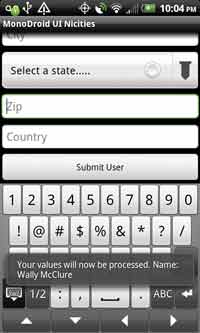
The .Click member of a button is an event that a program can use when a user selects the button. Why does a button have a .Click event? Remember, Android is flexible and has many form factors, as well as many different keyboards. If your device has a roller ball that can be used to make a selection, then a .Click event makes sense. Listing 5 shows the code to set up a button and a .Click event.
The output of this code can be seen in Figure 8. When a user clicks the button, a Toast is displayed to the user.
Spinner, aka Drop-Down List Box
An Android spinner is the equivalent of a .NET drop-down list box. A spinner is helpful for allowing users to easily enter predefined values. In this example, we'll add some values via an Adapter. Let's look at some code to start with. The XML layout for a spinner looks like this:
   <Spinner android:id="@+id/State"
   android:layout_width="fill_parent"
   android:layout_height="wrap_content"
   />
  The code to set up the spinner looks like this:
   Spinner States = FindViewById<Spinner>(Resource.Id.State);
   var fAdapter = ArrayAdapter.CreateFromResource(this,
   Resource.Array.states,
   Android.Resource.Layout.SimpleSpinnerDropDownItem);
   int spinner_dd_item = Android.Resource.Layout.
   SimpleSpinnerDropDownItem;
   fAdapter.SetDropDownViewResource(spinner_dd_item);
   States.Adapter = fAdapter;
In this code, a reference is made with the spinner with an id of State. Next, an adapter is created from one of the resources. In this case, the resource is loaded from Resources/Values/Strings.xml. Note the use of the SimpleSpinnerDropDownItem. This is an enum value that supplies binding-style information. Finally, the .Adapter property of the Spinner is set and the data is bound.
Processing a change event can be done via the .ItemSelected event. Let's look at some code for this:
// This statement is in your OnCeate method.state.ItemSelected += new EventHandler<ItemEventArgs>(sp_ItemSelected);


void sp_ItemSelected(object sender, ItemEventArgs e)
{
  // This code could do anything. In this case,
  // we're just outputting some text to a textview.
  tvSp.Text = Convert.ToString(aas.GetItem(e.Position));
}
Tabs
Tabs are an easy way to display multiple screens of information within a single screen. They're conceptually the same in Android and .NET. In this example, we'll have a tabbed interface of Artists, Albums and Songs. This example is from the Android developer Web site; it's been converted from Java to Mono for Android.
The XML layout code can be seen in Listing 6.
The next step, shown in Listing 7, is to look at the code to load the Tabs.
The Artist, Album and Song activities need to be created. For this, we'll display some text that tells us a Tab has been selected. Here's the code for our Artist activity:
protected override void OnCreate(Bundle bundle)
{
  base.OnCreate(bundle);
  TextView textview = new TextView(this);
  textview.Text = "This is the Artist tab";
  SetContentView(textview);
}
In this case, we're only displaying text, but we could load an .axml file instead.
The final step is to create the images and display them when they're pressed versus not pressed. Creating the images is on the designer. Handling the "pressed versus not pressed" images is the developer's responsibility. This can be handled with the following code (the graphic result can be seen in Figure 9):
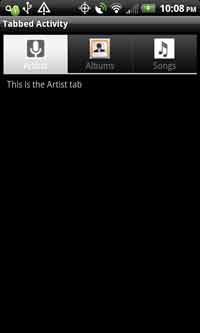
[Click on image for larger view.] |
| Figure 9. The Tabs interface. |
<?xml version="1.0" encoding="utf-8"?>
<selector xmlns:android="http://schemas.android.com/apk/res/android">
  <!-- When selected, use grey -->
  <item android:drawable="@drawable/ic_tab_artists_grey"
    android:state_selected="true" />
  <!-- When not selected, use white-->
  <item android:drawable="@drawable/ic_tab_artists_white" />
</selector>
Design Surface
One Mono for Android limitation is the lack of a native design surface. Developers can't go to the toolbox, drag an EditText to a design surface and find it set up in the .axml file.
This may sound like a major limitation, but it's not. Xamarin has thought through this issue and provided developers with IntelliSense support in Visual Studio. The IntelliSense support requires one change from a standard XML layout: the display files must use the .axml file extension. Within an .axml file, the IntelliSense looks something like that featured in Figure 10.
[Click on image for larger view.] |
| Figure 10. IntelliSense in Mono. |
Help Available
There are a number of tools to help developers inexperienced in Mono. They include:
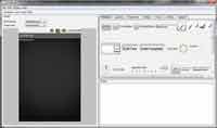
DroidDraw (Figure 11), a Java-based app that provides a design surface. It's not integrated with a particular IDE, and allows users to import and export the XML UI layout language via the Generate/Load buttons. DroidDraw is available at droiddraw.org. If you like it, consider a donation.
[Click on image for larger view.] |
| Figure 11. The DroidDraw interface. |
Eclipse with the Android tools, which presents a GUI layout engine for developers. The XML layout can be copied into and out of Eclipse into the .axml file in your Mono for Android project in Visual Studio. Eclipse is available for download, and Android Development Tools (ADT) for Eclipse is available here.
Mobile Design Considerations
Store images locally: When downloaded via the Internet, applications are using an antenna, so storing images on the device will result in better battery life for your users. Try to go "off device" as little as possible.
Suspend UI updates in background: When an application runs in the background, there's no reason to update the UI. This may sound like a small issue, but continually updating an image control from the camera is an easy way to drain battery life.
Applications must be usable: This means that applications really need to have the fewest number of controls to effectively get the job done. If you want to confuse users, put too many controls on the screen.
Think holistically about resource usage: The UI is only part of the application, but it triggers so much else. You need to think about how your application works. This requires thorough knowledge of your application.
Lessons Learned
I've learned many lessons from building Android UIs. These are two of the most important: First, don't be afraid to use a GUI tool for building the UI. Developers sometimes adopt the manly, "We don't need no stinkin' GUI tools" attitude. Remember that you need to solve problems and move along. GUI tools like DroidDraw and the Android plug-in for Eclipse can help. Second, many times, you think you're getting/setting a string value in Mono for Android, when in fact you aren't. One of the goals of Mono is to be "true to the platform."
This means not hiding the underlying complexities from the underlying platform. Sometimes, the value returned is an IEnumerable of type char. This issue tripped me more than once as I first learned the UI concepts.