UI Code Expert
Web Forms with HTML5
Your forms can be built entirely in HTML5, with no JavaScript necessary. Here's how.
In my last column, I discussed HTML5 support for offline storage and caching through the use of LocalStorage and SessionStorage. Continuing with the HTML5 focus, I want to investigate the new declarative form input types along with new attribute support. These new form features were the genesis of what eventually became the HTML5 specification. And, for those writing data-centric Web applications, these new features provide a significantly improved experience both for the Web programmer and the end user.
No JavaScript Required
To outline the new form features of HTML5, consider the form for entering contact information into a Web page, as shown in Figure 1.
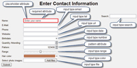
[Click on image for larger view.] |
| Figure 1. HTML5-implemented form features. |
Clearly, there's nothing particularly fancy about this form from the user perspective -- until you consider that it's implemented entirely in HTML5 -- no JavaScript required. For the remainder of the article, I'll enumerate each of the features highlighted in Figure 1, breaking the features down as either new HTML5 attributes or new type values on the input element.
Input Element Attributes
Before I look at the new HTML5 input types, let's consider some of the new attributes available for the input element.
Placeholder Perhaps the most visible attribute is the placeholder attribute, which adds a hint that describes the expected value of the text entered into the input textbox (the hint appears when the textbox is empty and disappears when the control gets focus or data is entered):
<form action="#">
  <input type="text" name="firstName"
    placeholder="First name" /><br />
  <input type="text" name="lastName"
    placeholder="Last name" /><br />
  <input type="submit" value="Submit" />
</form>
Prior to HTML5 support, placeholder implementation required implementations of the onfocus and onblur events. With HTML5, placeholder values can be added to any text input type or one of the new HTML5 input types, including search, url, tel and email.
The Pattern Attribute Another extremely valuable HTML5 input element attribute is the pattern, the code for which is shown here:
<form action="#">
  <input type="text" name="website" pattern="https?://.+"
    title="A URL such as http://www.intelliTect.com">
  <input type="submit" value="Submit" />
</form>
This attribute enables the specification of a regular expression check against the value entered. Text entered by the user is required to match the regular expression; if it doesn't, form submission is blocked and an error message is displayed describing the problem.
Unfortunately, the out-of-the-box pattern attribute doesn't prevent the invalid characters from being entered in the first place, even for simple patterns like when only digits are allowed ("\d+"). In other words, even with a numeric restriction, it's possible to enter non-numeric characters even though the field won't validate successfully when the form is submitted. In fact, the default behavior is to clear the data from the input entry if it doesn't match the pattern specified, either when the input element loses focus or when submitting the form. Using the required attribute mentioned in Table 1 will prevent the form submission and instead display the error message
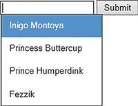
Datalist Using the new list attribute, HTML5 includes support for a "combobox" control where the input element not only allows for single-line text entry, but also provides a list of items to select from (see Figure 2):
[Click on image for larger view.] |
| Figure 2. The datalist attribute enables HTML5 support for a combobox. |
<form action="#">
  <input type="text" name="characters"
    list="characterList">
    <datalist id="characterList">
      <option value="Inigo Montoya"/>
      <option value="Princess Buttercup"/>
      <option value="Prince Humperdink"/>
      <option value="Fezzik"/>
    </datalist>
  <input type="submit" value="Submit" />
</form>
In Figure 2, the possible options to select from are hardcoded, but this list could obviously be loaded dynamically. The end result is a textbox with possible "suggested" values; the list of possible values displayed filters down to match whatever text is entered.
Additional New HTML5 Attributes Additional input element attributes to consider are shown in Table 1, although these don't generally have a user visible aspect associated with them.
| Description |
Code |
| autocomplete Modern browsers support autocomplete, by which previous values against input elements with the same attribute name appear with IntelliSense-like behavior. By default, autocomplete on an input element inherits from the form's attribute, which defaults to "on." By setting the autocomplete attribute to off, the browser no longer retains previous values, thereby not exposing sensitive information. |
<form action="#">
  <input type="text" name="firstName" autocomplete="off"
    placeholder="First name" /><br />
  <input type="text" name="lastName"
    placeholder="Last name" /><br />
  <input type="submit" value="Submit" />
</form> |
| min/max Used in conjunction with the number and date/datetime/time input type elements, min and max provide maximum and minimum validation of the data they're associated with. Note: These attributes don't have any effect when used with the text element type. |
<input type="number" name="age"
placeholder="Age" min="0" max="120" /> |
| step Like min/max, this attribute is intended for the number, date/datetime/time type input elements. Browsers that support this attribute generally provide a spinner control to the end of the input textbox and allow the value to be incremented/decremented by the step value. |
<form action="#">
  <input type="number" name="generation"
    placeholder="Age"
    min="0" max="120" step="10" /><br />
  <input type="submit" value="Submit" />
</form> |
| required Forces an input element to be filled in before submitting a form. |
	<form action="#">
  <input type="text" name="firstName" required
    placeholder="First name" /><br />
  <input type="text" name="lastName" required
    placeholder="Last name" /><br />
  <input type="submit" value="Submit" />
</form> |
| autofocus Placed uniquely on an input element, the autofocus attribute identifies which input element to place the focus on by default when the form loads. |
<form action="#">
  <input type="text" name="firstName"
    placeholder="First name" /><br />
  <input type="text" name="lastName" autofocus
    placeholder="Last name" /><br />
  <input type="submit" value="Submit" />
</form> |
| multiple Targeted toward selecting multiple files at once, rather than just a single file -- multiple is available in conjunction with other input types by separating individual values with a comma. |
<form action="#" method="post">
 <label>Select images:</label>
   <input type="file" name="images" multiple />
 <input type="submit" />
</form> |
Table 1. Additional New HTML5 Attribute
|
This list of new input type attributes is a welcome set of additions to its HTML base -- providing lots of functionality that was previously only available via JavaScript. Next, I'll take a look at how these come into play with a new selection of input type values.
Input Types
First, consider that all the controls are input types. As such, they're fully backward-compatible with non-HTML5-supporting browsers. This is implemented through the addition of new values for the input element's type attribute. As a result, all browsers, even legacy ones, are able to accommodate the additional types even if they don't yet support HTML5 explicitly. In fact, as is true for several browsers, it's possible for only a subset of the new HTML5 types to be implemented (several of the current browsers don't support color, for example). If a particular input type isn't supported, browsers will gracefully downgrade to use type text.
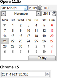
Unfortunately, although HTML5 is a standard, each browser that implements the standard does so differently. This occurs in several ways. For example, the Chrome 15 implementation of datetime doesn't include a dropdown for the time portion whereas Opera 11.5x does (see Figure 3).
[Click on image for larger view.] |
| Figure 3. The datetime control renders very differently in the Opera and Chrome browsers. |
Even a date type implementation varies: Opera 11.5x allows for typing in the year, where Chrome 15 doesn't (Firefox 8 and Internet Explorer 9 don't support date yet). Other differences in the behavior include more minor things such as variation in the validation error messages, default alignment, whether invalid characters are accepted, or the fact that Internet Explorer 10 preview and Firefox 8 change the border color when the text is invalid. In some cases the invalid style defaults to a red outline when the textbox loses focus, rather than waiting for the form to be submitted.
But such functionality is easily added or changed with a style attribute, such as the following:
input:required:invalid, input:focus:invalid
{
  border:5px solid red;
}
The key is to understand that the HTML5 vision of "write once, run anywhere" is not without its wrinkles. This doesn't mean the vision shouldn't be pursued; rather, that a significant amount of testing is necessary to achieve the vision.
With this caveat in mind, let's review the new HTML5 input types.
Email The email textbox is implemented simply with:
<input name="Email" type="email" />
And with the use of the type value "email", there is automatic validation that the text entered conforms to a valid e-mail address pattern. (It doesn't check that the e-mail address exists, or even that the domain itself exists). It ensures that the field's value contains an @ symbol in the appropriate place, followed by a potentially valid domain address.
URL The url input type is almost identical to the email type, except that it checks for a valid URL format. Like the email type, the url type only performs pattern matching. Because the pattern is for a URL and not simply a Web address, the format is broad. For example, it not only supports the expected http, https, file, dns, and ftp type schemas, but also mailto, tel or even fictional facebook schemas.
In some cases, as with Opera 15, if no schema is specified by the user, it auto-prefixes "http://" to the URL text.
Tel Another input type is for telephone numbers using the type value tel. However, tel behaves a little differently. First, the functionality is primarily targeted at mobile platforms, enabling them to auto-fill the text box with the mobile phone number. Second, it doesn't validate the format of the phone number (meaning this isn't something included in the HTML5 specification, and isn't something any vendor has implemented). The diversity of formats (consider international, possible separator characters, alpha-characters, extensions and so on) makes the rules for validation overly complex. As a result, the current intention for tel doesn't include validation.
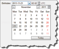
Date, Time, DateTime, Month, Week Although there are lots of JavaScript solutions for date entry, support for date entry in HTML5 is a welcome addition (see Figure 4).
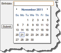
[Click on image for larger view.] |
| Figure 4. Date entry with HTML5 (Chrome 15). |
Especially attractive about each different browser's implementation is the fact that the date can be typed directly into a textbox or through selection from a dropdown calendar with a mouse. (This is a significant usability improvement from when the UI required entering year, month and day in separate dropdown boxes).
A similar UI is available for the datetime type value, as shown in Figure 5.
[Click on image for larger view.] |
| Figure 5. Entering a DateTime value (Opera 11). |
Other HTML5 time-related input types are time, month and week. The entry of time alone is available in a similar time format as the time textbox of the datetime input type.
Color Although support for it is currently only available on Opera 11.5x, HTML5 includes a new color picker control, available through the input type value of color (see Figure 6).
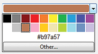
[Click on image for larger view.] |
| Figure 6. A color picker using input type value color (Opera 11.5x). |
Search Another new input type in HTML5 is search. It works identically to text, except that it's designed to look like a search text box on those platforms that have special search-text-box characteristics. For example, in some browsers the input type search includes an X on the right; this can be used for blanking out the value.
Number The support for a number type is another welcome addition. Not surprisingly, the goal of this input type is to limit the entry to a valid number. However, the implementation in all current browsers is lacking because, even with the input type of "number," it's still possible to enter letters. Furthermore, given invalid content, submitting the form is still allowed. Upon losing focus, the input element is blanked if the text is invalid, thereby allowing the form to be submitted -- less than ideal. (Using the pattern attribute with type number is not valid so that doesn't solve the issue, either.) For now, the solution will be to rely on JavaScript or (the afore mentioned) HTML5 required attribute.
Like the time related types, input type number also allows for the attributes min, max and step. As expected, min specifies a minimum value while max the maximum value. Step ensures that the value entered (assuming a number is entered) is an increment of the step value starting with min. In other words, given a min of 1 and a step value of 2, entering "2" will be flagged as invalid (see Figure 7). Here's the code:
<form action="#" method="get">
  Quantity: <input type="number" name="quantity"
    min="1" max="10" step="2" />
  <input type="submit" value="Submit" />
</form>
Notice in Figure 7 the spinners to the right of the text box. These allow using the mouse to increment by the value of step. Spinners are available in both Opera 11.5x and Chrome 15.
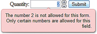
[Click on image for larger view.] |
| Figure 7. Using the input type of number. |
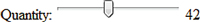
Range Another HTML5 input type addition is range, which adds a slider control to the quiver of controls available in HTML5. Range is supported in Chrome 15 and Opera 11.5x (see Figure 8). Note that by default, the input type with value range doesn't display the minimum, maximum or even the current value of the slider. These will need to be added using the output element.

[Click on image for larger view.] |
| Figure 8. An HTML5 slider, using input type range (Opera 11.5x). |
Like number, the range type also supports the attributes min, max and step.
Output
In addition to extending the types supported by the input element, HTML5 adds support for the output element. The purpose is to display the output of a calculation such as one calculated in a script. For example, we can use the output element to display the value of the input type with value range (see Figure 9). Here's the code:
<form oninput="rangeValueDisplay.value=range.value">
  Quantity: <input type="range" name="range" value="0" />
  <output name="rangeValueDisplay" for="range">0</output>
</form>
[Click on image for larger view.] |
| Figure 9. Using the output to display the slider value. |
Using the output element in combination with input type range causes the slider value to appear as it changes.
Browser Support
As mentioned already, browser support for HTML5 varies both in the implementation details of a particular feature, as well as the extent to which HTML5 is supported at all (see html5test.com and to test a particular browser's HTML5 capabilities.)
This seemingly makes HTML5 development sub-optimal at best, because of the likelihood that the HTML5 form features won't be available to the majority of a Web application's target constituents. Fortunately, open source provides a solution called "polyfills" or "shims" (see more). These JavaScript libraries provide an implementation of HTML5 with fairly comprehensive support, including the ability to leverage HTML5 page content and the necessary JavaScript that "virtually" implements HTML5 behavior.
Webshims, provides one of several implementations. It, in turn, relies on both jQuery and Mondernizr implementations. The latter is interesting, because although it doesn't provide any graceful downgrade from HTML5 on its own, it identifies via its API which features are implemented and to what extent. This enables polyfills to query the Modernizr API and activate additional functionality so that legacy browsers limp along until they're fully replaced. The Modernizr wiki, includes links to a collection of different polyfills to from which to choose.
A Compelling Case
It could be argued that HTML5 doesn't enable any functionality that wasn't already available through JavaScript, and given the backward port to non-HTML5 browsers through Modernizer and polyfills, this is a reasonable conclusion. However, the very fact that it's no longer necessary to turn to JavaScript for the HTML5 functionality is exactly what makes HTML5 so compelling. Furthermore, through the use of the polyfill JavaScript, it's possible to begin active development on HTML5 today.