In-Depth
Top 10 Tips for Building a Windows Phone App
There's a right way and a wrong way to build Windows Phone applications. These 10 tips can help you do it the right way.
- By Max Zilberman
- 02/03/2012
We all love devices. As a matter of fact, one of the first things people do with a PC, phone or tablet is customize it. We change backgrounds, install apps, change the ringtone; all to make it "personally mine." Over the last year, as the application ecosystem has grown, so has the number of applications available. Although the development tools for the Windows Phone platform are the best in the industry for building mobile applications, the quality range of applications developed for Windows Phone is similar to other platforms. In this article, I'll explore some development "gotchas" and see why some apps (apart from content) achieve greater customer response than others. Some issues are code-related, while others are design-based.
Rule No. 1: Embrace Metro
For most smartphones -- excluding Windows Phone -- the reality is that beyond some style magic, they are, in general, the same. Each has chrome, status indicators, pagination, app icons and the like. This commonality sometimes leads to the question, "What should my application look like?" What's a seemingly simple decision for some is extremely hard for others. Some publishers assume that all users across all platforms want, or need, the app to look the same. This is understandable, but an incorrect assumption in most cases.
As Microsoft designed Windows Phone, it took a different approach from other smartphones. The idea of a mobile app with the look, feel and functionality of an iPhone app being used on Windows Phone feels unnatural. In the same way, a Windows Phone application would look completely out of place on an iPhone. This leads to our first rule of Windows Phone development: Embrace, rather than fight, the Metro-style interface. Your app will feel natural to any consumer who uses Windows Phone.
Rule No. 2: Leave Some Space
Unlike other phone platforms, Windows Phone application design gives full edge-to-edge control over the design layout. This approach allows the designer to feel in complete command. The chrome and typical dressings like the Back button, chevrons (>) on lists as well as item separator lines are all elements that fill the screen without enhancing overall usability.
That's why the lack of these items in Windows Phone isn't an oversight; instead, it's an effort to condition users to expect that almost every piece of information in a list is actionable. This is true for all core apps that ship as part of the OS: For the Settings, Outlook or People Hubs, it should be clear that detail views are available for every item represented.
It takes as little as 24 pixels between list items for the user to differentiate them; thus, there's no need for lines (see Figure 1). Additional tricks can be done using different font size or colors; but nothing more than open space between items is pretty powerful.
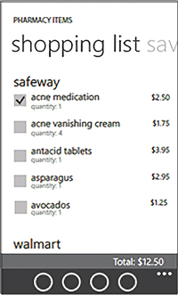
[Click on image for larger view.] |
| Figure 1. These items are strongly differentiated, although there are no separation lines between items. |
Rule No. 3: Respect Margins
Applications aren't static: they evolve over time. They're born out of ideas on a napkin or a conversation you had with a friend. Then they go through stages of prototyping, design mockups, developer prototyping and, finally, a formal design.
In very few cases does this mean that different people are doing the work, especially in smaller companies. Sometimes you're the owner, developer, designer -- even the janitor -- doing everything yourself.
Because of these factors, the pressure and irresistible desire to ship sometimes gets in the way of producing what would've been a perfect application. What keeps it from being perfect? Often, it's the seemingly tiny details; but they can turn out to be not so tiny in the competitive market of mobile apps. That applies to the subject of our third rule: Getting stuff to line up properly.
This simple rule -- proper margins -- is for some reason lost when trying to get controls on the screen. If there was only one thing I could impress upon developers, it would be this: one margin for all content works best; make it 24 pixels from the left.
Rule No. 4: Get Controls out of the Way
Controls within the Windows Phone developer toolbox allow you to build infinite combinations of visual styles and artistic designs. The ability of one of those tools, Silverlight, to style controls provides a lot of power. But this flexibility brings with it some potential challenges.
Consider an example of using a panorama or a pivot page with a Map Control. These two controls on the page don't represent an issue. However, when you place Map Control inside the PanoramaItem, the map will directly interfere with the "swipe" gesture of the Panorama Control, because this gesture is applicable to both controls. This can be seen in Figure 2.
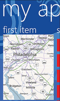
[Click on image for larger view.] |
| Figure 2. The end result when two controls interfere. It isn't pretty. |
Similar issues exist with other controls when a wide range of gestures is supported. As a general rule, don't nest controls that require side-to-side gestures. Bottom line: Make it obvious to the user how to use the app.
Rule No. 5: Make Navigation Predictable
An application is a street; your experience back and forth through the functionality is the path. Just as we do with our navigational landmarks in our daily life, application navigation is something that should stay the same.
The Windows Phone Home button will get many developers in trouble. A Home button inside an app is needed on phones that lack a dedicated Back button; an iPhone is a good example. All Windows Phone devices instead have a dedicated hardware button, removing the need to have an embedded Home button. This is a place where design religion comes in: Because iPhone, Android and Symbian apps all have embedded Home buttons, the belief is that a Windows Phone app needs one, too.
Unlike some other platforms, Windows Phone apps maintain a page stack in the navigation model. This model fits the normal user expectation for a Back button: it returns to the previous view. In this environment, a Home button would cause an unpredictable navigation pattern. If the user navigates deep into the interface and at some point presses Home, then continues navigating throughout the app, the number of navigation frames will continue to grow; then the Back button will have to unwind the entire path. In a Windows Phone application with no Home button, navigation is clear and simple: the Back button will always return the user back to the previous page.
In the Windows Phone 7.1 SDK, a new API was added that allows developers to access and modify the Page stack prior to returning to the previous page. This has given a large amount of new flexibility to developers.
The change was made to support a number of non-linear navigation scenarios such as Shopping Carts and payment and service subscriptions. These non-linear scenarios require a Wizard to be completed by the user, but the Back button should not unwind the navigation stack through seven steps of the checkout Wizard. In this case the developer would use the new API to modify the stack and return the user to the shopping experience once a confirmation page is shown, for example.
Although this flexibility in the API is now available, developers still should ensure that the overall experience of the application is highly predictable. That means the user should always know what happens when he clicks the Back button.
Rule No. 6: Learn How to Pin Tiles
One of the features most embraced by developers has been support for multiple tiles. The ability to pin single or multiple tiles to the home screen is very similar to a bookmark in a book. When pinned, the tile is added to the home screen, and when pressed, the tile should take the user directly to the content or feature.
There have been numerous debates on how this feature should be used. Should it be a link to a specific place in an app, while retaining the full app experience? Or should it limit the app to a smaller set of features, like a mini-app? A number of articles have been written, but questions of the original intent continue to surface on forums and at various events.
The concept of a pinned tile, shown in Figure 3, was as a deep bookmark that exposes a subset of features within the application. For example, weather of a single city, or a category of news, or a single contact card; similar to the way it's done in the Person Hub.
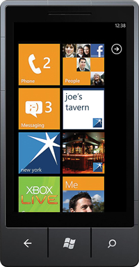
[Click on image for larger view.] |
| Figure 3. Pinning tiles. |
Stated another way: a pinned tile should be a shortcut to information typically located deep in the app -- not a bookmark that continues to provide access to the entire application.
Rule No. 7: Limit Results on Map Control to What the User Can See on the Viewport
As with Textbox and List, the Windows Phone SDK 7.1 includes Map Control. This is integrated with Bing mapping. This versatile control supports a number of features that allow developers to create great experiences with native Bing mapping.
The most common issue developers run into is trying to map the world in the control. Map Control has good performance, but you can never forget that you're running the application on a phone. There are a few rules to remember when using the control.
First, developers should check whether the point is in the map's visible area; in other words, in the viewport. A trivial method for checking would look something like this:
 protected bool CheckPinInViewport(double width, double height, Point coords)
{
  if (coords.X > 0 && coords.Y > 0)
  {
    return coords.Y < height && coords.X < width;
  }
  return false;
}
There's no point in showing anything outside of viewport. The code example applies to pins, but the problem is wider, as Map Control supports more types of elements such as tiles, layers, shapes and controls. Each adds complexity when the map view is moved or repositioned, adding calculations that affect the CPU.
The second issue is a little more complex: What if a large set of results is returned; condos in Manhattan, for example? The results even at a relatively low map resolution could produce a high number of pins. In this case you need to figure out how to cluster results together; at a very high number of results, separate overlapping pins are of little use to the user. In the end, this causes frustration and dissatisfaction.
Once a point is reached where the amount of data is more than both the user and phone can handle, there are a few options to consider. The data can be filtered, or the results of adjacent pins can be clustered.
Here's an example of clustering in a real-world scenario. Your app is showing a real estate listing, and there are 50 results at the same address (with different unit numbers). A traditional view of the results would have all 50 pins stacked on top of one another. In a clustered view, those pins can be represented by a single pin. In the same manner, you can take it a level higher and represent an entire block or a section of blocks by a single result, if the density of the pins at that location is higher.
Mapping is generally an immersive experience; everyone expects to be wowed by your custom template pins. Touch input should activate your pin with sufficient detail to allow the user to interact with the data without getting frustrated.
Rule No. 8: Tombstoning Should Be Transparent
This is all about how your application responds to the phone's signal that it needs more memory. Let's start with a description of the way the phone allocates memory and manages application state. In the Mango update of the OS, applications not in view aren't evicted from memory; they're literally paused and allowed to stay resident in memory.
The rest of memory management follows the pre-Mango rules: applications requesting memory are granted the request if sufficient memory is available.
Nothing actually happens unless the active application is exerting more pressure on the currently available memory pool. If the active app needs more memory, the OS evicts the app in the least-recently used (LRU) order. As shown in Figure 4, the foreground application -- being the most recently launched -- could evict an application not in the view, based on the LRU rule.
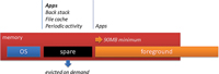
[Click on image for larger view.] |
| Figure 4. How tombstoning works in Windows Phone Mango. |
In the tombstoning process, the OS Memory Manager signals the application; that application is given a finite amount of time to shut down (it's forcefully killed if time runs out). Note that there's a great variance between what developers think should happen versus what actually happens when the application's reactivated.
Users expect the application to be in the same state in which it was left. In particular, they want to know that a CheckBox is still checked, a TextBox contains the same text, and a List is in the same position.
The view model within Windows Phone helps with this challenge; you can use two-way binding in Silverlight from the view model to appropriate properties within the model during tombstoning. This approach solves all the issues except for one: list. List can't be handled in the same way because it's a complex control with a deep structure; it also contains a number of elements to which you can't directly bind. In this case, you're looking for the position of the VerticalOffset property of the ScrollViewer. Here's how to find it:
ScrollViewer viewer = ((VisualTreeHelper.GetChild(myList, 0) as
  FrameworkElement).FindName("ScrollViewer") as ScrollViewer);
  _viewModel.ListBoxPosition = viewer.VerticalOffset;
In this case, the code saves the value into the basic property that can then be saved to the State collection of the page.
In summary: users shouldn't be aware of anything happening between the tombstoning of the app and when it resumes.
Rule No. 9: Properly Manage Network Failures
We enjoy the constant connected state on desktops, but don't have that luxury on mobile devices. And generally speaking, the more mobile the device, the more unpredictable the network state. Even for a laptop, moving from room to room can cause changes in the network performance profile.
Mobile phones are worse; they're highly sensitive devices, and the amount of power applied to the antenna has to be balanced with battery performance. Very few end users would enjoy a mobile phone that has fantastic reception but only lasts 30 minutes. The inverse is true as well: very poor network performance doesn't make users happy, even if the battery lasts a week. These situations require that developers test additional scenarios. Here are a few network-related issues that impact the overall quality of an application:
1. The app's disconnected state. If your application requires data access over the network, what happens when no network's available? In this case, any network call will throw an exception. Although it may seem trivial, this is often missed; just showing an error message isn't helpful to most of your users. There are a few ways your application can warn about a network failure, including green- or red-light indicators, dimming the entire UI or something as simple as a helpful message.
Over time, developers have learned ways to check connectivity. Listing 1, shows a sample method.
Here's the XAML version:
<Grid Background="#CC000000" Margin="0,0,0,-32" Grid.RowSpan="2"
DataContext="{Binding Source={StaticResource Locator}}"
Visibility="{Binding Environment.IsNetworkAvailable, Mode=OneWay}">
  <TextBlock HorizontalAlignment="Center" TextWrapping="Wrap" Text="Not
  Connected..." VerticalAlignment="Center"/>
</Grid>
This code, which could be adapted very quickly to fit almost any situation, lets the user know proactively that the network connection was lost.
The previous code block provides a way to determine and manage the network state. But there's still one element of network connection left unsolved: proxies. Proxies cause interesting behavior for the NetworkInterface.GetIsNetworkAvailable method. The method call will return true -- in fact, it is true -- when the phone is connected to the network and has an IP address. However, because the proxy has not yet been authenticated, all calls to the services will be blocked.
Methods that make network calls should use some variant of the following:
// Use "ResponseUri" property to get the actual Uri from where the
// response was attained to make sure it's not the proxy talking.
if (httpResponse.ResponseUri.AbsoluteUri.ToString() == requestUrl)
  {
// The content was returned from the desired server, do work
  ...
  }
Finally, let's discuss handling terminated requests due to tombstoning. This is a critical issue, especially for applications that require long-running server requests. It's an important consideration that needs to be handled well, but isn't easy to replicate, particularly in the emulator. There are utilities that allow you to simulate various network conditions, including 4G all the way down to even super-low-bandwidth connections where single bytes go through. Wireshark is a nice tool to use for network bandwidth throttling.
As the request is completed after the call to the WebRequest.BeginRequestAsync method, callback is invoked. Remember also that appropriate recovery measures should be developed in case the response isn't completed. Not accounting for a bad request could cause the code to fail, leading to an application crash. The lesson here: Don't underestimate how severely a bad connection can degrade app quality.
Rule No. 10: Avoid UI Thread Blocking
One of the most impactful issues related to user experience is blocking the UI thread. There's nothing more painful to the user than an application that isn't fluid. A good 15 years ago, when Visual Basic was in full swing, an application would sometimes "white out" as a call to the database would block the UI thread. But the single-threaded apartment model in Visual Basic ensured that there wasn't much that could be done about it -- most users just ended up waiting for the app to do its work and return. We have since moved on to better threading models, but if developers aren't careful, applications can still remind us of that past, with locked screens and jittery UIs. Listing 2 shows a prime example.
This looks like an extreme example, but this code could happen on any UI event, Button.Click, List.SelectionChanged or any constructor. To solve this issue, we need to load data off the UI thread. To do this, change the Loaded event, as shown in Listing 3.
As with any code change, this approach introduces another minor wrinkle: once data is received, the threading context is no longer on the UI thread, cutting off access to any elements to populate the data back into the model. To do this correctly, you need to dispatch context back to the UI thread using Dispatcher.BeginInvoke. Note there should be as little code as possible -- not in terms of number of lines, but in the length of time it takes to execute:
void  getDataWorker_RunWorkerCompleted(object sender, RunWorkerCompletedEventArgs e)
{
  this.Dispatcher.BeginInvoke( () => {

  // Make changes from the Model to the UI right here...

  });

}
One tool I didn't discuss in this section, which deserves its own article, is the new Windows Phone 7.1 SDK Performance Profiler. This is an invaluable tool that every team should adopt. It identifies and recommends solutions for blocked UI threads, memory leaks and CPU-related issues, among others. The most important thing to remember when using the Profiler: Establish a performance baseline and compare it often as changes are made during development. This will ensure you can pinpoint which particular code delta caused an issue, allowing the team to assess and remediate.
As a rule of thumb, any action that takes more than 50-100 milliseconds shouldn't be done on the UI thread.
Don't Let Deadlines Cause Shortcuts
Teams facing deadlines in the constantly changing world of mobile development are always pressured to ship products. But choosing that route is fraught with danger, and should be avoided. After all, it's important for business managers to understand that building a marketplace reputation and gaining share takes time, while growing it back after a large number of one-star reviews will be much more difficult. This means making an objective review of your code and seeing what works already, then what needs more love from the development teams. The 10 items listed here will speed you along the track to a solid, well-received Windows Phone app that should avoid the negatives that come with a product released before it's ready.