Mobile Corner
Working with the Windows Phone Application Bar
Nick Randolph shows how to create and work with the Application Bar in your Windows Phone application.
- By Nick Randolph
- 03/30/2012
When you design a Windows Phone application, it's important to think about the built-in constructs provided by the platform. You can choose to display the SystemTray, for example, to present device-based information such as the clock, battery level and connectivity status.
The ApplicationBar can also be used to present common tasks to the user. In this column, I'll show you how to create the ApplicationBar, and configure its menu and icons, in your Windows Phone application. Figure 1 illustrates the various states in which the ApplicationBar can found. The left image illustrates the ApplicationBar in the Default mode, showing only the four icon buttons. The ApplicationBar can include up to four icon buttons for the most frequent actions that apply to the current page. When the user taps on the ellipses on the right end of the ApplicationBar, it will expand up, revealing both the caption for the icon buttons and the additional menu items, shown in the middle image. It's recommended that you keep to a maximum of four or five menu items. If your page requires more than four icon buttons and four to five menu items, it’s probably an indication that there's too much information presented on one page and it may be time to refactor it into multiple pages. Finally, the right image in Figure 1 shows the ApplicationBar in the Minimized mode, where only the ellipses are visible.
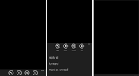
[Click on image for larger view.] |
| Figure 1. ApplicationBar States |
Defining an Application Bar
As with any other visual element within your application, the ApplicationBar can be defined in XAML using Expression Blend. The default page created in Visual Studio, or Expression Blend, doesn’t come with an ApplicationBar defined; instead you’ll see a placeholder "<> ApplicationBar" node in the Objects and Timeline window (see left image of Figure 2). Create an ApplicationBar by right-clicking on the PhoneApplicationPage node and selecting Add ApplicationBar from the context menu. The middle image of Figure 2 illustrates the newly created ApplicationBar. You can create either menu items or icon buttons by right-clicking on the ApplicationBar node and selecting either Add ApplicationBarMenuItem, or Add ApplicationBarIconButton from the context menu. The right image of Figure 2 shows both a menu item and an icon button.
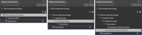
[Click on image for larger view.] |
| Figure 2. Creating an ApplicationBar |
Configuring Menu and Icon Properties
As with other visual elements, ApplicationBar items have a number of properties that you can configure via the Properties window. Figure 3 illustrates the properties of a menu item (left image) and an icon button (middle image). You’ll notice that they have IsEnabled and Text properties in common. In fact, both implement the IApplicationBarMenuItem interface, which defines these two properties and a Click event, which is raised when the item is clicked. The right image of Figure 3 illustrates the contents of the IconUri dropdown, which lists icons that ship with the SDK. You can use these icons within your application for common tasks such as Add, Back, Cancel, Save, Next and so on.
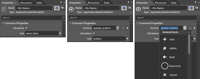
[Click on image for larger view.] |
| Figure 3. ApplicationBar Properties |
If I jump back into Visual Studio, I can take a look at what the ApplicationBar looks like in the XAML, and wire up event handlers for events on both the ApplicationBar itself and its items. The following XAML corresponds to the ApplicationBar created in the previous steps. Notice that event handlers have been added, to respond to the StateChanged event on the ApplicationBar and the Click event on both the menu item and the icon button.
<phone:PhoneApplicationPage.ApplicationBar>
    <shell:ApplicationBar StateChanged="ApplicationBarStateChanged">
        <shell:ApplicationBar.MenuItems>
            <shell:ApplicationBarMenuItem Text="menu item" Click="MenuItemClick" />
        </shell:ApplicationBar.MenuItems>
    <shell:ApplicationBarIconButton IconUri="/icons/appbar.favs.addto.rest.png"
                                    Text="button" Click="ButtonClick"/>
    </shell:ApplicationBar>
</phone:PhoneApplicationPage.ApplicationBar>
The Click event is raised whenever the user clicks on an icon button or a menu item, similar to a regular Button control that you may use elsewhere in your application. The StateChanged event is raised whenever the ApplicationBar is expanded up to show any menu items, or collapsed back to the normal position. You can query the IsMenuVisible property on the ApplicationBarStateChangedEventArgs within the event handler to determine if the menu items are visible or not. One point to note is that, this event doesn’t get raised if you have no menu items, even if the user taps the ellipse to show the caption of the icon button.
Other properties on the ApplicationBar are worth noting. First, you can set the Opacity of the ApplicationBar. With the default Opacity of 1, , the ApplicationBar will reduce the available height of the page by 72. If you set the Opacity to a value that is less than 1, the ApplicationBar will set over the contents of the page. You’ll see this in a number of places throughout the built-in hubs, such as People. On theWhat’s New pane of the People hub, you’ll see that the ApplicationBar is translucent, allowing the contents to scroll beneath it. The other thing you’ll notice on the What’s New pane, is that the Mode property of the ApplicationBar is set to Minimized (as shown in the right image of Figure 1). This is a great visual effect, reducing the clutter on the screen, while still giving users the ability to access common tasks. Caution should be taken in using this effect, however. It can be hard to select items from the ApplicationBar when it is expanded because the icons and text may visually collide with the content of the page, making them hard to discern. When you expand the ApplicationBar, you’ll notice that the Opacity of the ApplicationBar is set back to 1 when the menu is expanded. You can dynamically adjust the Opacity within the StateChanged event handler to toggle it between 1 and a value less than 1, based on the IsMenuVisible property.
Creating Your Own Icons
So far, you’ve learned how to create an ApplicationBar and add menu items and icon buttons to it. In closing, I want to point out some things to consider when you create your own ApplicationBar icons. First, the IconUri property of the ApplicationBarIconButton should specify a 48x48 png image that has been added to your application with a Build Action of Content. You may have noticed that while the icon buttons appear with a circular border, none of the icons that ship with the SDK include that border within the image. The circular border is painted by the system and should not be included. In the right image of
Figure 3, there's a Basecircle image. This should
not be used; it’s there for you to use as a guide for when you create your own icon images. Use the Basecircle image (C:\Program Files (x86)\Microsoft SDKs\Windows Phone\v7.1\Icons\dark\appbar.basecircle.rest.png) and create your icon within the central region. Keeping your icon to a 24x24 area in the center of the image will, in most cases, result in an icon image suitable for your application (don’t forget to remove the Basecircle, when you’re done).
The last point to be made about creating your own icons, is that they should only be created as white on a transparent background. You don’t need to worry about creating images in different colors or for different themes. Create them as white on transparent and the system will color them according to the theme, or alternatively, according to the ForegroundColor set on the ApplicationBar element.
In closing, it should be reiterated that the ApplicationBar is used whenever there are actions within a page that cannot be easily discovered by the user. If the user taps on an item in the list, this would normally trigger some action relating to that item. However, if the user wishes to clear the list, the application could include a "clear" menu item as it would be difficult to invoke this action by simply interacting with the list. Conversely, the ApplicationBar shouldn’t be used for actions that pertain to a specific item in the list. For example, the user shouldn’t have to select an item in the list, and then tap on an ApplicationBar item. The ContextMenu found in the Silverlight Toolkit for Windows Phone would be much better for this task.
About the Author
Nick Randolph runs Built to Roam, a consulting company that specializes in training, mentoring and assisting other companies build mobile applications. With a heritage in rich client applications for both the desktop and a variety of mobile platforms, Nick currently presents, writes and educates on the Windows Phone platform.