In-Depth
Good UI Design Is No Longer Optional
In a mobile world, software developers can no longer ignore UI design.
- By Billy Hollis
- 10/02/2012
In 1985, IBM Corp. ruled in both hardware and software. From mainframes to PCs, IBM set the pace for business software, and the COBOL developers who wrote that software were indispensable for businesses. They were at the pinnacle of their power and influence.
But 10 years later, IBM was irrelevant. Businesses were switching en masse to LANs of networked PCs. Visual Basic, PowerBuilder and FoxPro became the languages of choice. COBOL developers were first reduced to patching systems for Y2K, and then put out to pasture.
Today's developers, focused on managing complex APIs with Agile processes, use the Microsoft .NET Framework and Java to write the software that's indispensable for businesses. Today, .NET developers stand at the pinnacle of business software development.
Where will this cohort of developers be in 10 years? We face changes as great as those which rendered IBM irrelevant:
- Proliferation of devices
- Ubiquitous connectivity
- Touch-based interfaces
- Cloud-based storage
The device that best demonstrates the disruptive nature of these changes is the Apple iPad. In a little more than two years, it has sold about 100 million units. It took the PC about eight years to reach the same number.
I've asked many iPad owners why they made that purchase. Many of them couldn't tell me a specific reason. They just liked the immersive UX. Touch fosters a direct connection to the device. The navigation is smooth, fluid and intuitive.
This ought to sound a warning to those of us producing business software on the Microsoft platform. PCs didn't take over corporate America in the late 1980s because IT departments wanted it that way. PCs took over because individual workers brought them in, made them essential parts of the business and simply insisted that IT accommodate them.
Today, the same effect is happening with iPads and their Android tablet competitors. Executives all over the world are walking into IT with their iPads and asking tough questions. Why can't some of the business software be this mobile? And why can't all of it be this easy to use?
Microsoft understands the dangers. That's why the company has put so many other things aside to focus intently on Windows 8, and why it designed its own Surface tablet to run it. The transition to ubiquitous, touch-based, mobile devices is an existential challenge to a company whose strengths are in corporate software running on LANs.
So, Microsoft is getting ready to meet the challenge. Are you?
A New Era
For the history of software, success has depended mostly on simply making things possible. No longer. In the modern era, success also depends on making things easy.
As a group, we're not ready for that. The vast majority of corporate software I see has a UX somewhere between unpleasant and atrocious. I routinely talk to companies that admit it takes a new worker months to learn his way around the corporate software systems he must use.
The iPad is so easy a 2-year-old can use it. Animal behaviorists have taught monkeys to use one. I put mine in the hands of my mom, who is in her mid-70s. She figured it out in about 90 seconds.
We now have a generation of workers coming into the workforce whose mental model of technology is based on iPods, iPhones, Android smartphones, e-book readers and the iPad. What happens when they sit down on their first day of work in front of a typical corporate system? What kind of contempt do they feel for an organization that puts such low-quality work in front of them and expects them to use it for eight hours a day?
This situation is not stable. The Microsoft ecosystem of corporate software developers is going to have to do better, or face replacement by others who will do better.
Windows 8 is Microsoft's contribution to solving the problem. It's not perfect (when did Microsoft ever produce a perfect product the first time out?), but it's an entry point.
However, just shifting to Windows 8 won't solve the problem. You can't make someone an Olympic skier just by giving them better skis. Development teams also have to adapt the way they create software.
What Won't Work
The first path to failure in meeting the challenge is to keep on doing things the way we have in the past. It's easy enough to find excuses to keep creating bad UXes. The most common excuse I hear is, "The users don't know what they want! All we can do is start writing something, and show it to them for their feedback."
I consider this an unacceptable cop-out. I'm not saying it's easy to understand the users' needs, but based on my own experience and that of many others I've seen, it's quite possible in almost all routine business cases.
It just requires some skills not currently possessed by many developers. Listening,for example. When was the last time you sat in a meeting to describe some new functionality, and after the first five minutes you started tuning out the person talking because you were already coding a solution in your head?
The second most common path to failure I see is to believe that "better UX" equals "better cosmetics." It would be nice if we could fix our UXes by delegating visual appeal to a designer, and otherwise keep creating the same screens we always have.
But the iPad didn't succeed only because of aesthetics. Certainly beauty matters; people form first impressions in seconds, and mostly on attractiveness. But a good UX goes much deeper than that, and encompasses at least 100 design principles -- most of which are not based in aesthetics.
Most of these design principles are common sense once you hear them. It's not mysterious, for example, that people consider items close together to be associated in some way.
However, most developers only have a hazy idea of these principles because it wasn't that important in the past to apply them. Functionality came first, with usability way down on the list. Plus, the UI technology stacks at our disposal didn't give us that much latitude to apply good design principles. So most developers didn't learn much about them.
It's time for that to change.
The Path to Better UX
The foundation of creating a better UX is an understanding of these fundamental design principles. Without that, you're feeling around in the dark on your designs, because you have no guidelines for what works and what doesn't.
In the past, we've left all that to those with a more artistic bent. Thus, many developers have an impression that design principles are fuzzy and mostly about intuition by people with good artistic credentials.
Not so. Almost all design principles that apply to technology UX are rooted in the way the human brain and visual system work. For example, the principle that people consider items grouped close together to be associated is caused by "pre-attentive processing" in the visual system. The retina and the neurons that receive its impulses work to sort out what a person is seeing. The retina accentuates edges, and the next stage assembles the edges into shapes and groups, before any conscious processing on the image is done.
You can see this in action. Take a look at Figure 1 which is a variation of an example in a book named "Designing with the Mind in Mind" (Morgan Kaufmann, 2010) by Jeff Johnson. Do you see rows of stars or columns of stars? Almost everyone see rows. But then look at Figure 2 which has exactly the same size array of stars. Now you almost certainly see columns. The difference is based only on spacing and proximity.

[Click on image for larger view.] |
| Figure 1. Do you see rows or columns of stars? |

[Click on image for larger view.] |
| Figure 2. Showing how placement can change perception. |
In fact, the name of this design principle is the Gestalt law of proximity. It was researched by German scientists almost 100 years ago.
They also discovered other Gestalt principles, such as similarity. Figure 3 looks just like Figure 2, except that certain stars have a different color. But the similarity of color overrides proximity, and now it's quite likely that you see rows instead of columns.

[Click on image for larger view.] |
| Figure 3. Color can also provide clues for usability design. |
This has implications in software for everything from alignment of labels to data visualization. Figure 4, for example, shows some typical charting results. Gestalt proximity helps the viewer understand the results grouped for a certain quarter, while the Gestalt law of similarity using color helps the user see results in the same category over the different time periods.

[Click on image for larger view.] |
| Figure 4. This chart uses basic design principles that apply to UI layout. |
One of the best ways to gain proficiency with design principles is to observe them in the real world. Remote controls, appliances, doors and many other common real-world objects can teach us a lot about design, if we look closely.
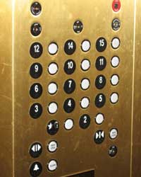
For example, consider the elevator panel in Figure 5. Examine it closely. Is there anything you find notable about it?
[Click on image for larger view.] |
| Figure 5. Notice how the paint on the "G" button is partially rubbed off. This is an example of bad design. |
I pose this question to developers in conference audiences all the time. There are several possible answers. In fact, this elevator panel is a train wreck of bad design.
It's instructive, though, to note the answer that is by far the majority answer among developers. The first thing they usually notice is that the panel contains no button for a 13th floor.
This is fairly common in hotels, especially those in gambling venues that attract superstitious guests. It's also exactly the sort of thing that analytical developers tend to notice. However, it's not what caused me to take the picture.
Other answers often concern the bad alignment of the buttons. Occasionally, an audience member will notice that the Gestalt law of proximity is being violated because many of the buttons are equidistant from two placards that indicate the floor numbers, making it harder to understand which button goes to which floor.
What I noticed was something entirely different, and usually only about one out of 100 people in a developer audience will see it. The paint on the "G" is smeared off.
This is unambiguous evidence of bad design. Dozens or hundreds of people a day are pressing that "G" placard.
In case it's not clear, the "G" placard is not a button. Yet people routinely press it anyway. Why? Because, in simple terms, it looks like a button.
This illustrates a design principle called archetypes. Certain things in the real world are expected to have consistent, quasi-universal forms. We expect buttons to be round, especially in elevators. Therefore something round is easily mistaken for a button, especially when there are no other clues to easily allow a person to quickly find the right button.
By contrast, look at Figure 6. This elevator panel is much better designed. The placards are not round, and they have a slot into which the associated button (which is round) can snuggle. Archetypes and Gestalt proximity explain why this design gives a much better UX.
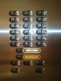
[Click on image for larger view.] |
| Figure 6. A much better design for elevator buttons. |
This panel also illustrates a design principle called Fitt's Law. You can look up Fitt's Law on Wikipedia for details, but one of the things it says is that users can more quickly locate and use an option if it's bigger. In Figure 6, there are larger buttons for the places that are more likely to be needed as destinations.
These same principles apply to software. Crowded, poorly organized screens can be best understood by knowing which design principles they violate. Such understanding can then be the basis for creation of better designs.
Another book I recommend to learn design principles is "Universal Principles of Design" (Rockport Publishers, 2010) by William Lidwell, Kritina Holden and Jill Butler. It contains a concise summary of 125 design principles, with examples of each in use or being violated. Not all of them apply to software UX, but most of them do.
In working with clients on designing better UXes, I always begin by explaining some of the most important design principles. At first, it was surprising to me to see how quickly developers picked up these concepts. Now I just expect it. And I see much better end products after they have done so. Their designs are cleaner, more intuitive, more productive and less stressful for users.
For other opportunities to explore this area, look for me at Visual Studio Live! (part of Live! 360), where I often do sessions and workshops on UX. It's not just a long lecture on principles; there are many hands-on exercises I use to help you gain a deeper understanding of good UX design principles.