Mobile Corner
Windows Phone Navigation with the LongListSelector
Use the LongListSelector control to conveniently display large amounts of data in your mobile apps.
- By Nick Randolph
- 11/01/2012
One iconic feature of the Windows Phone UI is its use of tiles to present content. In addition to being used to great effect on the Start screen, tiles appear within horizontal and vertical lists in each of the six main hubs within the core Windows Phone experience.
When a large number of items appear in a list, a LongListSelector (LLS) is used within a number of the hubs, as shown in Figure 1. In contrast to a traditional list -- where it can be tiresome to scroll through items to reach the one you want -- an LLS allows you to select a group or section header (in this case a letter) to bring up a jump list (as shown in the right image of Figure 1). Selecting an item in the jump list takes you back to the main list at the corresponding point in the list. This way, you can easily jump from "a" to "v" without having to scroll through the entire list.
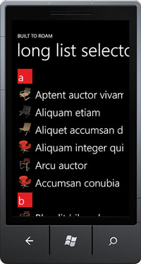 |  |
| Figure 1. The grouped LongListSelector allows users to select a group or section header (in this case a letter) to bring up a jump list. |
Unfortunately, the LLS currently does not ship as part of the Windows Phone SDK. Instead, it's part of the Silverlight for Windows Phone Toolkit, available via CodePlex or NuGet (the latter method is by far the easiest):
- Install NuGet: If you don't already have NuGet installed, head to nuget.org and follow the link to install NuGet.
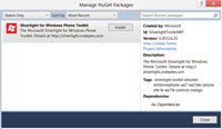
- Install Silverlight for Windows Phone Toolkit: After installing NuGet, you should be able to right-click your Windows Phone project in Solution Explorer in Visual Studio, and select Manage NuGet Packages. Search and install the Silverlight for Windows Phone Toolkit (as shown in Figure 2).
[Click on image for larger view.] |
| Figure 2. Installing the Silverlight for Windows Phone Toolkit via NuGet |
Designing the List
To achieve the look in Figure 1, you have to create a number of templates for various components within the LLS. First, let's switch to Microsoft Expression Blend to design the list. If you've only just added a reference to the Toolkit into your app, you should force a build (Project menu | Build Project) in order for the LLS to appear in the Assets window. Drag the LLS from the Assets window onto the main area of the design surface. Right-click the newly created LLS and select Auto-Size | Fill, allowing the LLS to take up all the remaining space.
For the purposes of this article, I'm going to use sample data created in Expression Blend. To follow along, simply select New Sample Data from the Create Sample Data icon at the top of the Data window. The sample data should contain a collection of items called Customers. Each item has a Name (string) and Photo (Image) properties. Normally, at this point, you'd drag the Customers node across onto the page, and Expression Blend would create and wire up a ListBox. However, in this case, you want to wire up the Customers property to the existing LLS. To do this, simply hold down the Shift key and drag the Customers node onto the LLS on the Objects and Timeline window. This will display a dialog that enables you to select which property to data bind to on the LLS. Select the ItemsSource property.
Interestingly, after data binding Customers to the ItemsSource, you won't see any items displayed on the page. This is because you've supplied a list of items to the LLS when it expects groups of items. There's a simple fix, which is to change the IsFlatList property on the LLS to True. You'll also need to specify an ItemTemplate, which will display each item as the photo alongside the name of the item (as shown in the left image in Figure 1):
 <DataTemplate x:Key="CustomerItemTemplate" >
   <Grid toolkit:TiltEffect.IsTiltEnabled="True" >
     <Image Height="60" Width="60" Source="{Binding Photo}"
      Margin="12,6" HorizontalAlignment="Left" / >
     <TextBlock Text="{Binding Name}"
      Style="{StaticResource PhoneTextExtraLargeStyle}"
      VerticalAlignment="Center" Margin="84,0,12,0"/ >
   </Grid >
 </DataTemplate >
This XAML uses the TiltEffect, which gives users a tilt animation when tapping on any of the list items.
Grouping List Items
Of course, if you wanted to present a flat list of items, you could just use the ListBox control. Where the LLS comes into its own is when presenting grouped list items. In this case, I'm going to simply group the list items by the first letter of the Name property. With the IsFlatList property set back to False, the ItemsSource property of the LLS expects a collection of IEnumerable items. In this example, you've got a simple class, Group, which will be used to group the list items, as shown in Listing 1.
You have several options for converting the flat list of items into a collection of Group objects. If you were to do it by iterating over the items at runtime, you still wouldn't have any design-time support in Expression Blend. One alternative is to use a value converter to transform the original list because it's data-bound to the ItemsSource property on the LLS. The value converter shown in Listing 2 groups the list items based on a property on the list items, supplied as a parameter to the converter.
Applying the value converter is as simple as creating an instance of the value converter in XAML, and then specifying it as the Converter, as part of the binding expression:
 <phone:PhoneApplicationPage.Resources >
   <local:ListToGroupedListConverter x:Key="ListToGroupedListConverter"/ >
 </phone:PhoneApplicationPage.Resources >

 <toolkit:LongListSelector
  ItemsSource="{Binding Customers, ConverterParameter=Name,
    Converter={StaticResource ListToGroupedListConverter}}"
  ItemTemplate="{StaticResource CustomerItemTemplate}" / >
Specifying the Group Templates
The next thing is to specify the layout of the group headers (for example, the letters that appear in the list that allow the user to go to the jump list). This is done by specifying the GroupHeaderTemplate:
 <DataTemplate x:Key="CustomerGroupHeaderTemplate" >
   <Grid Height="60" Width="60" Background="{StaticResource PhoneAccentBrush}"
    HorizontalAlignment="Left" Margin="12,6"
    toolkit:TiltEffect.IsTiltEnabled="True"  >
     <TextBlock TextWrapping="Wrap" Text="{Binding KeyName}"
      Style="{StaticResource PhoneTextExtraLargeStyle}"
      HorizontalAlignment="Left" Margin="3,0,12,0"
      VerticalAlignment="Bottom"/ >
   </Grid >
 </DataTemplate >
Again, note that the TiltEffect is added in order to give users extra feedback when they tap on a group header. The next step is to specify how each item in the jump list is going to be displayed. This is done by specifying a GroupItemTemplate; in this case, a larger square tile, which uses the accent color specified by the user, as shown in Listing 3.
This template is slightly more complex, as it contains a number of Border elements, which control the background color depending on whether the Group has items (Accent color). The combination of PhoneBackgroundBrush and PhoneForegroundBrush will yield dark or light gray based on the respective dark or light themes.
The last step is to arrange the group items into an array (otherwise, they'll be displayed in the default vertical StackPanel). This is done by specifying the GroupItemPanel:
 <ItemsPanelTemplate x:Key="GroupItemsPanel" >
   <toolkit:WrapPanel Margin="18,12" / >
 </ItemsPanelTemplate >

 <toolkit:LongListSelector
  ItemsSource="{Binding Customers, ConverterParameter=Name,
    Converter={StaticResource ListToGroupedListConverter}}"
  GroupItemTemplate="{StaticResource GroupItemTemplate}"
  GroupItemsPanel="{StaticResource GroupItemsPanel}"
  GroupHeaderTemplate="{StaticResource CustomerGroupHeaderTemplate}"
  ItemTemplate="{StaticResource CustomerItemTemplate}" / >
At this point, if you run the application, you'll see a grouped list, complete with tilting group headers and items (as shown in the left image of Figure 1). When you click on one of the group headers, you'll see a jump list containing all the groups; those with items will be in the Accent color. However, if you interact with the jump list, you should notice two things: the items don't tilt when tapped, and the whole jump list scrolls vertically, which is undesirable. The solution to this is to detect when the jump list (also known as the GroupView) is displayed and to dynamically apply the TiltEffect and disable vertical scrolling. This has to be done via code (as shown in Listing 4) because the jump list itself is dynamically created at runtime, so it can't be tweaked at design time.
Now, when you run the application, you should see a tilt when you tap on a group that has items. You won't see any tilt or other feedback for groups that don't have items because the IsHitTestVisible attribute is data-bound to the HasItems property on the group (meaning, it's False when there are no items in the group).
If you're presenting a large list of items in your Windows Phone applications, you should think about grouping them somehow. I've shown you how to use the LLS to display a flat list, and then apply a grouping to a list to present the items in groups using the same control. Additional templates, which aren't covered here, can be used to apply group footers, as well as groups of list headers and footers. Using the LLS ensures that users feel right at home navigating through data, because it presents a familiar Windows Phone experience.
About the Author
Nick Randolph runs Built to Roam, a consulting company that specializes in training, mentoring and assisting other companies build mobile applications. With a heritage in rich client applications for both the desktop and a variety of mobile platforms, Nick currently presents, writes and educates on the Windows Phone platform.