Practical .NET
The Myth of the Intuitive UI
The new Apple iOS stops looking like anything but a computer's UI -- but do you care?
With its latest release of iOS, Apple abandons the skeuomorphic design that characterized the iOS UI. If you're wondering what a "skeuomorphic" design is, it's a UI that mimics the way things look in the reality we live. A skeuomorphic design can range from an e-reader displaying a set of 3D books sitting on a bookshelf to a design that just uses drop shadows that make it look like your icons are floating over some surface. The alternative is what is known as a flat design: a design that looks like 2D shapes and images drawn on a screen. If you want to get all artsy about it, the difference is like the birth of abstract art: Instead of trying to make paint look like a hay wagon sitting under an overhanging tree beside a stream, an abstract painting just looks like paint.
Abandoning skeuomorphic design has some benefits: A flat design is a lot easier to create than a design that mimics a 3D world on a 2D screen, especially if you're creating a design that needs to look "correct" in several different formats. And, of course, as more companies turn to flat design, the more "flat" toolkits will become available, giving you more tools to work with in creating this kind of design. Those two factors pay off for your career prospects because flat interfaces also look up-to-date, with-it, and "hip and happening" -- flat designs are the UI equivalent of using Helvetica or Gotham as your typeface. These days, using a skeumorphic interface is like using Comic Sans as your typeface: You look old. And stupid.
But this change does raise the question of whether it makes much difference to your users. My answer is that, outside of any ergonomic issues, probably not. And by ergonomic issues I mean that it may be easier for me to hit a flat button with my fat fingers than it is for me to hit a skeuomorphic button with lots of decoration. In the absence of a study that shows otherwise, however, I suspect that my ability to press that button is more affected by the button's size and proximity to other buttons than whether or not it looks like a "real" button.
What does make a difference is whether I know that the drawing on the screen is a button. This was the driving idea behind skeuomorphic interfaces: Users would more readily recognize a UI button as "something to press" if the drawing on the screen looked like a "real" button. Do enough of this, designers thought, and you'll have an intuitive interface: an interface that doesn't have to be explained to the user because the user will simply know what to do. But that only goes so far, which (as it turns out) isn't very far at all.
Conventions
The claim I make is simple: There's no such thing as an intuitive UI. There's simply a set of conventions a user carries around and expects to apply. The idea behind skeuomorphic design is that there are conventions users bring from the real world to the world of computer UIs that will be helpful to those users in working with computers. I suspect this idea is either not true at all or true in so few conditions that it might as well not be true at all.
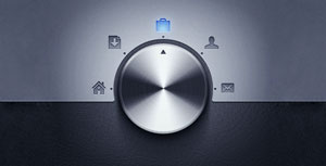
For instance, Figure 1 shows an image from a UI recently featured on uiparade.com. It's a knob the user turns to select the desired application. But how, exactly, will the user turn it? The user certainly can't grab it with his fingers and spin it as he would a real knob. My guess is that the user is supposed to put his finger (or mouse) on the dial and swing his finger around. My question is how, exactly, a user without experience with computer interfaces would figure that out.
 [Click on image for larger view.]
Figure 1. A knob looks exactly like a 3D knob using skeuomorphic design, but how does a user know what to do with it? Source: uiparade.com
[Click on image for larger view.]
Figure 1. A knob looks exactly like a 3D knob using skeuomorphic design, but how does a user know what to do with it? Source: uiparade.com
And here's the thing: Anyone with lots of experience in computer interfaces knows lots of things about computer interfaces -- why not build on that knowledge instead of some knowledge the user has from another domain?
Besides, a very realistic image like this knob often brings too many associations with it. Looking at this design, I'd want to know if I can push on the knob like I do with the volume knob on my radio to turn the radio off and on. What will happen if I do?
If skeuomorphic doesn't help, what should your real goal be? First, make similar things look the same and different things look different. What's the same in your application when compared to other applications should look the same; things that are special to your application should look different from what's found in other applications or in other parts of your application. Your second goal is to reward your users when they experiment.
For instance, a rough edge in the lower-right-hand corner of a window does not send an intuitive message that this part of the window can be grabbed and used to resize the window. What that rough area does signal is that part of the window is different from other parts of the window. If users experiment by hovering their mouse over that corner, they find that a familiar double-headed arrow appears (a convention) and, suddenly, users know what to do with that corner. That's good UI design.
Why the Knob?
I'll just note in passing that the knob -- intended to let the user switch between applications -- is a spectacularly poor UI choice. What a dial looks most like (to most people most of the time) is something that "increases or decreases things" -- it does not look like something used to "switch between things" (though that's not unheard of).
But even passing over that issue just brings you up against the control's logistic issues when used outside of a touch environment (swinging a mouse around is just plain hard). It may be that there's a shortcut so that you don't have to swing the dial; perhaps you can just click on the icon you want. But that just brings up the question of why you're giving up all that screen real estate to make room for that honking-big dial.
Finally: It's not even an extendable design! Think about what would happen as more options are added: either the choices get closer together, making it harder to stop at the right place, or that honking big dial gets even bigger. On the other hand, a menu or a set of tabs might be boring and tedious … but the user knows what they do, the logistic issues are solved and the design is extendable.
To be fair to uiparade.com, the site just says that the design is "interesting," and focuses on the use of textures, gradients and sharp edges. And I agree: It really is a beautiful dial -- stupid, but beautiful. Which, by the way, is what Apple is giving up in abandoning skeuomorphic designs. Apple wasn't stupid to stick with skeuomorphic design: Apple users knew all of those design conventions, so the design worked. The design also made the iOS devices look special (and, some would say, beautiful). By moving away from skeuomorphic design there's a danger that Apple will just look like everyone else -- it's a decision made in the marketing arena.
On that basis, I think Apple should have hung in: We still have abstract painting, but figurative painting made a big comeback in the 1980s and is still going strong. You can still look hip even if your paintings look like hay wagons under trees -- and Apple could have, too.
About the Author
Peter Vogel is a system architect and principal in PH&V Information Services. PH&V provides full-stack consulting from UX design through object modeling to database design. Peter tweets about his VSM columns with the hashtag #vogelarticles. His blog posts on user experience design can be found at http://blog.learningtree.com/tag/ui/.