Facing Developer Anger, Microsoft Reverses VS Code Icon Color Change
Citing "passionate feedback" from developers (some called it "backlash") that was "very helpful, painful, and entertaining all at the same time," Microsoft reversed its decision to change the color of its icons for the Visual Studio Code editor.
Sans the color reversal, however, the new design remains in place. Stay tuned for the coming "feedback" on that.
To sum up this situation:
- Microsoft in August floated some new designs for the VS Code icons in the midst of a broader developer tools initiative at the company.
- The negative feedback started immediately, proving once again how finicky developers can be about the UI of their favorite tools.
- On GitHub issues, coding forums, article comments, blog posts, Twitter feeds and more, coders aired their feelings on the new design, with a negative-vs.-positive ratio that I would guess to be around 95:5.
- Yesterday, while apologizing for the delay in response, Chris Dias, a Microsoft group program manager, related "The Icon Journey" and announced this TL;DR:
Thanks for all the passionate feedback. It has been very helpful, painful, and entertaining all at the same time. We're changing the orange icon to blue for Stable and keeping green for Insiders.
If nothing else, this whole icon-change saga provides interesting insights into the decision-making processes at large companies, even over something as seemingly insignificant as the appearance of a tiny icon that might measure just 32x32 pixels or even 16x16.
 The Previous VS Code Icon (source: Microsoft).
The broader developer tool initiative for new branding icons began back in March, Dias said, noting that "we had to work within a set of 'challenging' corporate branding guidelines."
Who hasn't been there? Hearing from the bosses, "OK, you've got to do this, but meanwhile, you have to follow this, allow for that, can't do this other thing, and absolutely must comply with these. Go get 'em!"
Not that Dias was making excuses. "It is easy to blame the guidelines, but at the same time, having a set of products that are easily and broadly recognizable is a valuable asset," he said. "Instead, we took on the challenge of working within the constraints while also working across the company to evolve the guidelines and address the problems we faced."
The team sweated over the tiniest details, working up and discarding idea after idea, iteration after iteration, color after color, option after option.
Finally, Dias seemed to indicate the team got so tired of the whole thing they just went with what was available.
"By mid-summer, icon fatigue rolled in. We had made so many iterations, we finally said let's go with the current shape, and we checked in the 'pre-release' design for Insiders."
Who hasn't been there? You work on something so much for so long you just get worn out and say: "Forget it, let's ship." (Actually, stronger language than "forget" would probably be used.)
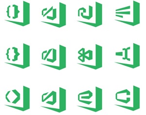 [Click on image for larger view.] Some Early Considerations (source: Microsoft).
But more work remained to be done, primarily concerning colors. It was fascinating to see that Dias admitted one of the principal complaints about the new icon scheme -- its similarity to the Sublime Text editor, which many developers have installed along with VS Code -- was actually considered by the team but discounted as a significant factor.
 The New Sublime Text Logo, Which Took Microsoft by Surprise (source: Sublime Text).
"At this point, we pretty much ran out of colors in the family palette, except for the now infamous orange. There was some concern about the similarity to Sublime Text color palette, but no one had issues when we tested it. And quite honestly, we were more surprised by the latest Sublime's use of a folded ribbon."
Of course, many developers complained the similarity caused them to open up the wrong program by mistake.
 [Click on image for larger view.] New Logos Introduced with VS Code v1.17 (source: Microsoft).
The new orange color introduced for the Insiders build (an early preview program) didn't generate much feedback for a couple months, Dias said.
"Maybe our fears were unfounded. Maybe users would really like the new icons and all the angst on a handful of problems were not worth losing sleep over. We decided not to shine a light on something that might not be a problem. We pushed the changes and made a small reference to the new icons in the release notes."
Developers noticed that small reference and began to complain. We reported on the issue and noted that Microsoft was "risking the wrath of recalcitrant developers." Oh boy, were they.
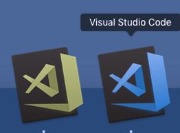
 The Latest: Back to Blue (source: Microsoft).
"Each day there were additional comments, each expressing a dislike of the new icon in new and interesting ways," Dias said. "After the first couple of days, we thought the feedback would slow and we would be able to address the individual issues. Turns out, we were wrong. The feedback just kept coming in. New issues were opened, comments came in faster than we could respond. Hacker News, Visual Studio Magazine. High School friends posted comments on FaceBook. Awesome."
Paraphrasing a capsule summation of the top issues, Dias listed:
- The color change was far too drastic, orange is the opposite color of blue, making that which looked good before, look horrible now.
- A flat single color icon that relies entirely on transparency to create negative space makes it less distinct and aggravates the distinguishability problems.
- The new border is so large and bold that it's more distinct to the eye than the infinity symbol is.
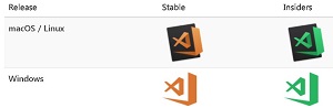
"All of this feedback urged us go back and see if we could do a better job while still creating a family of products," Dias said. "As a result, we are going change the Stable icon to the much-loved blue."
 Insiders (Green) and Stable (Blue) (source: Microsoft).
Dias noted that simple color change doesn't address all the issues raised, and more changes are likely in store, with the team being open to new ideas.
Will developers accept the color change as a welcome response to their concerns -- yet another manifestation of the new Microsoft that really values "Developers! Developers! Developers!" Or will they complain it isn't enough and demand a total retrenchment?
Well, what do you think?
Posted by David Ramel on 10/25/2017