Mobile Corner
Windows Phone Layout Using Grid
Nick Randolph walks through how to use the Grid to layout your Windows Phone 7 application.
- By Nick Randolph
- 05/09/2011
When it comes to designing your Windows Phone 7 application there are a number of different layout containers you can use. These include a StackPanel, for stacking items vertically or horizontally adjacent to each other, a Canvas, for full freedom of positioning items where you want, a WrapPanel (part of the Silverlight toolkit for Windows Phone 7), for when you want items to wrap either horizontally or vertically, and the Grid, where you position items in rows and columns.
Of these, the Grid offers a great compromise between flexibility to position controls where you want them, similar to the way you can with a Canvas, and having the layout automatically resize when either the size of the container changes, or items themselves change size. We're going to take a look at the Grid in more detail.
We'll of course start with a new project based on the Windows Phone 7 Application template in Visual Studio. Once you've created the project, let's take a quick look at the structure of the MainPage.xaml, since it already makes use of a Grid as its primary layout element. The following code illustrates the LayoutRoot element which includes two row definitions with heights set to Auto and Proportional (*).
<Grid x:Name="LayoutRoot" >
    <Grid.RowDefinitions>
        <RowDefinition Height="Auto"/>
        <RowDefinition Height="*"/>
    </Grid.RowDefinitions>
</Grid>
There is also a third way to specify the height which is to set it to a fixed value. Setting the height to a fixed value will ensure the row has the specified height. Alternatively, setting the height to either Auto or Proportional will allow the row to resize depending on the contents of the Grid. A row with a height set to Auto will automatically resize based on the size and position of the elements contained within that row. Lastly, any remaining height, after subtracting the height of Fixed and Auto rows from the height of the Grid, will be allocated to the Proportional rows. The allocation is done based on the proportion of the heights.
For example if there are three proportional rows with heights *, 2* and 5*, the remaining height is divided amongst those rows in the ratio 1:2:5 (note that where the proportion is 1*, the 1 can be dropped). You can also define column definitions with widths set to a fixed value, Auto or Proportional. If you omit either the Height (for row definitions) or the Width (for column definitions) properties, they will behave as if they were set to a proportional value of 1*.
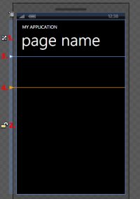
Rather than writing XAML, you can use Expression Blend (Blend) to design the rows and columns for your Grid. Switch over to Blend and select the LayoutRoot node in the Objects and Timeline window. You'll see that the LayoutRoot Grid takes up the entire screen and that it is split into two rows.
[Click on image for larger view.] |
| Figure 1.Caption caption caption |
Figure 1 illustrates the current page layout with four points of interest:
- The icons in along the left most edge of the Grid indicate the nature of the row definition. In this case the first row definition has a Height that is set to Auto.
- The second row definition has a Height set to Proportional, indicated by the open lock symbol. Tapping the icon next to the row will toggle between Auto, Proportional and Fixed (where Fixed is represented by a closed lock icon).
- When a Grid is selected the rows and columns are marked by separators. You may initially want to adjust row and column heights by dragging these separators. This will work as you expect for Fixed values but may give unexpected results. For example, in this case if you drag the separator you will see that a MinHeight attribute is added to the first row definition, ensuring that the first row, despite being Auto sized, will be at least the height you have defined.
- To add a new row or column, position your mouse cursor in the blue vertical or horizontal bar alongside the grid. Clicking the left mouse button will add the appropriate row or column.
In this case we're going to add a two more rows and two column definitions to give the following grid definition.
<Grid x:Name="LayoutRoot" Background="Transparent">
    <Grid.ColumnDefinitions>
        <ColumnDefinition Width="160"/>
        <ColumnDefinition/>
        <ColumnDefinition Width="Auto"/>
    </Grid.ColumnDefinitions>
    <Grid.RowDefinitions>
        <RowDefinition Height="Auto"/>
        <RowDefinition Height="160"/>
        <RowDefinition Height="Auto"/>
        <RowDefinition/>
    </Grid.RowDefinitions>
</Grid>
At this point you can also remove the default ContentPanel Grid from the layout. Drag a Button from the Asset window onto the second row, and after dropping it, select the Button and position it so that it lies across the first column separator, shown in Figure 2.
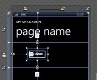
[Click on image for larger view.] |
| Figure 2. |
If you take a look at the XAML for the page you'll see that a Button element has been created, similar to the following code snippet. The Grid.Row attribute indicates that the Button is located in the second row (since rows and columns are on a 0 based index). The lack of a Grid.Column attribute indicates that the Button is in the first column.
<Button Content="Button" HorizontalAlignment="Right" Margin="0,41,-60,50" Grid.Row="1" />
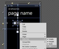
In this case we actually want to expand the Button to fill both cells in the second row. To do this right-click on the Button and select Auto-Size -> Fill (Figure 3). This will expand the Button to fill the first cell in the second row.
[Click on image for larger view.] |
| Figure 3. |
To get the Button to fill both the first and second cells, you can adjust the Grid.ColumnSpan attribute. This can be done in the Properties window, or by adding the attribute to the Button element in XAML.
<Button Content="Button" Grid.Row="1" Grid.ColumnSpan="2"/>
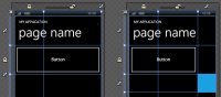
To illustrate the effect that the Auto sized row and column has on the layout, drag a Border element onto the page. Set the Height and Width of the Border to 100, the Background to be the PhoneAccentBrush resource and set the Grid.Row and Grid.Column attributes to 2.
<Border Grid.Column="2" Grid.Row="2" Width="100" Height="100"
               Background="{StaticResource PhoneAccentBrush}"/>
When you add the Border to the page you should see the third row and column appear and that the Button has to reduce in size in order to accommodate them. Figure 4 illustrates this, showing the Border in the lower right corner of the right hand image.
[Click on image for larger view.] |
| Figure 4. |
You've seen how easily you can use the Grid content container control to adjust the layout of your page. Rather than placing everything into a single row and column it's better to assign controls to their own rows and columns. This way you can leverage the auto-sizing capabilities of the Grid, rather than having to resize and reposition elements yourself in code.
About the Author
Nick Randolph runs Built to Roam, a consulting company that specializes in training, mentoring and assisting other companies build mobile applications. With a heritage in rich client applications for both the desktop and a variety of mobile platforms, Nick currently presents, writes and educates on the Windows Phone platform.