Papa's Perspective
Retemplating a Control and Adding Visual States with Expression Blend
Learn how to easily create a toggle button in Expression Blend by retemplating a control and adding visual states.
In my last post I showed how easy it easy to create a few shapes, convert them to paths, and apply transforms to them. The result was a path that looks like Figure 1, shown in the Blend designer. In this post I'll walk through the steps to retemplate a control to use our creation, and to add visual states to it.
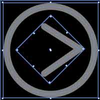
[Click on image for larger view.] |
| Figure 1. The button created in the last tutorial. |
You can either create a control and then retemplate it, or you can create a path similar to what I demonstrated in the previous post and then create a style that will effectively retemplate that control using the path. In other words, you can start with the instrinsic control or your path. Either way works. Since we already have the path, I'll explain how to take that creation and use it as the tempalte for a control.
Let's start by making this arrow serve as a ToggleButton control. I want to replace the control template for the ToggleButton with the ellipse and path we previosuly created. Before I can do that, I need one parent element to contain the template. I select both the ellipse and the path in the Objects and Timeline pane, right click, and select Group Into Grid (Figure 2).
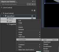
[Click on image for larger view.] |
| Figure 2. The first step in making a toggle button is to group several objects. |
I then right-click the Grid (which contains the path and ellipse) and choose Make into Control, as shown in
Figure 3. I then search for the ToggleButton control and select it from the dialog window. This will create a named style for ToggleButton controls. I could choose to apply to all styles, but that would make it an implicit style that makes all ToggleButton controls use this new style.
In this case I want a named style since I just want one instance of a ToggleButton control to use the style. I then select Define in This document to create the style in the current UserControl (MainPage.xaml). I could have selected the Application (app.xaml) or a resource dictionary, both of which would allow me to reuse this style outside of the local UserControl.
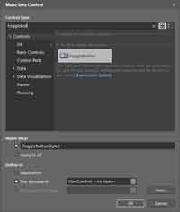
[Click on image for larger view.] |
| Figure 3. Creating a named style for the toggle button control. |
At this point I have a style named ToggleButtonStyle1, which has a target type of ToggleButton. By examining the XAMl of the style, you can see that the ControlTemplate has been redefined using the Grid that contains the Ellipse and the Path we previously created. The next step is to add the visual states.
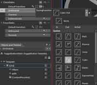
When I created the style, Blend put the designer right into the ButtonStyle1 button template. If you find yourself lost you can get back and edit the template by choosing the ToggleButton in the Objects and Timeline pane, right-clicking and choosing the Edit Current menu option. You'll know you're there when your screen looks like Figure 4.
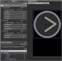
[Click on image for larger view.] |
| Figure 4. The Edit Current menu page. |
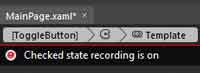
I want to add the visual states to make the arrow to point to the right when toggled off (unchecked), and point to the left when toggled on (checked). The ToggleButton already has a CheckStates state group as shown in the states pane in Figure 4. The CheckStates group has Checked and Unchecked states already defined (and an Indeterminate state). I don't need to modify the Unchecked state since my arrow already points to the right. However, I do want the arrow to point 180 degrees the opposite direction when it's toggled to the Checked state. So I select the Checked state and Blend instantly goes into state recording mode.
Blend responds to the state selection by automatically recording any changes you make. You can always tell when Blend is in the state recording mode by the red border around the design surface, the red filled circle in the upper left of the design surface, and the message [Your state] state recording is on (Figure 5). Just be careful to leave the recording mode when you're done making state changes. Do this by selecting the base state, turning off the recording by clicking the red circle, or by exiting the template in the Objects and Timelines. It's easy to forget this step, so be careful – otherwise, you may end up with some interesting and unexpected visual states.
[Click on image for larger view.] |
| Figure 5. Make sure to turn off recording when you're done making state changes. |
Now that Blend is recording my changes, I select the ellipse and change the opacity from 50 percent to 90 percent in the Properties pane. Then I select the path, press the V key (Selection), hover my mouse below the lowest point of the arrow until it shows the rotation mouse icon. Then I hold the SHIFT key down and rotate the arrow until it's pointing directly to the left. The SHIFT key makes the rotation transform snap to degrees in 15-degree intervals. I could also have gone to the Properties pane and calculated the degrees to rotate it. I now have an Unchecked state with a -135 degree Rotate Transform and a Checked state with a 45 degree Rotate Transform.
I'm not done yet, because the states are pretty abrupt. This is where easing and duration can make a big difference in the user experience. Right above the Unchecked state there are default transition properties for the CheckStates state group. Here I can set the duration between states to take 0.4 seconds. I can test this and see the effect by making sure the Turn on transition preview button is on (located at the top right of the states pane). Then, when I select the Checked and Unchecked states, the ToggleButton animates between the two states for me.
Currently, the state transition occurs at a constant rate over 0.4 seconds. Constant rates are pretty robotic, so let's add some easing to the states to make the swivel effect appear a little more fluid. There are several built-in easing effects from which to choose, right in the default transition properties for the CheckStates state group. You can choose from a variety of easings that ease in, ease out, or ease in and out. Let's add a Cubic Out easing, as shown in Figure 6.
[Click on image for larger view.] |
| Figure 6. Using the easing function smoothes out your animations. |
Now when we go between the states we can see the arrow rotate quickly at first, then slow down as it comes to rest over the same 0.4 seconds (and the opacity changes). Make sure you choose a duration not too lengthy, as you don't want users waiting unnecessarily for your state changes.
Once you get the desired effect from your visual states, you can exit the template and your ToggleButton is ready to go.
So what did we learn? This post shows how you can easily take a drawing and use it to retemplate a control. Then define visual states to the control, using its built-in states. You can test the completed solution if you followed along by pressing F5 (or download the code sample with this article).
About the Author
John Papa is a Microsoft Regional Director and former Microsoft technical evangelist. Author of 100-plus articles and 10 books, he specializes in professional application development with Windows, HTML5, JavaScript, CSS, Silverlight, Windows Presentation Foundation, C#, .NET and SQL Server. Check out his online training with Pluralsight; find him at johnpapa.net and on Twitter at twitter.com/john_papa.