News
Desktop Revolution: Windows 8 Metro Goes Radical
The new user interface is a clean break from the past.
Microsoft likes to tout its sales figures for Windows 7. And in fact, that OS appears set to be the company's most successful ever.
That's why it's a risk to completely change the look and feel of Windows 7 for its successor, Windows 8. But Microsoft seems not to care, having revamped the look and feel of the OS, from the Start button on.
It's also why Microsoft can't stop talking about its checkerboard-like Start Screen design in Windows 8.
The Start Screen is part of the Metro user interface in Windows 8 that was showcased at Microsoft's Build conference last month. It's a radical change for Windows desktop OS users, meaning that people will either love it or hate it when Windows 8 is released.
It appears that Microsoft put a lot of thought into the Metro UI before rolling it into Windows 8, which is now available for testing as a developer preview release. Those thoughts are laid out in three "building Windows 8" blog posts issued this month. Microsoft utilized a great swath of data voluntarily contributed by users, which largely guided the company's design decisions with Windows 8.
First off, the Start button had to go. In a post by Chaitanya Sareen, program manager lead on the Microsoft core experience evolved team, Microsoft explained that people were using the Start button in Windows less and less, based on statistical data. Instead, people preferred to launch apps that were pinned to the taskbar.
"The message is clear that the majority of people want most of their apps on the taskbar rather than having to dig into Start," Sareen explained.
Microsoft went a step further than that with the Windows 8 design and laid all of the programs out in a single view on the Start Screen, dropping the taskbar altogether from the Metro UI. That layout, in Microsoft's view, represents "the evolution of the Start menu." In this case, "evolution" means a collection of square and rectangular colored tiles, representing programs, all sitting right on the desktop screen.
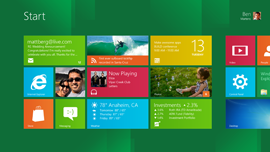 [Click on image for larger view.] [Click on image for larger view.] |
| Windows 8 Metro Start Screen. |
Next, Alice Steinglass, group program manager for the core experience evolved team, took up the cause of explaining the Start Screen's design in Windows 8. Her main point is that the Windows 8 Start Screen functions as a sort of "dashboard that helps you stay up to date and connected in a high quality experience substantially improved over the notification tray." The notification tray on the taskbar was simply dropped in the Metro UI because it just added clutter to the desktop. Similarly, Microsoft dropped the folder approach in the start menu because "folders are a way of burying things, not organizing them."
Metro has "live tiles" that update in near real time using the Windows Notification Service for Metro-style apps. The effect, according to Steinglass, is to provide a "heads-up display" of activity for users. That arrangement can save time for consumer users, who may not even have to launch an app to see an update, as in a stock-ticker app. It can benefit office workers too.
"We expect corporate applications to be developed that display Live tiles for important internal systems and processes too," Steinglass explained.
Metro looks a lot like the consumer UI seen in Windows Phone 7, but Microsoft is serious about it for office desktop workers. It works with keyboard, mouse and stylus in addition to touch. Users can move the tiles around to customize the Start Screen, but Microsoft hasn't neglected IT pros who manage corporate desktops. Windows 8 will enable "the managed lockdown of customization of the Start screen so that it is consistent across the corporation," explained a post by Marina Dukhon, a senior program manager lead on the Microsoft core experience team. She noted that IT pros will be able to remove items from the Start Screen, such as the Games app tile, in Windows 8.
Microsoft is also working to optimize Windows 8 for those who work with larger screens or multiple screens. The larger the screen real estate, the more app tiles can be displayed, although Microsoft currently has configured the Windows 8 Start Screen to display 20 apps on the screen before users have to scroll. The screen scrolls from right to left if there are more program tiles to see. Dukhon said that Microsoft will be "increasing the number of rows of tiles that you can see on large monitors" to fit more apps on the Start Screen.
Dukhon addressed a number of critical comments from Windows 8 reviewers in the blog post. In response to one comment, she announced that Microsoft's latest Windows 8 design restores the "all programs" folder structure that was used in previous Windows versions. The all-programs structure arranges lists of applications under their suite names (such as "Microsoft Office"). Users who got the developer preview of Windows 8 were somewhat shocked to see apps listed in plain alphabetical order, and the team appears to be responding to that feedback.
Microsoft has largely gone quiet on Windows 8 since the conclusion of its Build event in September. The exception appears to be the Metro UI. While the classic Desktop approach will coexist with the Metro UI in Windows 8, Microsoft apparently sees the squared-off Metro approach as "your new home base" in years to come.
The future of the Windows user interface is square and rectangular, according to Microsoft. It's app-based rather than file-based. If Microsoft keeps to expectations, that Windows 8 future may begin arriving as soon as April 2012 or sometime in 2013, when the OS is released as a final product.
About the Author
Kurt Mackie is senior news producer for 1105 Media's Converge360 group.