Mobile Corner
Animating Windows Phone Listbox Items
Adding visual states and animation to your Listboxes can juice up your Windows Phone app.
- By Nick Randolph
- 08/27/2012
Previously, we've looked at how you can style Listbox items by setting the ItemTemplate property. This can be extended to display items in a grid by setting the ItemsPanel property; you can also switch between different item templates using a template selector. In this article, we're going to extend a simple item template a little further by adding visual states and some animation.
The previous examples all used simple design-time data to illustrate how an image could be positioned alongside some text. We're going to change this slightly to use real data loaded at runtime from Flickr.
To start, we need to change our design time data in Expression Blend slightly. This time the collection name will be Items, with each item having properties Title and ImageUrl. The item template for the Listbox contains the following XAML, which displays the Image alongside a TextBlock containing the title:
<DataTemplate x:Key="ItemTemplate">
    <Grid Margin="12,0,0,12">
        <Grid.ColumnDefinitions>
            <ColumnDefinition Width="Auto" />
            <ColumnDefinition />
        </Grid.ColumnDefinitions>
        <Image
                Width="100"
                Height="100"
                Source="{Binding ImageUrl}" />
        <TextBlock Grid.Column="1"
                    Text="{Binding Title}"
                    Style="{StaticResource PhoneTextLargeStyle}" />
    </Grid>
</DataTemplate>
Before we customise the layout, let's add some code to load data at runtime from Flickr. Flickr exposes data in a number of formats; in this case we're going to load data from the public photo feed in JavaScript Object Notation (JSON), without the JSON callback. You can see this in the URI specified in the OpenReadAsync method on a WebClient instance in Listing 1.
When the Flickr JSON feed has been retrieved, it's deserialized into a FlickrData object. This class has been attributed using DataContract/DataMember, to ensure correct deserialization of data from Flickr. The result can be seen in Listing 2.
You'll notice that the FlickrData class has a property called Items, and each item has properties Title and ImageUrl. This matches the structure of the design data we used earlier. At this point, if you were to run the application you'd see the left column of the application appear blank to start with until the images have loaded; as the images load, they'll be displayed on the screen.
We're going to improve this by adding a placeholder Border to the item template, which will be displayed while the image is being loaded. Once the image has been loaded, it will be rotated onto the screen and the Border will fade out. Also, for the case where the image fails to load, the Border will change color from the default Gray to Red to indicate the image failed to load.
If you were to handle this all in code, it might take awhile to determine how best to approach it. Essentially, you'd need to tap into the ImageOpened and ImageFailed events on the Image control for each item in the Listbox. You'd then need to invoke a storyboard or state change to either display the Image control or change the Border color. But this can all be achieved in Expression Blend using a combination of Visual States and Behaviors.
Start by defining the two states which correspond to the Image being displayed: a) Once the image has loaded successfully; b) When the Border is Red (if the image fails to load). The XAML in Listing 3 illustrates these two visual states, along with the default layout which has the Image control at a 90 rotate (so it's not visible by default).
The final step is to add two GoToStateAction behaviors to the Image control. The GoToStateAction behavior is configured to listen for a particular event. When the event's triggered, the behavior forces a change in visual state.
In this case, the first GoToStateAction listens for the ImageOpened event and forces a change in the state to ImageLoaded. The second behavior listens for the ImageFailed event and forces a change in state to ImageFailedToLoad:
<Image x:Name="DisplayImage"  Width="100"
        Height="100"
        Source="{Binding ImageUrl}" >
    <Image.Projection>
        <PlaneProjection RotationY="90" CenterOfRotationX="0" CenterOfRotationY="0" />
    </Image.Projection>
    <i:Interaction.Triggers>
        <i:EventTrigger EventName="ImageOpened">
            <ec:GoToStateAction StateName="ImageLoaded"/>
        </i:EventTrigger>
        <i:EventTrigger EventName="ImageFailed">
            <ec:GoToStateAction StateName="ImageFailedToLoad"/>
        </i:EventTrigger>
    </i:Interaction.Triggers>
</Image>
Figure 1 illustrates the application running: in the left image, most of the images have finished downloading and are rotating onto the screen; the right image shows that all the images have successfully loaded.
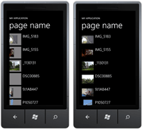
[Click on image for larger view.] |
| Figure 1. Transitioning images into the view. |
In this article you've seen how to extend the item template of a Listbox item, in order to add animation and customize the behavior based on events. This technique can also be used for running animations, to add or remove elements from the Listbox.
About the Author
Nick Randolph runs Built to Roam, a consulting company that specializes in training, mentoring and assisting other companies build mobile applications. With a heritage in rich client applications for both the desktop and a variety of mobile platforms, Nick currently presents, writes and educates on the Windows Phone platform.