Code Focused
Snazz Up Your MVC Apps with Twitter Bootstrap: A Get-Started Guide
Creating Web applications with a consistent interface can be time-consuming. Using Twitter Bootstrap, you can quickly scaffold out nice-looking Web applications. Here's how.
- By Ondrej Balas
- 11/05/2013
As a developer, it can be challenging to create a nice-looking user interface, especially one that's consistent between applications. The folks at Twitter ran into the same problem when it came to their internal software, so they created something called Twitter Bootstrap: A set of scripts and CSS styles that makes it easy to stylize your HTML elements. Not only that, it also includes some common behaviors that would normally be time-consuming to implement, like carousels.
Twitter Bootstrap is an open source project, and happens to be extremely well-documented. The project's GitHub page is here, but you'll probably want to begin exploring it by visiting its Web site. There you'll find great documentation with examples and code samples for virtually all its features. The latest version at the time of this writing is version 3.0.0, released Aug. 19, 2013.
Using Bootstrap Within Your MVC Application
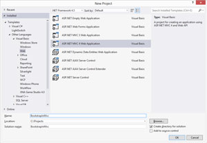
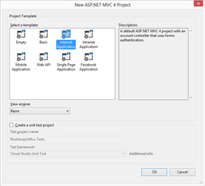
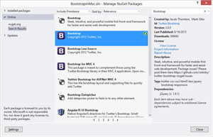
To illustrate just how easy it is to get started using Bootstrap, I'll begin by creating a new MVC application, as shown in Figure 1, then select "Internet Application" as the project template, as shown in Figure 2. At this point you'll need to get the Bootstrap files. The easiest way is through NuGet, as shown in Figure 3.
 [Click on image for larger view.]
Figure 1. Creating A New MVC Application
[Click on image for larger view.]
Figure 1. Creating A New MVC Application
 [Click on image for larger view.]
Figure 2. Choose "Internet Application" as the Project Template
[Click on image for larger view.]
Figure 2. Choose "Internet Application" as the Project Template
 [Click on image for larger view.]
Figure 3. Using NuGet To Get the Bootstrap Files
[Click on image for larger view.]
Figure 3. Using NuGet To Get the Bootstrap Files
Once the files are in your project, you'll need to make some slight modifications to the Views\Shared\_Layout.vbhtml file. First, find the following line:
@Styles.Render("~/Content/css")
And replace it with:
@Styles.Render("~/Content/bootstrap/bootstrap.css")
This will cause all pages using the site's default layout to use the bootstrap styling instead. You'll also need to scroll down to the bottom of that same file and add a script reference for bootstrap after the jquery reference. The two lines should look like this:
@Scripts.Render("~/bundles/jquery")
@Scripts.Render("~/Scripts/bootstrap.js")
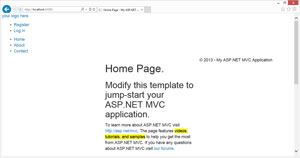
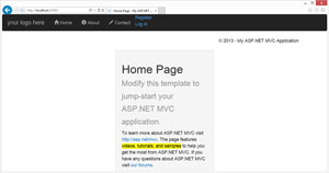
Once you get all set up, running the application should result in a very bare and non-stylized version of the template site, as shown in Figure 4. Now comes the fun part: Styling everything with Bootstrap.
 [Click on image for larger view.]
Figure 4. A Non-Stylized Version of the Template Site
[Click on image for larger view.]
Figure 4. A Non-Stylized Version of the Template Site
The Bootstrap Grid
One of the most critical things to understand with Bootstrap is the included grid system. When first getting started, you'll want to imagine it as being a grid with 12 columns. As an added benefit, those 12 columns will automatically collapse down to one column on a device with a small screen, such as a mobile phone or tablet. To illustrate this, start by finding the following line in the _Layout.vbhtml file you've been working with:
<div id="body">
Replace it with:
<div class="col-md-4 col-md-offset-4">
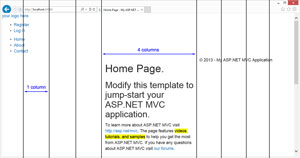
Upon refreshing the page, you'll immediately see the difference: The main body content is squeezed into the page's center, as shown in Figure 5. The class "col-md-4" instructs Bootstrap to make the content four columns wide, and "col-md-offset-4" tells Bootstrap to offset it by four columns, thus centering it. See Figure 6 for a rough overlay of how the column system looks.
 [Click on image for larger view.]
Figure 5. The Main Body Content
[Click on image for larger view.]
Figure 5. The Main Body Content
 [Click on image for larger view.]
Figure 6. The Column System
[Click on image for larger view.]
Figure 6. The Column System
Most of Bootstrap's styling and functionality is unlocked by assigning Bootstrap classes to appropriate elements, just like the positioning of <div> tags within the grid system.
Next, open up the Views\Home\Index.vbhtml file. Two changes are needed here within the "featured" section to make the header look a little better. First, find:
<div class="content-wrapper">
And replace it with:
<div class="well page-header">
This serves two purposes. First, it identifies the div as a "well," which is a somewhat stylized div. Second, it also identifies it as a page header, which adds further styling to header elements within it. Try removing the following two lines:
<h1>@ViewData("Title").</h1>
<h2>@ViewData("Message")</h2>
And replacing them with:
<h1>@ViewData("Title") <small>@ViewData("Message")</small></h1>
This leaves you with a page resembling the one in Figure 7. Try resizing your browser and watch as the grid dynamically changes based on the size of the browser viewing it.
 [Click on image for larger view.]
Figure 7. A Dynamic Grid
[Click on image for larger view.]
Figure 7. A Dynamic Grid
Navigation
The next change will be a bit more complex: adding a "navbar." To add one, go back to the _Layout.vbhtml file that was open earlier. Replace the <header> tag and its entire contents with the following:
<header>
  <nav class="navbar navbar-inverse" role="navigation">
    <div class="navbar-header">
      @Html.ActionLink("your logo here", "Index", "Home",          Nothing, New With {Key .[class] = "navbar-brand"})
    </div>

    <ul class="navbar-nav nav">
      <li>@Html.ActionLink("Home", "Index", "Home")</li>
      <li>@Html.ActionLink("About", "About", "Home")</li>
      <li>@Html.ActionLink("Contact", "Contact", "Home")</li>
    </ul>

    @Html.Partial("_LoginPartial")
  </nav>
</header>
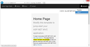
Running it now reveals the start of a nice-looking navbar, as shown in Figure 8. The <nav> tag defines the navbar, and the "navbar-inverse" class styles the navbar with a black background. If you were to replace the "navbar-inverse" with "navbar-default," the navbar background would instead become a light color.
 [Click on image for larger view.]
Figure 8. The Start of a Nav Bar
[Click on image for larger view.]
Figure 8. The Start of a Nav Bar
In the previous code snippet, the <div> element with the "navbar-header" class provides a location for the element showing "your logo here," which is also additionally styled with the "navbar-brand" class. The <ul> element acts as the container for the rest of the links on the navbar. Adding more <li> items within it creates more links on the navbar.
Note: Ignore the "Register" and "Log In" links hanging off at the end for now. I'll show you a nice way to handle those a bit later.
Next, let's drop some icons into the navbar to make it look more professional. Add the icons by replacing these three lines:
<li>@Html.ActionLink("Home", "Index", "Home")</li>
<li>@Html.ActionLink("About", "About", "Home")</li>
<li>@Html.ActionLink("Contact", "Contact", "Home")</li>
With:
<li><a href="@Url.Action("Index", "Home")">   <span class="glyphicon glyphicon-home">     </span> Home</a></li>
<li><a href="@Url.Action("About", "Home")">
  <span class="glyphicon glyphicon-info-sign">     </span> About</a></li>
<li><a href="@Url.Action("Contact", "Home")">
  <span class="glyphicon glyphicon-pencil">     </span> Contact</a></li>
Now when refreshing, the navbar should look like the one in Figure 9. Bootstrap comes with a whole set of icons you can easily drop in by including a <span> tag with a class corresponding to the desired icon. For a complete set of icons, see this page in the Bootstrap documentation.
 [Click on image for larger view.]
Figure 9. The Nav Bar with Icons Added
[Click on image for larger view.]
Figure 9. The Nav Bar with Icons Added
To finish up the navbar, I will make some major changes to the Views\Shared\_LoginPartial.vbhtml file. Replace the entire contents of that file with the code shown in Listing 1.
Listing 1: The Updated Contents of Views\Shared\_LoginPartial.vbhtml
<ul class="navbar-nav nav navbar-right">
  <li class="dropdown">
    @If Request.IsAuthenticated Then
        @<text>
        <a href="#" class="dropdown-toggle"            data-toggle="dropdown">           <span class="glyphicon glyphicon-user"></span>            Account <b class="caret"></a>
        <ul class="dropdown-menu">
          <li><a href="javascript:document.getElementById(             'logoutForm').submit()">Log off</a></li>
        </ul>

        @Using Html.BeginForm("LogOff", "Account",            FormMethod.Post, New With {Key .id = "logoutForm"})
          @Html.AntiForgeryToken()
        End Using
      </text>
    Else
      @<a href="#" class="dropdown-toggle"          data-toggle="dropdown">         <span class="glyphicon glyphicon-user"></span>          Account <b class="caret"></b></a>
        @<ul class="dropdown-menu">
          <li>@Html.ActionLink("Register", "Register", "Account",              routeValues:=Nothing, htmlAttributes:=             New With {.id = "registerLink"})</li>
          <li>@Html.ActionLink("Log in", "Login", "Account",              routeValues:=Nothing, htmlAttributes:=             New With {.id = "loginLink"})</li>
        </ul>
    End If
  </li>
</ul>
Doing this will take the "Register" and "Log In" links and neatly tuck them away under the new "Account" dropdown. This takes advantage of the <li> element having a "dropdown" class, allowing it to have <ul class="dropdown-menu"> within it. Any <li> element with an <a> tag (which can be created by Html.ActionLink) within it will then become a dropdown item.
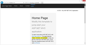
If all goes well, refreshing should result in a page that looks like the one in Figure 10.
 [Click on image for larger view.]
Figure 10. Nav Bar Progress
[Click on image for larger view.]
Figure 10. Nav Bar Progress
Other Common Elements
Some other commonly used elements can be added to provide a bit more functionality. I think the most common one is the use of buttons. Open up Index.vbhtml again and look for the three <a> tags with the text "Learn more." The links can easily be turned into buttons by adding the following three classes to them, sequentially:
<a class="btn btn-primary" href=   "http://go.microsoft.com/fwlink/?LinkId=245151">   Learn more…</a>

<a class="btn btn-success" href=   "http://go.microsoft.com/fwlink/?LinkId=245153">   Learn more…</a></div>

<a class="btn btn-danger" href=   "http://go.microsoft.com/fwlink/?LinkId=245157">   Learn more…</a></div>
Now, refreshing the page will result in a page that looks like the one in Figure 11. The "btn" class causes the link to be styled as a button, and the second class assigns a standard color to the button.
 [Click on image for larger view.]
Figure 11. With Learn More Links
[Click on image for larger view.]
Figure 11. With Learn More Links
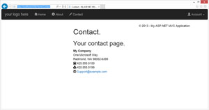
Another useful feature of Bootstrap is address styling. Open up Views\Home\Contact.vbhtml and replace the contents of the file with the code in Listing 2 below:
Listing 2: The Updated Contents of Views\Shared\Contact.vbhtml
@Code
  ViewData("Title") = "Contact"
End Code

<hgroup class="title">
  <h1>@ViewData("Title").</h1>
  <h2>@ViewData("Message")</h2>
</hgroup>

<address>
  <strong>My Company</strong><br />
  One Microsoft Way<br />
  Redmond, WA 98052-6399<br />
  <span class="glyphicon glyphicon-phone-alt">     </span> 425.555.0100<br />
  <span class="glyphicon glyphicon-print">     </span> 425.555.0199<br />
  <span class="glyphicon glyphicon-envelope"></span>    <a href="mailto:[email protected]">     [email protected]</a>
</address>
The result will be a contact page that looks like the one in Figure 12.
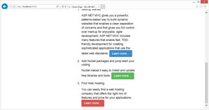
One more commonly used element is a tabbed button group. This allows you to have content tabs on your page, with just one tab's content visible at a time. To see this in action, open up Index.vbhtml again and find the line:
 [Click on image for larger view.]
Figure 12. Using Bootstrap To Add Address Styling
[Click on image for larger view.]
Figure 12. Using Bootstrap To Add Address Styling
<h3>We suggest the following:</h3>
Remove everything below that line, and replace it with the code from Listing 3.
Listing 3: The Code for Creating a Tabbed Button Group within Views\Shared\Index.vbhtml
<div id="tab" class="btn-group" data-toggle="buttons">
<a href="#starting" class="btn btn-info active" data-toggle="tab"> <input type="radio" name="options" /> Starting</a>
<a href="#nuget" class="btn btn-info" data-toggle="tab"> <input type="radio" name="options" /> NuGet</a>
<a href="#hosting" class="btn btn-info" data-toggle="tab"><input type="radio" name="options" /> Hosting</a>
</div>
<div class="tab-content">
<div class="tab-pane active" id="starting">
<h5>Getting Started</h5>
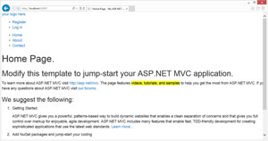
ASP.NET MVC gives you a powerful, patterns-based way to build dynamic websites that enables a clean separation of concerns and that gives you full control over markup for enjoyable, agile development. ASP.NET MVC includes many features that enable fast, TDD-friendly development for creating sophisticated applications that use the latest web standards.
<a class="btn btn-primary" href= "http://go.microsoft.com/fwlink/?LinkId=245151"> Learn more…</a>
</div>
<div class="tab-pane" id="nuget"> <h5>Add NuGet packages and jump-start your coding</h5>
NuGet makes it easy to install and update free libraries and tools.
<a class="btn btn-success" href= "http://go.microsoft.com/fwlink/?LinkId=245153"> Learn more…</a></div>
<div class="tab-pane" id="hosting"> <h5>Find Web Hosting</h5>
You can easily find a web hosting company that offers the right mix of features and price for your applications.
<a class="btn btn-danger" href= "http://go.microsoft.com/fwlink/?LinkId=245157"> Learn more…</a></div>
</div>
The resulting tab group is shown in Figure 13.
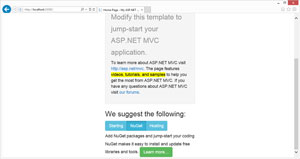 [Click on image for larger view.]
Figure 13. A Tabbed Button Group
[Click on image for larger view.]
Figure 13. A Tabbed Button Group
But Wait, There's More!
There is so much more to Bootstrap than this, but hopefully you'll find it to be a solid introduction. While the page styling demonstrated is far from impressive, it illustrates the uses of some of the key components of Bootstrap. For more information and examples on what can be done with Bootstrap, check out the documentation on the project's home page.