Code Focused
8 New Things To Check Out in Visual Studio 2013
From Peek Definitions to scroll bar customization, here are eight of the most helpful features you'll want to explore in Visual Studio 2013.
- By Ondrej Balas
- 12/09/2013
With the release of Visual Studio 2013, there are plenty of new things to try out. In this article, I've highlighted the eight features which I consider to be the most helpful all around. Whether you work by yourself or on a team, these new features can save you time and improve your development experience. Note that there may be slight discrepancies between what you see in this article and what you see in Visual Studio 2013, as this article was written based on the latest release candidate (RC) of Visual Studio 2013, which became available in October 2013.
1: Prototyping and Throw-Away Applications
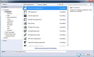
One of the first things you may notice when starting Visual Studio 2013 is that the "New Project" window looks a bit different, as shown in Figure 1. When creating a new project, the location and name of the solution no longer have to be set immediately. In previous versions, the project's name and location had to be set before it was created, even if you were just testing something out and planned to delete it right away. For those who create many new projects, that meant either an extra step to delete the project or having a cluttered project directory.
 [Click on image for larger view.]
Figure 1. The new "New Project" window.
Visual Studio now works more like Microsoft Office applications, allowing you to create a project and start coding, and defer the decision of if/where to save it.
2: Peek Definitions
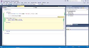
Peek Definitions lets you take a quick peek at a class or method definition without opening the file. You may be accustomed to hitting F12 to go to an object's definition, but now if you hit Alt+F12 instead, you will be able to take a peek at the definition just below its usage. As shown in Figure 2, I had my cursor on "prod.Name" when I hit Alt+F12, bringing up the definition of the Product class right inside my code window.
 [Click on image for larger view.]
Figure 2. Peek Definitions are shown within your current code window.
3: Improved Navigation and Search
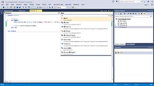
Along the lines of Peek Definitions, you can also try hitting CTRL+, which will behave differently depending on the position of your cursor. If the cursor is on a blank line, you can just start typing anything and it will begin searching for what you're typing. If the cursor is on some code, that object will be automatically typed into the search box to get you started. See Figure 3 for a look at what that search function looks like. You can then use your arrow keys or mouse to navigate to any of the results of the search.
 [Click on image for larger view.]
Figure 3. Improved Navigation allows you to get to where you want quickly.
4: CodeLens
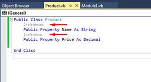
CodeLens is a feature that will be available only in Visual Studio Ultimate edition (more on the controversy here), but adds some very useful behavior to the editor. By default, the number of times a property or method is referenced by your code is shown above that property or method. This information can be helpful when changing existing code, since you'll know if the method is called from many places or just a handful. In larger projects, especially ones where you're not familiar with the entire codebase, this can be a big time saver. The number of references is shown in a small font above each property or method on your class, as shown in Figure 4. Clicking on the number of references will show you all of the methods that call it, making it easy to find and navigate to those sections of your code.
 [Click on image for larger view.]
Figure 4. CodeLens without TFS integration shows you the number of times a bit of code is referenced.
While not shown here, CodeLens also has some nice Team Foundation Server (TFS) integration. If you're using TFS, it will allow you to see commit history and unit tests targeting the code in question.
5: Scroll Bar Customization
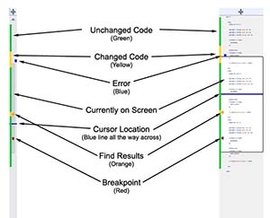
In Visual Studio 2013, the scroll bar can now be customized to give you a better overview of large files. It can be set to show various annotations, such as changes, errors, breakpoints and more. Optionally, it can be set to "map mode," which will give you a zoomed-out representation of your code right on the scroll bar itself. The difference between bar mode (the default) and map mode can be seen in Figure 5.
 [Click on image for larger view.]
Figure 5. Comparison between scroll bar modes: bar mode (left) and map mode (right).
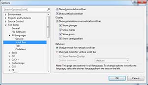
The options screen, as shown in Figure 6, is accessible by going to Tools > Options > Text Editor > All Languages > Scroll Bars.
 [Click on image for larger view.]
Figure 6. The scroll bars can be adjusted from the options screen.
6-8: Minor Tweaks
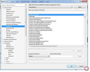
One of the smaller tweaks to Visual Studio is in the options screen itself. Take a look at Figure 7. Do you recognize that screen? The options screen not being resizable has been a pet peeve of mine for a long time, and I'm elated to know that it's now resizable.
 [Click on image for larger view.]
Figure 7. A small hidden feature: The options screen can be resized.
In the code window, you can also now easily move lines or blocks of code up or down. Try highlighting an entire line of code, and press ALT+UP or ALT+DOWN. The entire line will be shifted up or down -- another great time saver.
Finally, if you code from multiple machines, the new synchronization features can be of great benefit. If you choose to sign in with your Microsoft account when using Visual Studio, and you sign in from multiple computers, your environment settings -- like keyboard shortcuts and theme -- will be synchronized between instances automatically.
What Are Your Favorite Changes?
Microsoft continues to make Visual Studio the best (in my opinion) development IDE out there. The changes in Visual Studio 2013 really show that Microsoft cares about making the developer experience better with each release, even in relatively insignificant areas like the options screen. Take some time to try out the new features, and hopefully use them to make writing code more enjoyable. Let me know which ones you like best in the comments below.
About the Author
Ondrej Balas owns UseTech Design, a Michigan development company focused on .NET and Microsoft technologies. Ondrej is a Microsoft MVP in Visual Studio and Development Technologies and an active contributor to the Michigan software development community. He works across many industries -- finance, healthcare, manufacturing, and logistics -- and has expertise with large data sets, algorithm design, distributed architecture, and software development practices.