Mobile Corner
Multiple Item Templates in Windows Phone
How to use a template selector to dynamically select which item template to use for each list item.
- By Nick Randolph
- 08/06/2012
Earlier this year we took a look at working with ListBoxes in a Windows Phone application. That article demonstrated how to style items within a Listbox using a single item template, ensuring that all items in the list have the same layout.
But there are some cases where this isn't the desired behavior. In this article you'll see how to use a template selector to dynamically select which item template to use for each list item.
From the previous article, we'll reuse the design time data; this is a collection of contacts, each with a Name and an ImageUrl property. The corresponding item template for the Listbox was similar to the following XAML, which has an Image control on the left and a TextBlock on the right.
<DataTemplate x:Key="ImageOnLeftItemTemplate">
    <Grid Margin="12,0,0,12">
        <Grid.ColumnDefinitions>
            <ColumnDefinition Width="Auto" />
            <ColumnDefinition />
        </Grid.ColumnDefinitions>
        <Image  Width="100"
                Height="100"
                Source="{Binding ImageUrl}" />
        <TextBlock Grid.Column="1"
                    Text="{Binding Name}"
                    Style="{StaticResource PhoneTextLargeStyle}" />
    </Grid>
</DataTemplate>
In this example, we want to change this so that each alternate contact has the Image on the right side. There are a number of different ways to do this, but for the purpose of this article we're going to use a template selector to switch between two different item templates. The first thing we're going to need is an alternative item template, as in the following XAML:
<DataTemplate x:Key="ImageOnRightItemTemplate">
    <Grid Margin="12,0,0,12">
        <Grid.ColumnDefinitions>
            <ColumnDefinition />
            <ColumnDefinition Width="Auto" />
        </Grid.ColumnDefinitions>
        <TextBlock Text="{Binding Name}"
                    Style="{StaticResource PhoneTextLargeStyle}" />
        <Image Grid.Column="1"
                Width="100"
                Height="100"
                Source="{Binding ImageUrl}" />
    </Grid>
</DataTemplate>
You can see from this XAML that it's virtually the same as the previous XAML, with the exception that the columns have been exchanged, positioning the Image on the right of the TextBlock. You may wonder how we're going to switch between these two templates, since the ListBox control only has a single ItemTemplate property.
The trick is that we need to add a template selector control, which is going to dynamically pick which item template to use. The template selector actually comes in two parts: The first is a reusable abstract class, which can simply be added to any of your Windows Phone projects:
public abstract class TemplateSelector : ContentControl
{
    public abstract DataTemplate SelectTemplate(object item, DependencyObject container);

    protected override void OnContentChanged(object oldContent, object newContent)
    {
        base.OnContentChanged(oldContent, newContent);

        ContentTemplate = SelectTemplate(newContent, this);
    }
}
Essentially, the TemplateSelector abstract class exposes a SelectTemplate method, which needs to be implemented for the specific scenario within your application. The ContactTemplateSelector, in the following code block, implements the SelectTemplate method in order to return an item template used to display the Listbox item.
public class ContactTemplateSelector : TemplateSelector
{
    public DataTemplate ImageLeft
    {
        get;
        set;
    }

    public DataTemplate ImageRight
    {
        get;
        set;
    }


    public override DataTemplate SelectTemplate(object item, DependencyObject container)
    {
	// Determine which template to return;
    }
}
In this case, the ContactTemplateSelector has two DataTemplate properties. By exposing these properties it means that the item templates returned by the SelectTemplate method can be designed in Expression Blend, rather than being hard-coded within the ContactTemplateSelector.
The logic within the SelectTemplate method will vary depending on your application scenario. For this example, we're going to add a bool IsLeft property to the design time data in Expression Blend. Thus the SelectTemplate method uses this property to determine which item template to return.
public override DataTemplate SelectTemplate(object item, DependencyObject container)
{
    var contact = item as ContactsItem;
    if (contact != null)
    {
        return contact.IsLeft ? ImageLeft : ImageRight;
    }

    return null;
}
So far, our XAML has two item templates: ImageOnLeftItemTemplate and ImageOnRightItemTemplate. We need to add a new template which includes the ContactTemplateSelector:
<DataTemplate x:Key="SelectingTemplate">
    <local:ContactTemplateSelector Content="{Binding}"
                                    ImageLeft="{StaticResource ImageOnLeftItemTemplate}"
                                    ImageRight="{StaticResource ImageOnRightItemTemplate}"
                                    HorizontalContentAlignment="Stretch" />
</DataTemplate>
We then need to update the Listbox to use this new item template:
<ListBox x:Name="ContactListBox"
            ItemTemplate="{StaticResource SelectingTemplate}"
            ItemsSource="{Binding Contacts}"
            ItemContainerStyle="{StaticResource FullWidthListBoxItemStyle}" />
When you run this, your application should look similar to Figure 1.
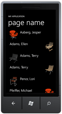
[Click on image for larger view.] |
| Figure 1. Alternating item templates. |
An interesting side effect is that in Expression Blend you'll only see one of the two item templates being used. This is due to the way that Expression Blend loads the design time data. In the ContactTemplateSelector, it assumes that a ContactsItem will be passed in, which is true at runtime. However, at design time Expression Blend loads a different type of object (actually it has the same name but isn't the same CLR type).
To resolve this, you can add a little reflection magic so that you can see at design time the two different item templates. It's important to note that we don't use the reflection logic at runtime, as this can introduce a significant performance hit within your application.
public override DataTemplate SelectTemplate(object item, DependencyObject container)
{
#if DEBUG
    if(DesignerProperties.IsInDesignTool)
    {
        var isLeftProperty = item.GetType().GetProperty("IsLeft");
        if(isLeftProperty!=null)
        {
            var isLeft = (bool) isLeftProperty.GetValue(item, null);
            return isLeft ? ImageLeft : ImageRight;
        }
    }
#endif

    var contact = item as ContactsItem;
    if (contact != null)
    {
        return contact.IsLeft ? ImageLeft : ImageRight;
    }

    return null;
}
In this article, you've seen how to dynamically switch between different item templates so as to change the layout of items within a list. This is useful if the layout of your items varies significantly, but can introduce a performance hit for lists which contain a large number of items.
There are other ways to solve this problem (such as data binding the visibility property of elements in the template to attributes on the data), so it's important to evaluate the most efficient option available for your application.
About the Author
Nick Randolph runs Built to Roam, a consulting company that specializes in training, mentoring and assisting other companies build mobile applications. With a heritage in rich client applications for both the desktop and a variety of mobile platforms, Nick currently presents, writes and educates on the Windows Phone platform.