In-Depth
VSM Goes Responsive, Part I: Why The Box Model Breaks Layouts (and How To Fix It)
This new series on the Visual Studio Magazine Web site redesign focuses first on one of the most frustrating things you can encounter on implementing responsive designs -- having layouts break after adding padding or borders -- and what you need to do to fix this.
- By Rodrigo Munoz
- 03/12/2013
Redesigning the Visual Studio Magazine (VSM hereafter) Web site was a challenge. The old site, while functional, needed a fresh look, and had not yet adapted to the world of mobile devices.
My main job as the front-end developer for the VSM site was to help update it for mobile consumption. Obviously, this is of paramount importance in the age of smartphones and tablets (and their infinitely variable screen sizes). My team had heard from many readers that the older, more static site didn't scale properly on those devices, making it hard to read and discouraging to use. To that end, the decision was made early on that the VSM team would move the site to a responsive design model. This model allows readers to consume content on any size screen, and makes the VSM Web site truly mobile.
There are many redesign aspects worthy of discussion. Through a series of articles, I'll provide a behind-the-scenes look at what it took to make this Web site responsive. I'll start with a simple yet crucial and foundational site design concept: the box model.
Sizing Boxes
The VSM site wasn't my first responsive-design Web site. When I helped redesign a sister site for the 1105 Media developer conferences, I quickly learned how difficult it can be to lay out a site using percentages. This is due largely to the standard box model. When you add padding or a border to an HTML element on a page, it gets larger, even if you declare its width. For example, if you have a <div> element on a page and you give it a width of 100 pixels and 20 pixel padding, the element is no longer 100 pixels wide; it's now 140 pixels (see Figure 1).
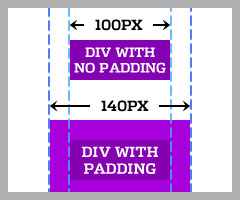 Figure 1. Padding expands the width of HTML elements.
I'll lay out a simple page to demonstrate this further. Imagine trying to lay out two elements, taking up half the page, floating side by side. The HTML code for that might look like this:
<div class="box1"><p>Content for Box 1</p></div>
<div class="box2"><p>Content for Box 2</p></div>
This is the CSS to lay out those elements:
body { margin: 0 }
.box1, .box2 { width: 50%; float:left; }
.box1 { background: green }
.box2 { background: lightblue }
Figure 2 shows what this would like.
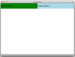 [Click on image for larger view.] Figure 2. A standard box layout without padding.
This works out fine, until you add padding to the elements:
.box1, .box2 { padding: 30px }
Doing that breaks the layout, as shown in Figure 3. Box1 takes up more than 50 percent of the page, so box2 is forced to be on its own line.
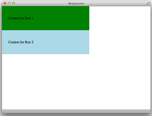 [Click on image for larger view.] Figure 3. The same layout with padding added.
The standard box model is difficult to work with. Luckily, there's a way to change the box model. I recommend you begin every responsive design project using the following CSS code:
* { -moz-box-sizing: border-box; -webkit-box-sizing: border-box; box-sizing: border-box; }
The full code is shown in Listing 1.
Listing 1. CSS code for a new project.
<html>
<head>

  <title>Responsive</title>

</head>
<style>

  * { -moz-box-sizing: border-box; -webkit-box-sizing: border-box; box-sizing: border-box; }
  body { margin: 0;}
  .box1, .box2 { width: 50%; float: left }
  .box1 { background: green; }
  .box2 { background: lightblue; }
  .box1, .box2 { padding: 30px; }

</style>

<body>

  <div class="box1">
    <p>Content for Box 1</p>
  </div>
  <div class="box2">
    <p>Content for Box 2</p>
  </div>

</body>
</html>
By adding this snippet of code you are effectively altering the box model for every element on your Web site, so borders and padding will no longer break your layouts!
Browser Support
The next step after implementing this is to make sure it works on all browsers. Fortunately, the box-sizing property works in Chrome, Firefox and Safari. If you need to support Internet Explorer 6 or 7, there's a polyfill available that will force browsers to recognize the box-sizing property.
For the VSM Web site, I decided not to use a polyfill. Instead, I targeted Internet Explorer 7 in my CSS and changed the widths of the layouts. In a future article, I'll go into detail about how to easily target old browsers without using CSS hacks. The VSM Web site doesn't support Internet Explorer 6 -- sorry!
And then there's IE 9. There's a meta tag used to force IE to render using the latest rendering engine -- if you don't use it, IE 9 will go into compatability mode, causing the border box not to work. Here's that tag (place it in the head):
<meta http-equiv="X-UA-Compatible" content="IE=edge,chrome=1">
You can read more about the box-sizing property on Paul Irish's blog, where I first discovered this approach.
There's so much to cover about responsive design. This entry is just one of many to come. I hope you find it helpful. If you have any questions or suggestions, please leave a comment or e-mail me.
About the Author
Rodrigo Munoz is a senior front-end Web developer for 1105 Media, Inc. He has been building Web sites for more than 13 years, and can be reached at [email protected] or on Twitter at @pixelfuture.