Mobile Corner
How To Use the Windows Phone 8.1 GridView and ListView Controls
If you're used to ListBox or LongListSelector, find out how the GridView and ListView controls for Windows Phone 8.1 can do it better.
- By Nick Randolph
- 07/07/2014
At some point, most applications need to present a list of items. In the pre-Windows Phone 8.1 days, this would've meant using the ListBox or the LongListSelector. But the new world of Windows convergence offers Windows Phone developers access to the GridView and ListView controls. In this article, you'll learn how to use these controls and how you can tailor their layout.
I'll start by creating a new Windows Phone application, based on the Blank App project template. Because I'll primarily be defining the application layout, I'll use Blend for Visual Studio. One of Blend's most powerful features is design-time data, which gives you the ability to preview the application's layout as you're designing it. For this example, I'll create a new sample data set by selecting New Sample Data from the Create Sample Data button at the top of the Data tool window. Selecting the default options will generate a data source called SampleDataSource, which is enabled at both design and runtime, as shown in Figure 1.
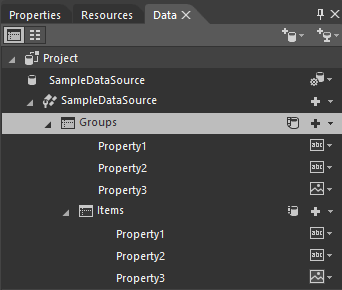 Figure 1. A SampleDataSource in the Data Window
In the past, creating a new sample data set would've created a simple collection of items. The experience for Windows Phone 8.1 is similar to that of building for Windows -- the new sample data set is a collection of grouped items, which makes it ideal for working with groups using either a GridView or ListView controls.
I start the layout by dragging the Groups node from the Data window onto the design surface. This will create a ListView wired up to the sample data set. To get the ListView to fill the screen, I right-click on the ListView and select Layout, Reset All.
The ListView code connects the ItemsSource property to the Groups property of the sample data source. It also sets up an ItemTemplate, which you can think of as the template used to create each item that will appear in the ListView:
<Grid
  DataContext="{Binding Source={StaticResource SampleDataSource}}">
  <ListView
    ItemTemplate="{StaticResource GroupTemplate}"
    ItemsSource="{Binding Groups}" />
</Grid>
The ItemTemplate sets up a basic two-column layout, with an image in the left column and two stacked text elements in the right column, as shown in Listing 1.
Listing 1: Two-Column Layout Set up by ItemTemplate
<DataTemplate x:Key="GroupTemplate">
  <Grid>
    <Grid.ColumnDefinitions>
      <ColumnDefinition Width="Auto" />
      <ColumnDefinition />
    </Grid.ColumnDefinitions>
    <Border Margin="0,9.5,0,0"
      Background="{ThemeResource ListViewItemPlaceholderBackgroundThemeBrush}" >I'
      <Image Source="{Binding Property3}"
        Height="79" Width="79" />
    </Border>
    <StackPanel Grid.Column="1" Margin="14.5,0,0,0">
      <TextBlock Text="{Binding Property1}"
        Style="{ThemeResource ListViewItemTextBlockStyle}" />
      <TextBlock Text="{Binding Property2}"
        Style="{ThemeResource ListViewItemSubheaderTextBlockStyle}" />
    </StackPanel>
  </Grid>
</DataTemplate>
Before moving on, I'm going to create a second page, called SecondPage.xaml, based on the Blank Page template. This page will use the same sample data source, but this time I'm going to connect it to a GridView. If I dragged across the Groups node onto the design surface, I'd just get another ListView. Instead, I'll drag a GridView from the Assets window onto the design surface, resetting the layout again to have it take up the full screen. From the Data window I can then drag across the Groups node onto the GridView to wire up the sample data set. Doing this will also create a default item template defining the layout for each Grid item.
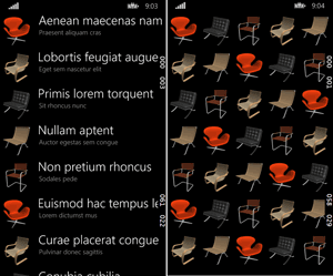
At this point, the GridView layout looks very similar to the ListView in that each item takes up almost a full row (the ItemTemplate created is actually exactly the same as that created for the ListView). I'll adjust the ItemTemplate for the GridView by right-clicking on the GridView and selecting Edit Additional Templates, Edit Generated Items (ItemTemplate), Edit Current. By commenting out the StackPanel in the ItemTemplate, the layout changes dramatically to clearly show a grid of items. Figure 2 illustrates the two pages with a ListView on the left and GridView on the right.
 [Click on image for larger view.]
Figure 2. ListView and GridView Examples
[Click on image for larger view.]
Figure 2. ListView and GridView Examples
As you can see, there's very little difference between the two controls; the main difference is the arrangement of items. In the ListView the items are in a simple vertical list, whereas the GridView wraps its items across and then down the view. This is more obvious in the ItemsPanel template for each control:
<ItemsPanelTemplate x:Key="ListViewItemsPanel">
  <ItemsStackPanel Orientation="Vertical" />
</ItemsPanelTemplate>

<ItemsPanelTemplate x:Key="GridViewItemsPanel">
  <ItemsWrapGrid Orientation="Horizontal" />
</ItemsPanelTemplate>
The main difference between these controls is encapsulated in the ItemsPanel template, with the ListView using an ItemsStackPanel and the GridView using the ItemsWrapGrid. In fact, if you change the ListView to use an ItemsWrapGrid, it'll behave the same as a GridView, and vice-versa -- changing the GridView to use an ItemsStackPanel makes it behave like a ListView. This is because nearly all the logic for these controls resides in the ListViewBase class, from which these two controls inherit. From now on I'll focus on the ListView, because the two controls are relatively interchangeable.
Both ItemsPanel templates have an Orientation attribute that determines the direction items are stacked. In the case of the ItemsStackPanel, items are stacked either vertically or horizontally; the ItemsWrapGrid items stack either vertically or horizontally until the edge of the screen is reached, at which point the next item wraps into the next column or row, respectively. If you change the orientation attribute on either control you'll also need to change the scrolling orientation for the control. In Listing 2, for example, the code for the GridView Orientation of the ItemsWrapGrid has been changed to Vertical, and the scroll orientation set to Horizontal.
Listing 2: GridView and ScrollViewer Orientation Changes
<Page.Resources>
  <ItemsPanelTemplate x:Key="GridViewItemsPanel">
    <ItemsWrapGrid Orientation="Vertical" />
  </ItemsPanelTemplate>
</Page.Resources>

<Grid
  DataContext="{Binding Source={StaticResource SampleDataSource}}">
  <GridView
    ItemTemplate="{StaticResource GroupTemplate}"
    ItemsSource="{Binding Groups}"
    IsSwipeEnabled="False"
    SelectionMode="Single"
    ItemsPanel="{StaticResource GridViewItemsPanel}"
    ScrollViewer.HorizontalScrollMode="Auto"
    ScrollViewer.VerticalScrollMode="Disabled"
    ScrollViewer.HorizontalScrollBarVisibility="Auto"
    ScrollViewer.VerticalScrollBarVisibility="Disabled" />

</Grid>
With this change, the items will wrap down and then across the page, and horizontal scrolling will be enabled. Note that the HorizontalScrollMode and VerticalScrollMode attributes don't appear in the Blend Properties window, but are required if you want to switch the scroll orientation.
Sometimes you might need to present a short list of items in which you don't want the list to scroll. The simplest way to do this is to disable scrolling in both directions, but this does mean your ListView has an unnecessary ScrollViewer element that needs to be rendered. You should always be looking for ways to minimize the visual tree, so I'll take a closer look at the ListView template. In Blend, you can create a copy of the default Template for the ListView by right-clicking on the ListView and selecting Edit Template | Create a Copy.
To disable scrolling, remove the ScrollViewer element that houses the ItemsPresenter in the ListView template. This removes any scrolling and allows items to be presented in a stack. Because the items won't be scrolling, there isn't really any need for the virtualizing capabilities of the ItemsStackPanel, which means in the ItemsPanel template you can also switch this back to the StackPanel control. By doing this, you'll also remove some of the animation behavior applied when items are added and removed from the list.
Notice, however, that when you created the copy of the template for the ListView, it created a copy of the entire default Style for the ListView. This includes a number of default attribute values for the ListView, one of which is the ItemContainerTransitions. This contains an AddDeleteThemeTransition and a ReorderThemeTransition. In some cases, you may want to remove these animations to improve the loading time of your page -- remember, though, that they exist by default to enrich the UX, so only remove them if you're really struggling to boost performance.
Group Display
Now I'll discuss using the GridView and ListView to display groups of data. As mentioned when we created the sample data set, it already created a collection of grouped data. In fact, what we've been displaying so far is actually the group information, not the individual items residing in the groups. The switch to displaying grouped data involves two steps. First, rather than data binding directly to the Groups property on the sample data, I need to add, and data bind to, a CollectionViewSource with the IsSourceGrouped attribute set to true:
<Grid
  DataContext="{Binding Source={StaticResource SampleDataSource}}">
    <Grid.Resources>
    <CollectionViewSource x:Key="GroupedData"
      Source="{Binding Groups}"
      IsSourceGrouped="True" ItemsPath="Items"/>
    </Grid.Resources>
  <ListView
    ItemTemplate="{StaticResource GroupTemplate}"
    ItemsSource="{Binding Source={StaticResource GroupedData}}" />
</Grid>
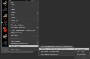
At this point, you'll see that all individual items appear in their groups, but with no clear divider between them. The second part of presenting groups of items is to create a GroupStyle and specify a header template. To do this, right-click on the ListView and select Add GroupStyle. This actually generates too much XAML, most of which is redundant, so switch to split or XAML view and remove both the GroupStyle.ContainerStyle and the GroupStyle.Panel elements. What you should be left with is the GroupStyle.HeaderTemplate, where you can define the group headers layout. Rather than edit the XAML directly, right-click on the ListView and select Edit GroupStyle, Edit Generated Header (HeaderTemplate), Edit Current, as shown in Figure 3.
 [Click on image for larger view.]
Figure 3. Editing the Group HeaderTemplate
[Click on image for larger view.]
Figure 3. Editing the Group HeaderTemplate
When editing the group HeaderTemplate, you can use the Properties window to wire up elements to the sample data. The default HeaderTemplate already contains a TextBlock, so you can either find the Text property for the TextBlock and select the Create DataBinding, or drag one of the data elements from the Data window across onto the TextBlock (you'll need to drag it to the Object and Timeline window, because the TextBlock won't currently be displayed on the screen). It's worth noting that Blend won't refresh the layout property while you're editing the HeaderTemplate, and you might need to close and reopen the page in order to see the new layout.
With the data in groups, the group header now docks to the top of the screen when you scroll the ListView. If you change the orientation to horizontal and the scroll orientation to match, you'll see that the group headers still appear at the top of the screen, but they stay in line with the first item of the group as you scroll. This is clearly more relevant when displaying a grid of items, rather than items in a list.
Jump Lists
Finally, I'll show how to replicate the jump-list style unique to Windows Phone. This allows a user to tap on a group header, see a summary view of the groups and then jump to the point in the list he's after. This is different in Windows Phone 8.1 than in Windows Phone 8.0, which used an alternate jump layout with the LongListSelector. Instead, it's done with a SemanticZoom control, and defining zoomed in and zoomed out views. In the example in Listing 3, the zoomed-in view will be the ListView just created. I'll also define a second ListView, which will only display the group headings.
Listing 3: The ListView Zoomed In
<SemanticZoom>
  <SemanticZoom.ZoomedInView>
    <ListView ItemTemplate="{StaticResource GroupTemplate}"
      ItemsSource="{Binding Source={StaticResource GroupedData}}"
      ItemsPanel="{StaticResource ItemsPanelTemplate1}">
      <ListView.GroupStyle>
        <GroupStyle>
          <GroupStyle.HeaderTemplate>
            <DataTemplate>
               <TextBlock Text="{Binding Property1}" />
            </DataTemplate>
          </GroupStyle.HeaderTemplate>
        </GroupStyle>
      </ListView.GroupStyle>
    </ListView>
  </SemanticZoom.ZoomedInView>
  <SemanticZoom.ZoomedOutView>
    <ListView
      ItemsSource="{Binding CollectionGroups, Source={StaticResource GroupedData}}">
      <ListView.ItemTemplate>
        <DataTemplate>
           <TextBlock Text="{Binding Group.Property1}"
                      Foreground="Black" FontSize="18" />
        </DataTemplate>
      </ListView.ItemTemplate>
    </ListView>
  </SemanticZoom.ZoomedOutView>
</SemanticZoom>
In its current form, when a group header is tapped while in the zoomed-in view, the zoomed-out view will be displayed. The default background of the zoomed-out view is transparent, and as the ItemTemplate doesn't contain a background, I'll be able to see the zoomed-in ListView behind the zoomed-out view.
There are two ways to solve this. The first is to simply add a background to the ItemTemplate. The other is to override the default Style of the SemanticZoom control and set a background on the zoomed-out view. The latter can be done by right-clicking on the SemanticZoom control and selecting Edit Template | Create a Copy. In the template, the core functionality is housed by two ContentPresenter controls. The zoomed out view is displayed over the top of the zoomed-in view using a Popup control. The code in Listing 4 sets the background of the PopupBorder to White:
Listing 4: Setting the PopupBorder Background to White
<ContentPresenter
  x:Name="ZoomedInPresenter"
  Content="{TemplateBinding ZoomedInView}"
  HorizontalAlignment="{TemplateBinding HorizontalContentAlignment}"
  VerticalAlignment="{TemplateBinding VerticalContentAlignment}" />
<Popup
  x:Name="Popup">
  <Popup.ChildTransitions>
    <TransitionCollection>
      <PopupThemeTransition />
    </TransitionCollection>
  </Popup.ChildTransitions>
  <Border
    x:Name="PopupBorder"
    Background="White">
    <ContentPresenter
      x:Name="ZoomedOutPresenter"
      Content="{TemplateBinding ZoomedOutView}"
      HorizontalAlignment="{TemplateBinding HorizontalContentAlignment}"
      VerticalAlignment="{TemplateBinding VerticalContentAlignment}" />
  </Border>
</Popup>
Performance Boost
Each iteration of the Windows Phone platform brings new list controls designed to improve performance while maintaining the core Windows Phone UX. The ListView and GridView provide not only consistency with Windows, but better performance. They're also more flexible to work with, and give developers more control over the way lists of data are presented. Performance is a key aspect of any mobile application, and the correct use of these controls is an important consideration during development.