Cross Platform C#
Building for the iPhone X
Our cross-platform C# specialist turns his attention to the iOS side of things only to demonstrate some programming issues associated with the much-hyped device from Apple, including Face ID, the "notch," Safe Areas, Large Titles and more.
When Apple released the much-anticipated iPhone X on Nov. 3, it generated a surprising amount of interest in a phone that starts at nearly $1,000. Initial delivery dates were four to six weeks out for those who didn't get their initial preorders in. Amid all of the excitement about the new phone, Apple released iOS 11.1 and Xcode 9.1 (followed by the release of 9.2 stable last month). You can now take "full advantage" of the iPhone X. This article will look at what you need to do to leverage this advantage and ensure your apps look right on the iPhone X.
Update to iOS 11
The first step to update an app to support iOS 11 and the iPhone X is to support changes in architecture. The biggest change is the removal of support for 32-bit apps; your apps must be updated to only support 64 bits. This means that when you select Project Options -> iOS Build -> Supported architectures, underneath the iPhone platform, you must select the ARM64 option to support the 64-bit ARM architecture in the iPhone 5s and later.
After you've updated to Xcode 9.1 or 9.2, open the solution/project in Visual Studio for Mac, and select the iPhone X simulator. Select the simulator for the iPhone X as shown in Figure 1.
 Figure 1. Selecting the iPhone X Simulator
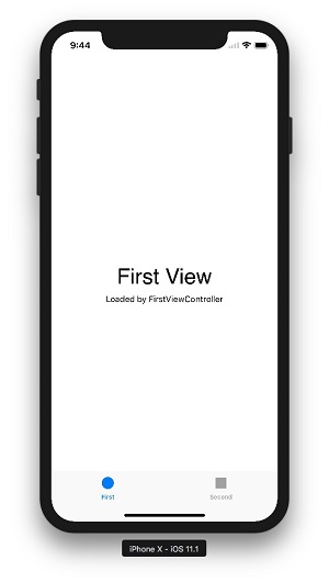
An example tabbed view application is shown in Figure 2. This is a simple tabbed application built with Xamarin.iOS.
 [Click on image for larger view.]
Figure 2. A Simple Tabbed Application Built with Xamarin.iOS
Once your app is up and running, you need to explore it as much as possible within the iPhone X simulator. You'll need to pay attention to the UI of the application, specifically items such as:
- Parts of the UI that aren't using auto layout
- Parts of the UI where content is displayed to the user as full-screen
- The app in landscape mode
For example, if an app isn't displaying properly in full resolution on a device, I've found one common reason for this is likely to be a missing a launch screen storyboard (see Figure 3). Note that for an app to run in the iPhone X full screen display mode, it will need to target iOS 11 and to have either a launch screen storyboard or an iPhone X launch image.
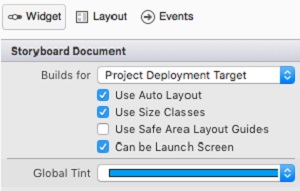 Figure 3. A Missing Launch Screen Storyboard Can Cause Problems
Finally, if an app makes use of Layouts, you probably won't need to do much updating. Apps that need some custom constraints or manual layout techniques are more likely to need to be adjusted. iOS 11 has a new Storyboard layout guide called "Use Safe Area Layout Guides." Selecting this option will constrain content to the area of the screen that's safe for all iPhones.
What about Xamarin.Forms?
Xamarin.Forms is Microsoft's cross-platform UI toolkit. What happens with Xamarin.Forms and the iPhone X?
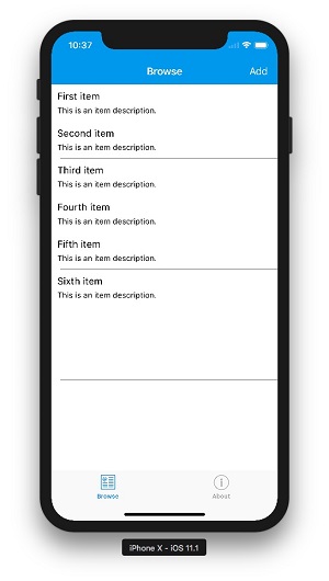
- If an app doesn't do anything "crazy" regarding the UI, then there's a good possibility it will work. If there is something crazy going on, you might find some issues – it all depends on the app. Figure 4 shows an app running in portrait mode on the iPhone X simulator.
 [Click on image for larger view.]
Figure 4. An App Running in Portrait Mode on the iPhone X Simulator
- Xamarin.Forms has support for the iPhoneX, but you need to verify that you're on the most recent version of Xamarin.Forms to leverage this support.
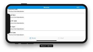
- One issue that I have personally found is running an Xamarin.Forms app in landscape mode. Items near the "notch" may be obscured because the app is assuming that the entire width of the screen is available. Figure 5 shows the potential issue when an app runs in landscape mode.
 [Click on image for larger view.]
Figure 5.A Xamarin.Forms Listview with No Support for the Safe Areas. You Definitely Don't Want to Have Your Users See This.
How do you solve this? With Xamarin.Forms, there are two properties that can probably help you out:
-
Specific support for Safe Areas. When you initialize a page, in the constructor, specify:
On().SetUseSafeArea(true);
This call will override the padding values that any code may apply so that the content is not hidden by the "notch." This may also be applied by applying the ios attribute to a content page's XAML:
<ContentPage xmlns="http://xamarin.com/schemas/2014/forms" xmlns:x="http://schemas.microsoft.com/winfx/2009/xaml" xmlns:ios="clr-namespace:Xamarin.Forms.PlatformConfiguration.iOSSpecific;assembly=Xamarin.Forms.Core" ios:Page.UseSafeArea="true">
- If finer control over the safe areas is needed, the defaults can be changed in code, and the padding on the views can be updated to meet more specific needs:
protected override void OnAppearing()
{
  base.OnAppearing();

  var safeInsets  = On().SafeAreaInsets();
  safeInsets.Left = 24;
  this.Padding = safeInsets;
}
- Padding. The Padding attribute on a layout sets the amount of padding to use on the left, right, top and bottom of a layout, which can be helpful to solve design problems. In this example, in the horizontal layout, an app can determine an orientation change. On the orientation change, if the app is in landscape more, it can add some appropriate amount of left padding to a layout.
- Margin. The Margin attribute is set on a control. The control sets an amount of spacing between a specified control and another control. Depending on the situation, this can also be valuable in addressing design issues.
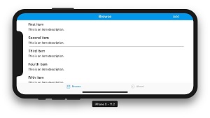
Figure 6 shows a Xamarin.Forms ListView with support for the safe areas.
 [Click on image for larger view.]
Figure 6. A Xamarin.Forms ListView with Support for Safe Areas
Safe Areas
To review, Apple has defined Safe Areas -- areas within all iPhones where content should be "safe" to be displayed. Make sure the app displays properly in both the landscape and portrait modes on the iPhone. You'll need to take care that content doesn't go into the corners or block the home button slider on the bottom of the screen.
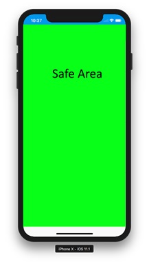 Figure 7. Safe Areas Show Where to Safely Place Content
Large Titles
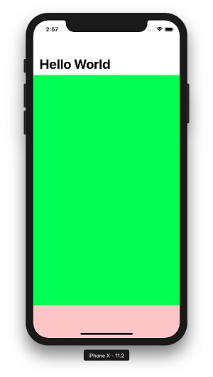
Large Titles are new and used in iOS 11 to provide a larger display of the titles displayed in the Navigation bar. When large titles are displayed, they appear in the nav bar as larger and left aligned.
They can be set by one of two ways in the constructor of a content page.
Here's one way:
On<Xamarin.Forms.PlatformConfiguration.iOS>().SetPrefersLargeTitles(true);
This command will determine if the running device is an iOS device, and, if so, it will apply the large titles to the device.
Another option with the same command is to call:
On<Xamarin.Forms.PlatformConfiguration.iOS>().SetLargeTitleDisplay(LargeTitleDisplayMode.Automatic);
The LargeTitleDisplayMode is an enum within the Xamarin.Forms.PlatformConfiguration namespace. It has the possible values of Always, Automatic and Never. The default is Automatic. Automatic means that the behavior is inherited from the previous page in the navigation stack.
Figure 8 shows the use of Large Titles in iOS 11
 [Click on image for larger view.]
Figure 8. Showing Large Titles in iOS 11
There are several items of note regarding the large titles that should be shared:
- The namespaces that will need to be included are:
- using Xamarin.Forms.PlatformConfiguration;
- using Xamarin.Forms.PlatformConfiguration.iOSSpecific;
- There will be some naming collisions between Xamarin.Forms and the previous included namespaces. You'll need to add an alias or use the fully qualified names for a class.
- The implementation of Large Titles on iOS is a bit confusing and not well documented. It appears to need a scrollable container in the view.
- Large Titles require a view controller within a UINavigationController. In Xamarin.Forms, this means that a ContentPage must be within a NavigationPage.
What About Xamarin.iOS?
The rules for Large Titles are similar in Xamarin.iOS as they are in Xamarin.Forms. The differences are in:
- The names of the members to set. The names are similar, so it should not be too difficult to spot the changes:
- NavigationBar.PrefersLargeTitles = true;
- NavigationItem.LargeTitleDisplayMode = UINavigationItemLargeTitleDisplayMode.Always;
- The methods where the members are set are a little different. For example, the ViewDidLoad method will be where the methods from OnAppearing are performed.
Usage of Large Titles are dependent on the specific app. A common usage by Apple is to assign Large Titles in the high level of an app. Lower-level navigation controllers will have a regular size title. These settings may be set using the previously mentioned options.
Support the Updated Resolutions
The iPhone X has a slightly different display size than the previous iPhones. We as developers have had to deal with the 3.5-inch iPhone, the 4-inch iPhone 5 family, the iPhone 6, the iPhone 6+, and now we have the iPhone X resolutions. Please be aware that any time a program does display calculations based on the screen size, this is an opportunity for a problem. The resolution on the iPhone X is similar to the 4.7-inch iPhone. The X is the same width as the base iPhone when in portrait mode and 145 pixels taller. You should check the images and the screen content, as well as videos, in both portrait and landscape mode.
Updated for Face ID
There are a number of apps that use Touch ID. Touch ID works well and has been around since the iPhone 5s. With the iPhone X, Touch ID has been replaced with Face ID. In the first couple days that my father had his iPhone X, he really loved just playing around with Face ID by itself. Some apps will have embedded strings that allow for using Touch ID. These will need to be updated to properly be used by Face ID.
Wrapping Up
The iPhone X is here. Customers have it. Developers need to be familiar with potential issues when targeting it. Some early issues I've discovered primarily revolve around the layout of content and dealing with the safe areas of the phone. Good luck!
More Resources
About the Author
Wallace (Wally) B. McClure has authored books on iPhone programming with Mono/Monotouch, Android programming with Mono for Android, application architecture, ADO.NET, SQL Server and AJAX. He's a Microsoft MVP, an ASPInsider and a partner at Scalable Development Inc. He maintains a blog, and can be followed on Twitter.