Mobile Corner
Working with ListBoxes in a Windows Phone Application
By overriding templates, you can modify the look and feel of the ListBox without changing the underlying behavior.
- By Nick Randolph
- 04/01/2012
Most Windows Phone applications need to present a list of items to the user at some point.
If you look through the six hubs that form part of the core Windows Phone experience, you'll notice a number of lists, each one presented a bit differently. For example, in the People hub, there's the "what's new" pane, which is a vertical list of recent activities, and the "recent" pane, which is a horizontal array of tiles representing an individual contact.
If you want to present lists within your Windows Phone application, then you'll need to master using the ListBox control. In this article I'll walk you through getting started with the ListBox, and then move on to some of the more advanced techniques.
Adjusting the Layout
Figure 1 illustrates four different ListBox applications. Figure 1 (A) illustrates a ListBox in which the list of items is hardcoded into the XAML, as shown in the following code:
<ListBox x:Name="ContactListBox" >
  <sys:String>Item 1</sys:String>
  <sys:String>Item 2</sys:String>
  <sys:String>Item 3</sys:String>
  <sys:String>Item 4</sys:String>
  <sys:String>Item 30</sys:String>
</ListBox>
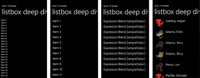
[Click on image for larger view.] |
| Figure 1. The items in the ListBox can be hardcoded in XAML (A), dynamically loaded with Style and Margin (B), represented as a string by default (C) or arranged in Grid with an Image column and a TextBlock column (D). |
Each item is added to the ListBox using a default ListBoxItem, which creates a TextBlock containing the string representation of the item. In this case, each item is a string, so it isn't far from what I want.
I'll come back to how you handle different types of ListBox items in a minute. First, I'll look at how to adjust the layout of the items in the ListBox. To do this, you need to modify the ItemTemplate for the ListBox. You can think of the ItemTemplate as a cookie cutter that's used to determine the layout, or presentation, of each item in the List. Microsoft Expression Blend provides a nice design-time experience for modifying the ItemTemplate, which makes working with the ListBox control much easier.
In this case, I want to override the default layout. To do this, you go to the Objects and Timeline window in Expression Blend, right-click the ListBox and select Edit Additional Templates, then Edit Generated Items (ItemTemplate), and Create Empty. Give the new template a name, ListBoxItemTemplate, and specify where in the application the template will be defined. This will create a new DataTemplate that contains a Grid. Select the Grid, and then in the Assets window, locate the TextBlock control. Double-click on it to add a TextBlock to the Grid.
At this point, you'll notice that the text "TextBlock" is repeated down the list. To correct the text that's displayed within each TextBlock, you'll need to change the Text property so that it's data-bound to the current data context. In the case of controls within a ListBox item template, the data context is, of course, the item within the list. Your ListBox XAML should look similar to the code in Listing 1. You'll also notice that a Style and Margin have been added to the TextBlock, as shown in Figure 1 (B).
Next, I'm going to change the contents of the ListBox so that the data is loaded dynamically at runtime, rather than hardcoded in the XAML. In this case, I'm using design-time data generated by Expression Blend, but you can use any collection or list of data loaded within your application. Each item in the list is a Contact with a properties Name and ImageUrl.
The following code illustrates the structure of the Contact class as it assigns the list of contacts to the ItemsSource property on the ListBox:
namespaceExpression.Blend.SampleData.ContactSampleData{
  public class Contact{
    public string Name {get; set; }
    public string ImageUrl {get; set;}
  }
}

voidMainPage_Loaded(object sender, RoutedEventArgs e) {
  var data = new ContactSampleData();
  ContactListBox.ItemsSource = data.Contacts;
}
At this point, if you run the application, you'll notice that all you see is a ListBox full of the type name of the Contact class, as shown in Figure 1 (C). By default the ListBox attempts to present the string representation of the item.
You can control how a Contact appears in the ListBox in different ways. If you simply want to display information about the Contact in a single TextBlock (for instance, use the ItemTemplate you currently have defined), you can either override the ToString method on the Contact class, or set the DisplayMemberPath attribute on the ListBox to the property that you want displayed. For example, setting the attribute to "Name" will display the Name of each Contact.
In most cases, you'll want more control over how each Contact is presented. For example, you might want to display both the image of the Contact (using the ImageUrl property) and the name of the Contact. The following XAML replaces the ListBoxItemTemplate used earlier with an ItemTemplate that's made up of a Grid containing an Image, in the first column, and a TextBlock, in the second column:
<DataTemplate x:Key="ListBoxItemTemplate">
  <Grid Margin="12,0,0,12">
    <Grid.ColumnDefinitions>
      <ColumnDefinition Width="Auto" />
      <ColumnDefinition />
    </Grid.ColumnDefinitions>
    <Image  Width="100" Height="100" Source="{Binding ImageUrl}"/>
    <TextBlock Grid.Column="1" Text="{Binding Name}"
                                  Style="{StaticResource PhoneTextLargeStyle}" />
  </Grid>
</DataTemplate>
Note that the Text attribute of the TextBlock has changed from {Binding} to {Binding Name}, which tells the data-binding engine to use the Name property of the current data context (for instance, the Name property of the Contact being displayed). The Source property of the Image control is similarly data bound to the ImageUrl property. This will result in the layout shown in Figure 1 (D).
Deeper Dive into ListBox
Now that you've had a quick overview, it's time to take a look at some of the more advanced aspects of the ListBox. I'll start by looking at what happens when you set a background color on the list items. In the ListBoxItemTemplate, add the following attribute value to the Grid: Background="{StaticResource-PhoneInactiveBrush}". In this case, as shown in Figure 2 (A), none of the list items stretches the width of the ListBox.
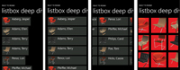
[Click on image for larger view.] |
| Figure 2. You can modify various templates; for example, change Left (A) to Stretch (B), or use Silverlight Toolkit controls such as WrapPanel (C) and HubTile (D) to modify the look of the ListBox. |
You might think that this could easily be solved by setting the HorizontalContentAlignment property on the ListBox to Stretch. That's not the case. You have to override the default ItemContainerStyle. Unlike the ItemTemplate, which was used earlier to define the layout of each list item using a DataTemplate, the ItemContainerStyle is, as the name suggests, a Style. This means it's comprised of a number of setters for properties such as the Background, Padding, Border and Template.
Right-click on the ListBox and select Edit Additional Templates, then select Edit Generated Item Container (ItemContainerStyle) and click on Edit a Copy. The Style that's added to your project includes a Setter for Template, and its Value is a ContentTemplate. You can modify the ContentTemplate if, for example, you want to add a Border to each item in the list, or remove the default behavior that changes the foreground color of the selected item. You can also change the default HorizontalContentAlignment from Left to Stretch, as shown in the following code:
<Style x:Key="FullWidthListBoxItemStyle" TargetType="ListBoxItem">
  <Setter Property="HorizontalContentAlignment" Value="Stretch"/>
  <!--  other property setters -->
</Style>
This will extend the background of the list items to the full width of the ListBox, as shown in Figure 2 (B).
In some cases, you may not want to present the list of items in a vertical list. Take, for example, the "recent" pane of the People hub. This is a 4x2 horizontal array of tiles that represent your recent contacts. You can present a similar interface within your application by overriding the default ItemsPanelTemplate. The ItemsPanelTemplate determines how each list item is arranged relative to the other items in the list. By default, the layout of a ListBox uses a virtual- ized StackPanel, which makes it very efficient for long lists of items. This can be overridden by right-clicking on the ListBox and selecting Edit Additional Templates, then Edit Layout of Items (ItemsPanel), and Create Empty. Again, this doesn't actually create an empty ItemsPanelTemplate; instead it includes a StackPanel by default.
UI Controls in the Silverlight Toolkit
In this case, I'm going to replace the StackPanel with a WrapPanel, found in the Silverlight Toolkit for Windows Phone. I want the list to extend sideways, so I change the default Orientation of the WrapPanel from Horizontal to Vertical. This will mean that items are initially listed vertically until the bottom of the control is reached, then a new column is started, progressing from left to right.
Finally, the default behavior of the ListBox itself is for the horizontal scrollbar to be disabled and for the vertical scrollbar to be automatic. This needs to be reversed by setting the HorizontalScrollbarVisibility to Auto and the VerticalScrollbarVisibility to Disabled. After doing this, you should see a layout similar to the one shown in Figure 2 (C).
At this point, I'll make a small change to the ItemsTemplate to change the layout of the list items to use the HubTile control found in the Silverlight Toolkit:
<DataTemplate x:Key="ListBoxItemTemplate">
  <toolkit:HubTile Notification="{Binding Name}" Source="{Binding ImageUrl}"
                    Margin="{StaticResource PhoneMargin}" />
</DataTemplate>
HubTile is a great control that makes building arrays of tiles within your application easy. It also includes animation similar to what a user sees on the Start screen of their device. Figure 2 (D) illustrates the use of HubTile within the ListBox.
Before I leave the ListBox, there are a couple of additional points worth noting. First, if you're familiar with the behavior of the core Windows Phone experience, you'll notice that when you tap an item in a list there's a slight visual augmentation, or tilt, followed by an action, typically navigation to a new page. When the user returns to the list, typically via the back button, there's no item selected in the list. The user can tap on the same item to interact with it again.
Unfortunately, the default behavior of the list does almost the reverse. There's no tilt when the user taps an item. The ListBox changes the foreground color of the selected item and retains the selection when the user returns to the page. This prevents the user from reselecting that item. The steps to fix this problem are relatively straightforward:
Add the following attribute to the ListBox (alternatively you can add it to the ItemsTemplate): toolkit:TiltEffect.IsTiltEnabled="True".
Add an event handler to the SelectionChanged event on the ListBox and determine the selected item. Once the selected item has been retrieved, set the SelectedIndex to -1. This will reset the selected item on the list.
To prevent an iterative loop from occurring, make sure that you do a null check on the selected item:
private void ListSelectionChanged(object sender, SelectionChangedEventArgs e){
var selectedItem = (sender as ListBox).SelectedItem;
if (selectedItem == null) return;
  (sender as ListBox).SelectedIndex = -1;
  // Do action with selectedItem ...
}
In this article, I've covered a number of steps on how to use the ListBox control to present lists of items within your Windows Phone application. The ListBox is one of the most versatile and powerful controls. By overriding the various templates, you can completely change the look and feel of the control without changing the underlying behavior of the ListBox.
About the Author
Nick Randolph runs Built to Roam, a consulting company that specializes in training, mentoring and assisting other companies build mobile applications. With a heritage in rich client applications for both the desktop and a variety of mobile platforms, Nick currently presents, writes and educates on the Windows Phone platform.