Mono for Android
Xamarin Designer for Android
The latest version of Mono for Android includes a long-awaited design surface. Learn how it works.
It's interesting to look at the needs of various segments of developers. When I first start looking at an environment, the first thing I need to understand is the UI. I'm not magically born with some knowledge about the environment and don't learn well by just reading, so I need some help in getting started. I found this was true when I started Windows based development in the early 1990s, Dynamic Web in the late 1990s, ASP.NET in 2000, Silverlight/WPF, iPhone and Android.
I find that getting up to speed with a UI is the single biggest deterrent for someone learning a platform. I find that as a beginner I need the features provided by a design surface. It's only as I grow and become comfortable with a platform that I find that building a UI by hand is more productive. Even as I get more advanced, I still can learn from a designer, so it has value as I grow into a platform.
A few years ago, I started working with Android. I stepped into it thinking that there were design surfaces I could work with. Unfortunately, I found that there was no design surface when I started. Eventually, I found DroidDraw. Then a designer was integrated into the Eclipse. Unfortunately, Mono for Android 1.0 initially shipped without a designer.

[Click on image for larger view.] |
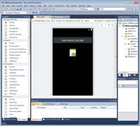
| Figure 1. The Xamarin Designer for Android, as it appears in Visual Studio. |
The .axml support in IntelliSense was a great help for advanced users, but non-advanced users had problems knowing where to start. Unless you knew to work with an EditText control, you could easily get lost trying to find a TextBox (I had this problem on day one). Thankfully, all was not lost; Android's UI layout language is based on XML. This allows UI definitions to be transferred between DroidDraw, Eclipse and other Android development tools.
Given the initial goal of getting Mono for Android working, supporting all Android features and supporting the various Android versions, the lack of a designer is understandable. On May 14, Xamarin announced Mono for Android 4.2. Among the many new features of this version is a design surface. Let's look at the Xamarin Designer for Android.
After installing Mono for Android 4.2, open up a layout file, and you'll see something similar to Figure 1. This is the Xamarin Designer for Android, running in Visual Studio 2010. Notice the graphical design surface in the middle of the screen, and the toolbox on the left-hand side.
The toolbox contains a set of controls grouped together logically, as shown in Figure 2. You may notice that some controls have multiple versions. These controls will sometimes differ only by an attribute. For example, there's a LinearLayout with horizontal and vertical attributes.

[Click on image for larger view.] |
| Figure 2. Control groups in the Designer. |
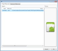
On the lower right hand side of the screen are the property pages familiar to every .NET developer. The property page of a control allows you to change various parameters, but also goes one step further. For instance, with an ImageView, I can select the drawable objects included in a project, as shown in Figure 3.

[Click on image for larger view.] |
| Figure 3. ImageView in the Designer. |
One of the interesting features is the Document Outline. The Document Outline doesn't display automatically. In Visual Studio, go to View/Other Windows/Document Outline. This will bring up the display shown in Figure 4.
The Document Outline displays the hierarchy of a layout. Controls can be selected, copied, pasted or drag-and-dropped. This is a design time view of the layout. While not a perfect indicator, it does give a developer a feeling for how hierarchical a layout is. In Android, the more hierarchical a layout is, the slower the layout typically is, making the Document Outline a valuable tool.

[Click on image for larger view.] |
| Figure 4. The Document Outline, displaying layouthierarchy. |
Resources
The concept of resources is a common concept in many platforms, but Android has a different set of resources than .NET developers are familiar with. To help speed the learning curve, the designer integrates with these resources.
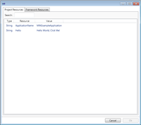
Figure 5 demonstrates how easy it is to edit and add to resources.

[Click on image for larger view.] |
| Figure 5. Editing and adding resources is simple. |
For example, a developer can select the text in a button, change the text, and have that text updated in the resources.
This round-trip support in Android Resources is a powerful force to help developers use resources as a best practice. Figure 6 shows how easy it is to select an existing resource in your application, by selecting an existing resource in the popup. This was generated via the property page, by clicking the button to input a hint.

[Click on image for larger view.] |
| Figure 6. Resources can also be chosen via popups like this one. |
Resource Qualifiers
Applications look differently, depending on the device. An application running on a 4-inch Android 2.2 device in portrait mode will look different than the exact same application running on a 10-inch Android 4 device in landscape mode. Applications running in an English language system will look different from a Spanish language system (assuming that the application has been localized).
The Xamarin designer supports this variety. When a layout's loaded into the designer, there's a row across the top of the designer that contains a series of options for viewing the layout. The options that developers have for selecting the display output include:
- Device. This is the general size and device configuration.
- Device Configuration. This is typically the orientation of the device; however, other configurations are possible beyond portrait and landscape.
- Android Version. This is the version of Android used to render the application.
- Language/Region. This is the language and region for the designer's display.
- Theme. This is the UI theme used for the application's display. Note that the visual theme can be changed.
- There are other resource qualifiers within the designer.
We Don't Need No Stinkin' Designer
There's always been debate about the value of a designer. With apologies to my disagreeing friends, there
is value in making development easy. The designer provides a number of advantages, including:
- Beginners can easily get started building a UI.
- Advanced users can learn new things. I used the designer on an existing project and immediately added some new features.
- There's less need to compile, deploy, and run to review the UI. The designer gives you immediate feedback.
I've found that the Xamarin Designer helps out beginning and advanced developers.
Platforms
.NET developers naturally want to know how Xamarin Designer works with Visual Studio. The good news is that works very well. And thankfully, the designer works on other platforms, including MonoDevelop 3.0 for Windows and MonoDevelop 3.0 for the Mac. This means you have access to the designer whether you're running Windows or Mac. Of course, there may be slight differences between features exposed in the various platforms. If there are differences, I'd expect Xamarin to resolve these, given its rapid release schedules and automated update tools.
If you've been wondering about Android, the shipment of the Xamarin Designer removes the final roadblock. I'm sure there will be speed bumps in the future, but the road is smoothing out considerably.
(I recently did a webinar on the Xamarin Designer. Developers can view the webinar through my blog).
About the Author
Wallace (Wally) B. McClure has authored books on iPhone programming with Mono/Monotouch, Android programming with Mono for Android, application architecture, ADO.NET, SQL Server and AJAX. He's a Microsoft MVP, an ASPInsider and a partner at Scalable Development Inc. He maintains a blog, and can be followed on Twitter.