In-Depth
VSM Goes Responsive, Part 2: Media Queries Explained
CSS3 media queries are the key to making responsive design work.
- By Rodrigo Munoz
- 04/01/2013
In Part 1 of "VSM Goes Responsive," I covered how you can change the box model to help make responsive design layout easier. Now it's time to explore CSS3 media queries and see how they're used in CSS to lay out a responsive site.
CSS3 Media Queries Basics
CSS3 media queries are the key to making responsive design work. With a media query you can identify the size of a browser window and apply corresponding style rules if the media query is true. I'll start with a very simple code example to demonstrate how media queries work.
Listing 1. Changing background color with media queries.
<!doctype html>
<html lang="en">
<head>
  <meta charset="UTF-8">
  <meta http-equiv="X-UA-Compatible" content="IE=edge,chrome=1">
  <title>Responsive Design Rocks!</title>
  <style>
  body { margin: 0;}
  h1 { text-align: center; color: white; }
  @media(min-width: 300px) {
    html { background: red; }
  }
  @media(min-width: 600px) {
    html { background: blue; }
  }
  @media(min-width: 900px) {
    html { background: green; }
  }
  </style>
</head>
<body>
  <div class="wrapper">
    <h1>Resize me.</h1>
  </div>
</body>
</html>
The HTML page shown in Listing 1 will have a different background color depending on the size of the browser window. If the window size is at least 300 pixels wide the background is red. Enlarge the window to at least 600 pixels wide and it becomes blue. Keep it up until you reach 900 pixels wide and it changes to green. Sweet!
Media queries can also check for the maximum width of a device's viewport. For example, if you wanted to target an iPhone 4 device, you would write the following CSS media query:
@media (max-device-width: 480px) {
  // iPhone CSS code goes here
    .wrapper {
      width: 480px;
  }
}
As you can see, media queries are easy to use and can be very useful. There are many other things media queries can check, such as orientation, device height and color. For a comprehensive list of features, have a look at this excellent article from the Mozilla Developer Network.
Mobile-First Approach
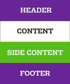
Now that I've gone over the basics, I'll talk about how media queries were implemented on VisualStudioMagazine.com. I decided to go with a mobile-first approach, which means on my CSS file I first applied styling for how the Web site will look on a mobile device. The Web site on a mobile device is laid out into one column (see Figure 1).
 Figure 1. The mobile layout.
During this first step no media queries were required. I simply laid out the site as it would appear on a mobile site. The header, content, side content and footer have no width declared so that they stretch out to fill the viewport of any device.
Tablet View and More
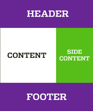
After completing the CSS layout for the mobile view, I laid out the page for the tablet view. I didn't target any specific tablet (such as iPad or Nexus) -- I just resized the browser window and felt that at 635 pixels it was necessary to change the layout to a two-column layout. For a view of the layout, see Figure 2.
 Figure 2. The table layout.
To make sure the content and side content scaled, I used percentages for widths. Here are a few code snippets I used on VisualStudioMagazine.com:
@media (min-width: 635px) {
  .pContent {
    float: left;
    width: 65.523809524%;
  }
  .sContent {
    float: right;
    width: 34.476190476%;
  }
}
Now I have my tablet view -- so what's next? The content and side content scale, but I wanted to make sure the size of the Web site didn't exceed 1,068 pixels. To do that I simply declared a maximum width to the header, footer and parent container of the content and side content. The full code for this layout is shown in Listing 2.
Listing 2. Declaring maximum widths for containers.
<!doctype html>
<html lang="en">
<head>
  <meta charset="UTF-8">
  <meta http-equiv="X-UA-Compatible" content="IE=edge,chrome=1">
  <title>Responsive Design Rocks!</title>
  <style>
  * { -moz-box-sizing: border-box; -webkit-box-sizing: border-box; box-sizing: border-box; }
  html { background: #ccc; }
  body { margin: 0; color: #fff;}
  header, footer, .pContent, .sContent { text-align: center; display: block; font-family:
    sans-serif; padding: 40px; }
  header, footer, #main { max-width: 1068px; margin: 0 auto; }
  header, footer { background: #691D95; }
  .pContent { background: #fff; color: #333; }
  .sContent { background: #53BF00; }
  @media(min-width: 635px) {
    .pContent {
      float: left;
      width: 65.523809524%;
    }
    .sContent {
      float: right;
      width: 34.476190476%;
    }
    #main { overflow: hidden; }
  }
  </style>
</head>
<body>
  <header>
    HEADER
  </header>
  <div id="main">
    <div class="pContent">
      CONTENT
    </div>
    <div class="sContent">
      SIDE CONTENT
    </div>
  </div>
  <footer>
    FOOTER
  </footer>
</body>
</html>
Browser Support
CSS3 media queries are supported by just about every major browser except Internet Explorer 6, 7 and 8 -- but there's no need to worry, because there's a polyfill for that. Respond.js is a tiny JavaScript file that automatically checks whether the browser supports media queries, and adds the functionality if it's missing.
If you're not using media queries in your design, consider adding them; you'll be surprised how much they can do to make your site more mobile. Be on the lookout for the next article in this series, where I'll cover more about how the VSM site went responsive.
About the Author
Rodrigo Munoz is a senior front-end Web developer for 1105 Media, Inc. He has been building Web sites for more than 13 years, and can be reached at [email protected] or on Twitter at @pixelfuture.