Cross Platform C#
Styling Xamarin.Forms Apps with CSS
- By Greg Shackles
- 05/29/2018
Some months ago a feature landed in Xamarin.Forms that seemed to truly polarize the Xamarin.Forms community: support for styling applications using CSS. Some argued that it was an unnecessary introduction to "Web" technology to the native development experience, and others that it simply isn't the right solution to the problem.
While I sympathize with the latter opinion and think there's plenty of room for some good debate on the right path forward, I count myself as part of a third camp: I think that CSS is a powerful (and frequently maligned) solution to the problem of styling native mobile applications.
In Defense of CSS
I've long lamented the traditional approaches to styling mobile applications, especially in trying to do so across multiple platforms. Android has a decent theming system, but it gets messy pretty quickly. iOS has the UIAppearance APIs, but they tend to fall far short of allowing you to truly centralize an app's styling. Styling Windows applications via XAML has always managed to feel foreign to me.
I'll also admit that in addition to mobile development I've also been a big fan of Web development for a long time, so CSS is something I'm quite familiar with. It's not without its problems, of course, but it's also important to remember to draw the distinction between the language and the platforms. Many of the Web's problems historically have stemmed from inconsistent browser support and the need for workarounds, which manifests itself in CSS but isn't the fault of CSS.
If you're a XAML developer coming from WPF or UWP, you already know that XAML in Xamarin.Forms -- while still XAML -- is not exactly the same as you remember from those platforms. I encourage you to approach thinking about CSS in much the same way. At its core, CSS is an expressive, centralized and productive way to define an application's styles.
Rather than continuing to make the theoretical argument, let's take a look at what this looks like in an actual application!
Creating the App
CSS support in Xamarin.Forms was introduced in version 3.0, which shipped on May 7. I'll start from scratch to show how easy it is to start styling Xamarin.Forms apps with CSS. Start out by creating a new Xamarin.Forms application using the Blank Forms App template, naming it CSSDemo.
Next, open the generated CSSDemoPage.xaml file and replace its contents with:
<?xml version="1.0" encoding="utf-8"?>
<ContentPage xmlns="http://xamarin.com/schemas/2014/forms"
             xmlns:x="http://schemas.microsoft.com/winfx/2009/xaml"
             xmlns:local="clr-namespace:CSSDemo"
             x:Class="CSSDemo.CSSDemoPage">
    <StackLayout>
        <Label Text="Welcome to CSS!"  />

        <StackLayout>

            <Entry Placeholder="Email Address" />
            <Entry Placeholder="Password" IsPassword="true" />

            <Button Text="Login" />
            <Button Text="Forgot Password?" />

        </StackLayout>
    </StackLayout>
</ContentPage>
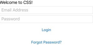
Here I create a basic login form, with fields for e-mail and password and buttons for logging in and starting a forgot password flow. Obviously there's no styling here, so spinning up the app now isn't going to look particularly appealing (see Figure 1).
 [Click on image for larger view.]
Figure 1. The Unstyled Login Screen
Normally this is when you would start adding styles directly to your XAML, but in this case I'm going to approach this more like a Web developer would. Bear with me!
Adding the Style Sheet
First, I'll create a style sheet that will contain all of the app's styles. Add a new CSS file to the project named Styles.css (see Figure 2).
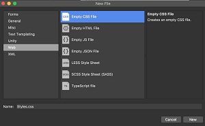 [Click on image for larger view.]Figure 2. Adding a CSS File to the Project
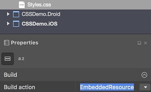
Once that is added, make sure to set its build action to EmbeddedResource so that it gets added properly to the project (see Figure 3).
 [Click on image for larger view.]
Figure 3. Setting the Build Action for the Style Sheet
Finally, I'll just add a directive to the XAML page to pull in the CSS file:
<ContentPage.Resources>
    <StyleSheet Source="Styles.css" />
</ContentPage.Resources>
Styling the App
Now that there's a style sheet, it's time to start styling!
If you're familiar with CSS already, then the Xamarin.Forms flavor of CSS will feel quite familiar. There are some differences, though, including the addition of syntax to allow for targeting object types in Xamarin.Forms directly using a ^:
^ContentPage {
    background-color: #B9BAA3;
    padding: 15;
}
Just by adding these few lines, any page that inherits from ContentPage will automatically get this background color and padding. It's defined in one place and is easily shared across an entire application.
Next I'll go ahead and style the label to look a little nicer:
^Label {
    text-align: center;
    font-style: bold;
    font-size: 30;
    color: #A22C29;
}
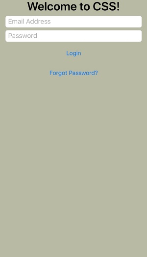
You might also notice that the properties here are deliberately aligned with what CSS exposes on the Web, making it easy to get started applying any CSS skills you might have to your native applications. Without making any changes to the XAML the label will now be bold, centered, in a larger font, and in a different color(see Figure 4).
 [Click on image for larger view.]
Figure 4. Some Initial Styling
This looks a little bit better, but it's still not that visually appealing. We can do better! If you've used CSS before, you're already likely familiar with the ability to assign identifiers to elements and target them directly in your styles. That's exactly what I'll do here, assigning an identifier to the container around the form:
<StackLayout StyleId="LoginForm">
That allows this element to be targeted in CSS:
#LoginForm {
    background-color: #D6D5C9;
    padding: 15;
    border-radius: 5;
    margin-top: 20
}
This creates some separation between the background and the form, but the entry and button elements are still a bit mundane. First, I'll apply a new base style to all entry elements:
^Entry {
    font-size: 30;
    background-color: white;
    margin: 10 0;
    color: #0A100D;
}
I'll also create a new base style for all buttons:
^Button {
    font-size: 16;
    color: #A22C29;
    margin: 5 0;
}
Now all entry elements will be larger with a small top margin, and buttons will have a different color and a small top margin of their own. That's a good start, but I'd also like to create a distinction between the login action, the primary action on the screen, and the forgot password action.
To do this, I'll introduce a new style for primary buttons, which should also feel familiar if you've worked with CSS before. To do this, I'll simply add an attribute to the login button:
<Button Text="Login" StyleClass="primary" />
Then I can target that in CSS as an extension to the base button style:
^Button.primary {
    background-color: #902923;
    color: #FFFFFF;
    font-size: 20;
    margin: 15 0;
}
Primary buttons will have a different background and foreground color, font size, and a larger margin. This will make them visually distinct from other buttons in the UI. With this new style applied, the UI will now look like Figure 5.
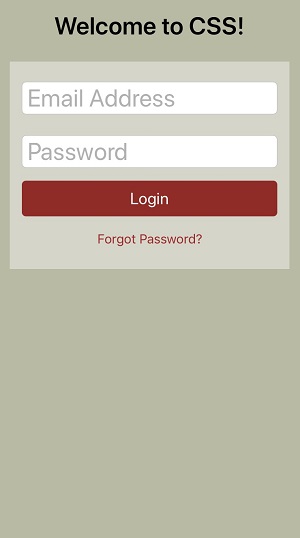 [Click on image for larger view.] Figure 5. A Styled Login Form
Summary
There are many different approaches to styling a Xamarin.Forms application, and this is by no means meant to contend that using CSS is the only (or even best) way to do so. That said, you can see here that the application's XAML code was able to stay lean and free of any style directives, and a few lines of CSS were able to transform that raw markup into a very different visual experience.
Just because CSS is most associated with Web programming, and thus associated with all the woes that accompany that, don't let it stop you from appreciating its power in being able to easily express the visual representations you're seeking in your applications. Maybe CSS is the missing link you were looking for, or maybe it's not, but I encourage you to check it out and see if it helps!