Just yesterday, Microsoft's James Montemagno hosted David Ortinau, Xamarin.Forms program manager, for a presentation titled "4 Awesome Things in Xamarin.Forms 4.0." Earlier in the month, Montemagno and Matt Soucoup discussed Xamarin.Forms 4.0 in the Xamarin podcast with a presentation titled "Xamarin.Forms 4 -- Who Could Ask For More?"
Here's a look at the new features in Xamarin.Forms 4.0, including what Montemagno, Ortinau and Soucoup had to say in the video and podcast, along with blog posts and Microsoft documentation:
Shell
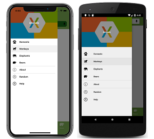
At its documentation Web site Xamarin.Forms Shell is described as reducing "the complexity of mobile application development by providing the fundamental features that most mobile applications require. This includes a common navigation user experience, a URI-based navigation scheme, and an integrated search handler."
It features:
- A single place to describe the visual hierarchy of an application.
- A common navigation user experience.
- A URI-based navigation scheme that permits navigation to any page in the application.
- An integrated search handler.
In the podcast, Montemagno described Shell as the biggest new feature worthy of the most attention, especially as it's a new feature he's played around with, athough while at the Build developer conference earlier this year he struggled with how to explain it.
"I really tried to figure out how to describe it accurately, and I call it this container, it's a shell, it's a container of how you can potentially structure and organize your application," Montemagno said.
Soucoup added that it's opinionated, which he actually likes. "It really kind of tells you how you're gonna do it. If you want a flyout menu, it's gonna give you a flyout menu the way it wants a flyout menu."
 [Click on image for larger view.] Shell App Featuring a Flyout for Top-Level Navigation (source: Microsoft).
Montemagno noted Shell has been in the works for a long time, as Microsoft wanted to produce a product that could be used to help the majority of mobile developers.
"So the shell really says, 'hey let me show you how to, for all intents and purposes, theme your entire application with a set of resources at app level and then also how to layout your control,' " Montemagno said. "So you mentioned flyout, there's top tabs of bottom tabs you can mix and match them together. You can specify your items and it handles everything for you."
In an MSDN Magazine article, program manager Ortinau said: "The Shell journey is just starting. We hear loud and clear from Xamarin.Forms developers that you often need to make your iOS and Android applications look mostly or exactly the same. To address this, we plan to release Material Shell, which is an implementation of Shell that applies Google’s Material Design styling as the starting point for all supported controls. The controls are still native so there are no performance or feature compromises."
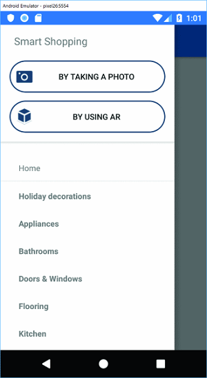
 A Flyout with a Header (source: Microsoft).
In the Channel 9 video, Ortinau described Shell as "the big thing, and really the thing that warrants calling it a 4.0, because conceptually it brings some really nice new things."
He did a hands-on screen presentation of one of those new things, Fast Renderers.
Fast Renderers
"First of all, Fast Renderers, are now enabled by default, and this benefits Android developers primarily because it's an optimized renderer that removes the need for a wrapping group, a view group," Ortinau said. "So for image button and label, those just immediately get faster, less memory less view inflation, all the good things you expect there."
Microsoft's Fast Renderers documentation explained more about that, noting how, traditionally, most of the Android control renderers are composed of two views:
- A native control, such as a Button or TextView.
- A container ViewGroup that handles some of the layout work, gesture handling, and other tasks.
To simplify that complex visual tree, which eats up more memory and CPUs, "Fast renderers reduce the inflation and rendering costs of a Xamarin.Forms control into a single view," the docs state. "Therefore, instead of creating two views and adding them to the view tree, only one is created. This improves performance by creating fewer objects, which in turn means a less complex view tree, and less memory use (which also results in fewer garbage collection pauses)."
Android controls leveraging Fast Renderers include: button, image, label and frame.
Image Source
Ortinau, in his Xamarin.Forms 4.0 announcement post last month, noted that icons and image sources for various controls didn't all implement the same types. FontImageSource was introduced in v3.5 to use font glyphs to decorate an app, but didn't work with icons and images.
"From this point forward everything implements ImageSource," Ortinau wrote in his post. "You can now use FontImageSource, embedded resources, files, and URIs everywhere without impedance."
In the podcast, Montemagno noted he had updated all his apps to v4.0 and they worked fine, though some squiggles were associated with the new ImageSource unification, asking if Soucoup had deep dived into that new feature.
"I haven't deep dived in into it but I know what we're dealing with," Soucoup said. "Let's say you have a background image, or a background image source, and it's the same thing as like your icon source. Now they all implement the same interface essentially."
"Yeah and then this is really nice," Montemagno replied, "because previously where you maybe could only set an image, or a background image or something like that, or an icon in one way and other ones would have like four ways in different image sources, now you just have one way of doing it for everything."
Soucoup added: "So it's just a unification, it's not a breaking change because your old code still works technically, but eventually it'll be deprecated right so you probably want to start to move over from there."
Ortinau also discussed the new ImageSource with Montemagno in the Channel 9 video. "If you've ever tried to use font glyphs before," the program manager said, "or even other formats, and you're like, 'Why are toolbar icons different from image source, and that's different from ... ' I think there were like three different image source types that were littered throughout our code-base. Well, that's now consistent."
Accessibility
Ortinau summed up new accessiblity features in his May blog post thusly:
Xamarin.Forms is a native cross-platform framework, and this means you have the inherent advantage of always having native accessibility features at your fingertips. We continue working towards improving the ease with which you can make your apps more accessible by now controlling the focus order directly in Xamarin.Forms. When you have a modal that goes away, or when you navigate from page to page, it's important to tell the device's screen reader which element has focus. Something should have focus. In order to now do this, you can set the TabIndex on any VisualElement and the native OS will take care of the rest.
He also provided this code sample:
<Label AutomationProperties.IsInAccessibleTree="false"
               Text="Turn on your screen reader and swipe between elements. The elements should be read in ascending order. It should *not* read Skip. It should *not* read this text." />
<Label TabIndex="0" Text="This will be read first and have focus"/>
<Button TabIndex="1" Text="Next Focus"/>
In the video, Ortinau said, "We're always pushing forward on accessibility, and so we have a nice bit of improvement."
In the podcast, Soucoup said, "And another cool thing that we have going on with 4.0 is tab ordering, which definitely helps with accessibility as well. So now you know where the, essentially the input the focus is going to go, in order, which helps obviously with the accessibility so you can provide, I guess, prompts that way."
In the meantime, resources available to help you continue your deep dive into Xamarin.Forms 4.0 include: