News
Developer Feedback Shapes New Visual Studio 'Welcome Experience'
When you cover Microsoft development tooling, one common theme you notice is that the company's dev teams take seriously the developer feedback they get from various previews.
That seems to be true across the board -- perhaps some kind of organization-wide priority -- and a great example is the Visual Studio Welcome Experience, which as you might infer is what a developer is presented with when firing up the flagship IDE, hopefully providing a useful, user-friendly start to things with resources to consult and next-stop options to proceed.
The dev team for Welcome solicited feedback back in March in VS 2022 v17.6 Preview 2.
"With your feedback in mind, we started experimenting with a new Welcome Experience," the company said in March. "We're only just starting our initial investigations in this area, and we know there's a lot of work we need to do here to ensure a great experience. Read on for more information on what we're thinking and download Visual Studio 17.6 Preview 2 today to give it a try and share your feedback."
Initial efforts involved a Welcome tab instead of the modal Start Window, helping users jump right into shell, and providing a "What's New" page along with:
- Your most recently used project list
- A search box for recent projects
- Quick links for creating a new project, opening an existing project, opening a folder, and cloning a repository
So devs weighed in with their thoughts, and this week the team detailed reiterations of the experience since then, announcing two significant changes.
"One of the main issues that many of you pointed out in the original Welcome Experience was how the design felt empty or small for developers with larger screens," Microsoft said in a May 30 post. "We've addressed this by designing a layout that uses more horizontal space for larger screens, and we've made the elements more space-efficient by adjusting margins and removing one of the headers. This means that the design is now responsive, so the elements will stack nicely on a small screen too."
Other feedback indicated the "Most Recently Used" (MRU) section of Visual Studio no longer was up to snuff for modern development.
"Some developers had over 50 items on the list, while others had items that had been deleted from disk," Microsoft said. "Now, you can remove individual items, missing items, or all items from the list. This means that your Welcome experience will only show you the most useful information, and it will always be up to date."
Below is a comparison of the March iteration and the May iteration with those two features above incorporated -- both illustrated with animated GIFs.
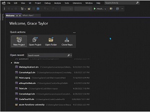 [Click on image for larger view, animated GIF view.] The March 16 Iteration in Animated Action (source: Microsoft).
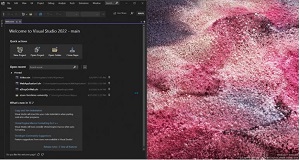 [Click on image for larger, animated GIF view.] The May 30 Iteration in Animated Action (source: Microsoft).
The entire, complicated process for this can be tracked in the associated Developer Community ticket titled "Welcome customizations in Visual Studio," authored by Microsoft's Grace Taylor, a product manager. It shows more than 30 comments documenting opinions and steps taken by the team. The back-and-forth between team members and developers providing feedback gives a glimpse into how things like this are introduced, fine-tuned and (usually, or at least often) realized in the final product (though that can take years for major features).
"We understand that your Welcome impacts how you begin your workflow, and we're excited to hear your thoughts on this new Welcome," Taylor said in this week's update. "If you'd like to give it a try, download the latest Visual Studio Preview today and let us know what you think on this Developer Community ticket!"
About the Author
David Ramel is an editor and writer at Converge 360.