News
Finally Go Eyes On with Upcoming Visual Studio 2022 UI Refresh
Six months ago, Microsoft teased Visual Studio 2022 developers by announcing an upcoming UI refresh, which they can now finally get their eyes on in the new v17.9 preview 1.
Following the general availability of v17.8 this week, Microsoft published a couple blog posts on the first preview of the next edition and the first look at the upcoming UI refresh.
Messing with a UI is always dangerous, and complaints are already rolling in from developers who are famously finicky when it comes to design changes of any kind. The complaints are apparently based on static images and textual descriptions.
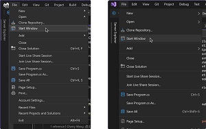 [Click on image for larger view.]Left: Visual Studio 17.6 menu UI; Right: Proposed menu UI (source: Microsoft).
But devs can now judge for themselves, eyes on, by downloading v17.9 preview 1 and enabling the sneak peek via the menu system with Tools > Manage Preview Features and then checking the box for "Experimental control styles," after which a restart will enable the UI refresh.
It's just the early bits though ("This represents the first functional preview of the UI Refresh, but we know we still have more work to do"), as Microsoft is taking its time in rolling out this refresh, apparently keeping those finicky devs in mind. The company even made note of that concern in replying to a comment on its announcement post from a developer who asked when it would be generally available: "We don't currently have a timeline for when this will be in the GA channel. Major changes to the UI like this are something we want to make sure are correct before we take them out of the preview channel, which is why we're engaging as early as we are."
Today (Nov. 16), Microsoft's Dante Gagne, senior product manager for Visual Studio, detailed the UI refresh, which he said was undertaken to improve productivity, create a more inclusive environment and keep up with evolving global accessibility requirements. Microsoft based its revamp on the Fluent design language and focused on three related pillars: cohesiveness, accessibility and productivity.
Microsoft always makes a concerted effort to use developer community feedback to guide its tooling changes, and this refresh is no exception. The associated Developer Community ticket, posted in April by Gagne, has received 84 votes and a whopping 152 comments. In fact, the company noted it has already tweaked things based on commentary to its May announcement, which only provided static screenshots of proposed changes.
"In this version of the UI Refresh, you'll get to experience a balance of the feedback we received with the accessibility requirements around things like clickable target space and reduction of visual clutter," Gagne said. "This means a more inclusive experience to help everyone be more productive and comfortable while still maximizing code space and respecting the feedback you've shared with us. As an example of this, the first screenshots we shared, showed a reduction of nearly a full line of code in the editor space, but the editor in 17.9 preview 1 is only reduced by a quarter of a line."
This graphic illustrates that last point:
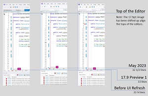 [Click on image for larger view.] Before and After (source: Microsoft).
The dev team apparently hustled to provide a preview to showcase at this week's Ignite IT pro/developer conference, so some features, including the IDE's blue theme, aren't enabled in this early preview. Speaking of themes, the company is providing new "Tinted" themes to join the basic Dark and Light themes.
"In addition to the new UI which is based on the Fluent Design language, we're also proud to reveal the first preview of the Tinted themes," said Microsoft's Maddy Montaquila, senior product manager for .NET MAUI, in a post announcing v17.9 preview 1. "You can find these under Tools > Theme or in the "Color Theme" combobox in Tools\Options under Environment > Visual Experience. This new set of themes, inspired by Microsoft Edge, gives you a new set of options to give Visual Studio a fresh set of colors to express your particular style."
Another thing that made the Ignite preview cutoff is a simplification of the colors used, with the refreshed styles using some 100-plus color tokens, a number culled down from the previous 4,000-plus tokens. Microsoft said this makes colors easier to maintain and helps avoid misuse while also leading to more consistency and a more cohesive and comfortable experience, addressing those guiding pillars.
Gagne hinted at further work and solicited more feedback on the project. "We're excited to hear what folks think now that you can try out the UI Refresh instead of simply seeing static screenshots," he said. "We know that there's still more we need to do. When switching to the tinted themes, customers not using the default Cascadia font will need to set their font back to their font of choice, and custom themes may not be compatible with the UI Refresh at this time. This is the first preview, but it certainly won't be the last."
This is a design change, though, which always come with many complaints, like this one appended to Gagne's post: "Exactly what I feared. Way too much useless white space. I hope the old dense UI will be available for ever...."
Stay tuned for complaints it's too crowded to be functional and needs to be spread out to provide a less intimidating initial impression and provide quicker access to features and ....."
About the Author
David Ramel is an editor and writer at Converge 360.