In-Depth
Semantic Zoom with Silverlight 5 PivotViewer
The Silverlight 5 PivotViewer allows you to create unique and interactive data visualizations for your users. Find out how to effectively use this technology and incorporate semantic zoom into your data collections.
- By Tony Champion
- 09/02/2012
If you've spent much time writing data-driven applications, then you're painfully aware of how complex users' requirements can become around visualization. Each user in a domain will have his own idea of how data should be sorted, filtered and displayed.
When Microsoft released Silverlight 5 in December 2011, a new data-visualization control called the PivotViewer was among the additions to the platform. PivotViewer allows you to build solutions that empower users to create their own vision of their data.
Originally developed by Live Labs as a standalone Silverlight 4 control, PivotViewer sets the bar in data visualization by providing an intuitive client-side interface for sorting and filtering data, and presenting two distinct data views with different zoom levels. Built on the Silverlight Deep Zoom technology, PivotViewer allows you to enable users to visualize collections of data in an interactive way.
This type of data visualization presents a unique solution that allows users to not only create customized views of a data set, but to discover trends and relationships within the data that might have been missed in more traditional formats. In this article, I'll cover the fundamentals of using PivotViewer and show you how to incorporate Semantic Zoom into your data collections.
Creating a PivotViewer Application
Because the PivotViewer is now a part of the Silverlight SDK, the only required installations are Microsoft Visual Studio 2010 SP1 and the Microsoft Silverlight 5 Tools for Visual Studio 2010 SP1. You can download the developer tools here.
Once you have everything installed, create a Silverlight 5 application by selecting File, New and Project from the Visual Studio menu. After the New Project dialog is displayed, select a Silverlight Application, as shown in Figure 1.
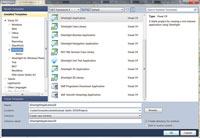
[Click on image for larger view.] |
| Figure 1. Creating a new Silverlight 5 application. |
For this project, the only reference you need to add is the PivotViewer control. Unlike the previous version, PivotViewer is now entirely contained in a single DLL, making it easier to add the control to your project. To add a reference to the PivotViewer, right-click References in the Silverlight project and add a reference to System.Windows.Controls.Pivot. Now the project is set up, and you're ready to build a PivotViewer application.
You need only three things to create a PivotViewer application: data, properties and templates. Like other Silverlight item controls, a collection of data can be added to PivotViewer by setting the ItemsSource property (one of the most requested features after the release of the original version). With this feature, you're able to use any method that you choose to obtain data, whether it's Collection Extensible Markup Language (CXML, the original PivotViewer data source), Open Data Protocol (OData) or Rich Internet Application (RIA) services.
In order to focus on the PivotViewer -- instead of on obtaining data -- the sample code (found in the code download and available at VisualStudioMagazine.com/Champion0912) is going to generate some sample data on the client at runtime. To accomplish this, you need to define a data class -- in this case, statistics on each table of diners during a single shift in a restaurant.
Defining a Data Class
The first order of business is to create a class in your project that will contain the dinner party statistics. Right-click on the Silverlight project and select Add, then Class. Once the Add New Item dialog screen appears, name the class DinnerParty.cs. Then add the following properties to the class: Id, StaffName, TimeSeated and SizeOfParty.
In order to generate a collection of data for this example, you'll create a static method in the DinnerParty class that will return a collection of 100 DinnerParty objects. This method should handle each property uniquely so the data is somewhat meaningful to test against. For example, each party will get a unique Id; the SizeOfParty will be a random number between 1 and 5; and table assignments will rotate through each member of the wait staff. The final DinnerParty class is shown in Listing 1.
Before adding the newly generated data to the PivotViewer, you must first add a PivotViewer to the project. Because this is a PivotViewer example, the application's UI will consist solely of a PivotViewer object. The first step is to open the MainPage.xaml and add a namespace to System.Windows.Controls.PivotViewer. Next, add an instance of the PivotViewer to the Grid control and name it pViewer:
 <UserControl x:Class="VSM_PivotViewer.MainPage"
  xmlns="http://schemas.microsoft.com/winfx/2006/xaml/presentation"
  xmlns:x="http://schemas.microsoft.com/winfx/2006/xaml"
  xmlns:pivot="clr-namespace:System.Windows.Controls.Pivot;assembly=
    System.Windows.Controls.Pivot" >
   <Grid x:Name="LayoutRoot" Background="White" >
     <pivot:PivotViewer x:Name="pViewer" >
     </pivot:PivotViewer >
   </Grid >
 </UserControl >
The last step is to assign the ItemsSource property of pViewer to our generated collection. Open up the codebehind file, MainPage.xaml.cs. In the constructor, you can now add the generated data:
public MainPage()
{
  InitializeComponent();
  pViewer.ItemsSource = DinnerParty.BuildData();
}
After defining the data source for this example, you must define the properties PivotViewer will display. This is accomplished by setting the PivotViewerProperties property to a collection of PivotViewerProperty objects. There are four different PivotViewerProperty classes that are available:
- PivotViewerDateTimeProperty
- PivotViewerLinkProperty
- PivotViewerNumericProperty
- PivotViewerStringProperty
The purpose of a PivotViewerProperty is to add metadata to each property that you wish to display inside PivotViewer and tell it how you want the data to be treated. PivotViewer will only display data for the properties you define. If your object has 20 properties and you only define four, then you'll only see those four within the PivotViewer UI.
A PivotViewerProperty is defined by a unique name, a display name, a binding statement that maps it to your object, and one or more options. Each option defines how the PivotViewerProperty will be used within the PivotViewer. The following list includes the available options and explains how they're handled by PivotViewer:
- CanFilter: Adds the property to the filter panel and the sort dropdown
- CanSearchText: Allows the property to be searched
- None: Does not add a property to the UI
- Wrapping Text: Wraps the text of the property when displaying it in the detail pane
Next, add all four properties to the PivotViewerProperties collection. You can define these properties in XAML or code. Listing 2 shows the complete XAML for declaring the PivotProperties. For Id and SizeOfParty, use a PivotViewerNumericProperty. TimeSeated is a PivotViewerDateTimeProperty, and StaffName is a PivotViewerStringProperty. All of the properties except for Id have the CanFilter option set, so they appear in the filter pane. In addition, the StaffName has the CanSearch option set, so you can search features of PivotViewer to look up a particular staff member.
Designing Trading Cards
The final -- and arguably most important -- part of using the PivotViewer is to define the visual representation of each object, otherwise called a trading card. This is accomplished by setting the ItemTemplates property of the PivotViewer to a collection of one or more PivotViewerItemTemplates. A PivotViewerItemTemplate is an extension of a Silverlight DataTemplate. It uses data binding to populate its UI from each object in the ItemsSource collection.
Designing the trading cards is often the biggest challenge for developers. Let's face it: This jumps into the design world. In order to design an effective trading card, it's important to understand the data you're displaying and what's important to the user. Designed correctly, the trading cards can add an extra dimension to the data that enables users to visually identify relationships and trends.
Size is an important design concept to keep in mind. When you're looking at an entire collection containing 1,000 items, each trading card will be very small. Because the purpose of the trading card is to convey information to the user, it's only possible to present one or two pieces of information. Any more than that and the cards will be too cluttered for the user to distinguish between them. As the size of the cards gets larger on the screen, there's more real estate available to add information for the user. Ideally, you'd like to present a more detailed card as the user zooms in closer and increases the size of the trading card on the screen.
For example, in our sample data collection, the StaffName and SizeOfParty are two important pieces of information that stand out. The first trading card will focus on these two properties. The trading card itself will be a square. The SizeOfParty will be displayed in a large TextBlock that's centered in the square. The only remaining question: How do you show the StaffName? If you print the StaffName on the card, it will be unreadable when you zoom out to view the entire collection. This is where visualization comes into play.
The No. 1 question I get asked about using PivotViewer is, "What happens if I don't have any pictures in my data?" Some developers feel that this will prevent them from having a usable collection. This notion couldn't be further from the truth. Developers routinely present other forms of data visualization that don't require images. When was the last time you needed a picture for each data point in a line or bar chart? It's possible to present effective visualizations with a combination of text, color and icons. Not only can you make the trading cards visually appealing, but you can also use these tools to help the user identify trends and relationships among the displayed data set.
Trying to visualize the StaffName property is a good example. If each staff member is represented by a different color and you set the background of each trading card to the color representing that staff member, then you have created a visualization that will make sense and is useful to the user. With a large number of trading cards, a user can look at the histogram of tables per hour and can visually determine which staff member had the most tables for that time period.
Implementing Value Converters
The best way to accomplish this visualization is with a value converter. By creating a value converter that converts a StaffName string to a SolidColorBrush, you'll be able to bind the trading card's background to the StaffName. Start by adding a new class to the project named StaffNameValueConverter.cs. The class should inherit the IValueConverter interface. Visual Studio will add the code necessary to implement this interface for you. This can be done by right-clicking IValueConverter and selecting Implement Interface.
The IValueConverter interface has two methods: Convert and ConvertBack. The Convert property receives the raw value in a binding statement and lets you convert it into something different. For this example, it takes the StaffName string and returns a SolidColorBrush based on that string. In this instance, it isn't necessary to write an implementation for the ConvertBack because the binding doesn't need to convert from a color back to the StaffName.
Listing 3 shows an implementation of a value converter that will map the staff names to unique colors. The method contains a switch statement that will map each of the three names of the staff members to a unique color. While a more flexible converter would need to be created in a real-world solution, this is suitable for demonstrating how to visualize a textual property. Before you can use the new value converter an instance of it must be added to your XAML. The first thing to add is a new namespace to the UserControl:
xmlns:local="clr-namespace:VSM_PivotViewer"
An instance of the value converter is then added to the UserControl by adding a resource to the UserControl:
   <UserControl.Resources >
     <local:StaffNameValueConverter x:Key="staffConv"/ >
   </UserControl.Resources >
Once the StaffNameValueConverter code is completed, you can create the first PivotViewerItemTemplate and add it to the ItemTemplates property, as demonstrated in Listing 4. As previously mentioned, the template will only contain a Grid and a TextBlock. The Grid's Background property is bound to the StaffName property using the StaffNameValueConverter. The TextBlock has its Text property bound to the SizeOfParty property.
Running the project, the PivotViewer is loaded with 100 items displayed, as shown in Figure 2. You're able to change the sort, filter the collection, and see the item details in the detail pane on the right-hand side when you select an item. It's important to remember that all of this functionality came out of the box. All that's required is to supply the data, and describe what to show and how to show it.
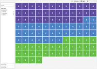
[Click on image for larger view.] |
| Figure 2. Screenshot of PivotViewer displaying an entire collection. |
The first thing that should catch your eye is the division of tiles between all three of our staff members. Even with the simplistic trading cards, it's possible to begin inferring data relationships. For example, sorting by "Staff Name" and selecting the histogram view will show that each staff member has roughly the same number of tables in the system. Sorting by "Size of Party" in the histogram view lets you visualize which staff members had the larger or smaller parties. It should quickly become evident that this approach to data analysis can be useful to the user given properly designed cards.
Using Semantic Zoom
Another improvement in the latest release of PivotViewer is the concept of Semantic Zoom. Semantic Zoom is the ability to create different visualizations based on the size of an item. This lets you change the level of detail that the user sees as he zooms closer to an item.
If you take a look at the current example, not a lot of detail is shown once you select a trading card. To take full advantage of the PivotViewer, you should provide more information as the user zooms in closer to a trading card. The solution is to add a second trading card with more details to the PivotViewer.
Before adding a second template to the ItemTemplates collection, it's necessary to take a closer look at the PivotViewer workflow with regard to item templates. The PivotViewerItemTemplate has a MaxWidth property. This property is important to the workflow. When a trading card is rendered, the first template in the collection is used to render the card. If the MaxWidth property is set on the template, then once the trading card is wider in screen pixels than that value, the PivotViewer moves to the next card in the collection. This process continues until the correct size is found, or there are no more templates to check. If this happens, the trading card won't be generated and a blank image will be rendered to the screen.
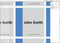
In order to present the user with more information, Listing 5 shows an updated ItemTemplates property for the PivotViewer. The template adds more details from our data set. For instance, both the staff name and the time the table was seated are displayed on the card.
The template is added after the first template, so the PivotViewer will still load the original template first. Before the new template is used by the PivotViewer, you must first set a MaxWidth to the original template. Listing 5 shows how the original template was modified to define a MaxWidth equal to 300. Running the app will generate the same view as the first example. However, once you zoom in closer to the cards, the cards will change to the new, more detailed template as shown in Figure 3. If you zoom in slowly enough, you'll also notice that the PivotViewer creates a smooth transition between the two templates by blending in the new template over the original.
[Click on image for larger view.] |
| Figure 3. Creating a second, more detailed PivotViewer item template. |
If you take a look at what this second template provides you, you should begin to see the power of Semantic Zoom. Effectively, utilizing this approach allows you to bring another dimension to your users.
Imagine if you only used a single template in your collection. You'd have to take one of two approaches. The first would be to use a simplistic card, as in the original collection. This would give you the ability to create graphical correlations between data points, but overall it would be lacking in details about a single data point. If you went the other direction and created a single detailed card, all of your cards would look identical when viewing the entire collection. This would hinder your ability to show relationships between data. In addition, you'd take a performance hit by attempting to render an entire collection with a complex template.
With the enhancements in the latest version of the PivotViewer, it's now conceivable to give the user the ability to choose which templates to use and how those templates are defined. A single interface could be used in completely different ways to display data. The PivotViewer API allows you to set things like the current viewer, the filter state and the sorting property via code. Therefore, you can store this information for the user and restore settings for future sessions.
The Silverlight 5 PivotViewer has come a long way since the original version. Its client-side XAML-based rendering, dynamic updates and enhanced API provide a solid foundation for creating interactive and informative data visualizations. Adding the PivotViewer to your apps will give your users a completely new way to experience their data and allow them to explore it in ways not previously possible.