Mobile Corner
Building Media Apps for the Universal Windows Platform Using the Player Framework
The Universal Windows Platform comes with rich media capabilities. In this article Nick explores how to customize and extend the media playback experience using the Player Framework.
- By Nick Randolph
- 07/27/2016
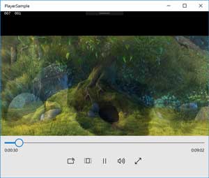
Out of the box, the Universal Windows Platform makes it easy to display video content within an application. The MediaElement, shown in Figure 1, can be used to display video and provide basic controls to allow users to play, pause, seek and control settings such as volume or whether the video is shown in full screen.
 [Click on image for larger view.]
Figure 1: Playing Video with the MediaElement
In XAML, setting the Source and the AutoPlay attributes will automatically start video playback as soon as the element has completely loaded. The following XAML:
<MediaElement
    Source="http://rdmedia.bbc.co.uk/dash/ondemand/bbb/2/client_manifest-common_init.mpd"
    AutoPlay="True"
    AreTransportControlsEnabled="True"/>
also enables the panel containing the playback control seen at the bottom of Figure 1, by setting the AreTransportControlsEnabled attribute to True. When the user isn't interacting with the application, the playback controls are hidden automatically.
For applications where video is an important feature, it is often necessary to customize the playback experience. Typically, this might involve changing the style and layout of the playback controls, or perhaps displaying an image whilst the video is initially buffering, before playback commences. Both of these customizations could be achieved with the MediaElement.
I'll start by displaying an image while media is being loaded. In this case I'll specify the image using a remote URL. It's worth noting that the image will have to be downloaded so there may be a few seconds where there is no image being displayed, so if possible, using an image packaged with the application may yield a better experience. To display an image while media is being prepared, I need to specify the PosterSource property:
<MediaElement
    Source="http://rdmedia.bbc.co.uk/dash/ondemand/bbb/2/client_manifest-common_init.mpd"
    AutoPlay="True"
    PosterSource="http://camendesign.com/code/video_for_everybody/poster.jpg"
    AreTransportControlsEnabled="True"/>
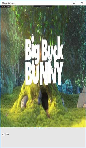
Once downloaded, the image will be stretched across the entire background of the MediaElement. This is shown in Figure 2, where the image hasn't been stretched uniformly, resulting in the image being distorted. Unfortunately there is no attribute on the MediaElement to define how the poster artwork should be stretched.
 [Click on image for larger view.]
Figure 2: Displaying Poster Artwork
Adjusting the look or layout of the playback controls involves overriding the default style for the MediaTransportControls element. The default style can be found in the file
C:\Program Files (x86)\Windows Kits\
10\DesignTime\CommonConfiguration\
Neutral\UAP\10.0.XXXXX.0\Generic\Generic.xaml.
In order to make changes to the transport controls, it's necessary to take a copy of the default style for the MediaTransportControls and add it as a resource to the application. It is then possible to modify any individual component. For example, the following changes the AppBarButtonStyle to specify and Width and Height of 80:
<Style x:Key='AppBarButtonStyle' TargetType='AppBarButton'>
    <Setter Property='Width' Value='80' />
    <Setter Property='Height' Value='80' />
</Style>
The MediaElement control also provides support for both closed captions and support for different media formats, such as Smooth Streaming and Dash. However, going beyond basic customizations -- for example to control the stretch of the poster artwork, or customizing play, pause and buffer visual states -- requires implementing a lot of custom logic and elements that no longer form part of the MediaElement control. This is where the Player Framework can be used to kick-start development of an awesome media experience.
Installation of the Player Framework is easy, as it is available in binary format and installs using the familiar Visual Studio extension format. Simply download and run the .VSIX file from the Downloads area on the Codeplex site.
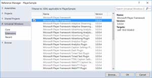
The Player Framework is actually broken up into a number of assemblies that you can reference, depending on which features you want to make use of, as shown in Figure 3. In this case I'm just going to add a reference to the Microsoft Player Framework and click OK.
 [Click on image for larger view.]
Figure 3: Adding Reference to the Player Framework
If you've already been using the MediaElement control in your application, switching to the Player Framework is just a matter of replacing the MediaElement with the MediaPlayer control from the Player Framework:
<playerFramework:MediaPlayer
    Source="http://rdmedia.bbc.co.uk/dash/ondemand/bbb/2/client_manifest-common_init.mpd"
    AutoPlay="True"
    PosterSource="http://camendesign.com/code/video_for_everybody/poster.jpg"
    AreTransportControlsEnabled="False"
    />
Behind the scenes, the MediaPlayer does use the MediaElement in order to display video, but it provides an abstraction that includes a variety of templated elements that make it easy to customize the experience. You'll notice that in this case I've disabled the playback controls by setting AreTransportControlsEnabled to false, as this will hide the controls provided by the MediaElement. Instead, I'm going to be using the controls provided by the MediaPlayer, as shown in the left image of Figure 4.
 [Click on image for larger view.]
Figure 4: Different Media Player Styles
In addition to the default style provided by the MediaPlayer, there are three alternative styles that come with the player framework. Applying these themes is as easy as including a reference to the appropriate resource dictionary, as shown in the following code which includes the Classic style (middle image of Figure 4):
<Page.Resources>
    <ResourceDictionary>
        <ResourceDictionary.MergedDictionaries>
            <ResourceDictionary
                Source="ms-appx:///Microsoft.PlayerFramework/themes/Classic.xaml" />
        </ResourceDictionary.MergedDictionaries>
    </ResourceDictionary>
</Page.Resources>
The other two styles can be selected by including either Entertainment.xaml (right image of Figure 4) or Phone.xaml (not shown but is a mobile-optimized layout).
Unlike the MediaElement where there are only a limited number of options for customizing the playback controls, the MediaPlayer has a number of templated elements and visual states that can be adjusted. Depending on how much of the experience you want to customize, you can either override individual styles and templates, or you may want to include the whole MediaPlayer style (pick either the default (ie generic.xaml), Classic.xaml, Entertainment.xaml or Phone.xaml as a starting point) and customize it entirely.
The first style element that I'm going to override is the foreground color of the playback controls. The MediaPlayer makes use of the built-in theme colors and brushes where possible. For example, the foreground of the playback controls references the theme brush, AppBarItemForegroundThemeBrush. To change the foreground color of the playback controls I can simply change the color of this brush. At this point it's worth noting that there are some inconsistencies in how theme dictionaries are applied and that in order to get this to work I moved the reference to the Classic.xaml style into the App.xaml resource dictionary, and overrode the theme colors in the same dictionary, as shown in Listing 1.
Listing 1: Customizing Playback Controls
<Application x:Class="PlayerSample.App"
             xmlns="http://schemas.microsoft.com/winfx/2006/xaml/presentation"
             xmlns:x="http://schemas.microsoft.com/winfx/2006/xaml"
             xmlns:local="using:PlayerSample"
             RequestedTheme="Light">
    <Application.Resources>
        <ResourceDictionary>

            <ResourceDictionary.MergedDictionaries>
                <ResourceDictionary
                      Source="ms-appx:///Microsoft.PlayerFramework/themes/Classic.xaml" />
            </ResourceDictionary.MergedDictionaries>


            <ResourceDictionary.ThemeDictionaries>
                <ResourceDictionary x:Key="Default">
                    <SolidColorBrush x:Key="AppBarItemForegroundThemeBrush"
                                     Color="LightGreen" />
                </ResourceDictionary>
                <ResourceDictionary x:Key="Light">
                    <SolidColorBrush x:Key="AppBarItemForegroundThemeBrush"
                                     Color="DarkGreen" />
                </ResourceDictionary>
            </ResourceDictionary.ThemeDictionaries>


        </ResourceDictionary>
    </Application.Resources>
</Application>
It's also worth observing there that there are two themes defined, Default and Light. The selection of theme can be done at application, page or control level by specifying the RequestedTheme attribute.
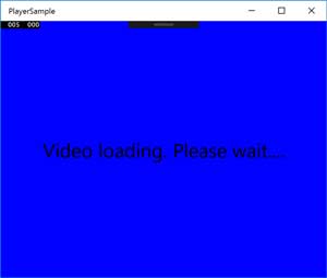
The next customization I will do is to the view that is presented when media is being buffered. I can do this by creating a Style for the BufferingView control, as shown in Listing 2. In this case I'm setting the background to blue and presenting some text in the middle of the screen.
Listing 2: Customized BufferingView Control
<Style TargetType="playerFramework:BufferingView">
    <Setter Property="Background"
            Value="#FF0000FF" />
    <Setter Property="Template">
        <Setter.Value>
            <ControlTemplate TargetType="playerFramework:BufferingView">
                <Grid Background="{TemplateBinding Background}">

                    <TextBlock Text="Video loading. Please wait...."
                                FontSize="30"
                                VerticalAlignment="Center"
                                HorizontalAlignment="Center" />
                </Grid>
            </ControlTemplate>
        </Setter.Value>
    </Setter>
</Style>
Adding this Style, overrides the style that comes with the MediaPlayer, as shown in Figure 5. Be aware that the BufferingView is presented at any time the media is being buffered, either prior to or during playback. This is why the default style has a transparent background, allowing the current frame of the video to still be present on the screen while buffering is in progress.
 [Click on image for larger view.]
Figure 5: Customizing the BufferView
Going beyond these customizations usually requires taking a copy of the entire MediaPlayer style. There are two ways to do this: either by copying out the contents of one of the style xaml files (these can be found at
C:\Program Files (x86)\Microsoft SDKs\
Windows Kits\10\ExtensionSDKs\
Microsoft.PlayerFramework.Xaml.UWP\
3.0.0.4\DesignTime\CommonConfiguration\
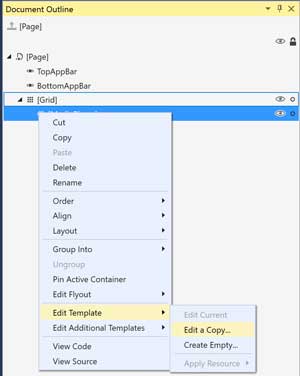
neutral\themes), or by right-clicking the MediaPlayer in the designer (either Visual Studio or Blend for Visual Studio) and selecting Edit a Copy from the Edit Template menu item, as shown in Figure 6. This will create a copy of the style, and template, for the MediaPlayer control, allowing you to customize both layout and visual states.
 [Click on image for larger view.]
Figure 6: Taking a Copy of the MediaPlayer Style
It doesn't take much effort to include and perform basic customizations on the MediaPlayer control that's part of the Player Framework. There are a number of components that can be individually customized and it's worth spending time understanding how the framework operates before attempting significant customizations.
The full source code for the player framework is available on Codeplex, and it's worth having it downloaded as a point of reference as you work to build your amazing media application.
About the Author
Nick Randolph runs Built to Roam, a consulting company that specializes in training, mentoring and assisting other companies build mobile applications. With a heritage in rich client applications for both the desktop and a variety of mobile platforms, Nick currently presents, writes and educates on the Windows Phone platform.