Cross Platform C#
Composable Customizations with Xamarin.Forms
Learn how Xamarin.Forms Behaviors and Effects make it easy to customize your apps in ways you can reuse them across all of your apps.
- By Greg Shackles
- 08/03/2016
In the early days of Xamarin.Forms, if you wanted to start customizing any of the built-in controls in ways beyond what were explicitly exposed on those controls, you probably found yourself creating a lot of custom renderers. Renderers can be a great way to hook into the Xamarin.Forms rendering pipeline and inject your own customizations, but it can quickly get unwieldy if you do it a lot, and is often a larger hammer than you would want to be swinging.
In more recent versions of Xamarin.Forms, the concepts of behaviors and effects were introduced that make these types of customizations much more approachable. In contrast to renderers, where you can only have a single implementation for any given control, behaviors and effects allow you to define customizations at a much more granular level. In addition, you can add any number of behaviors and effects to a control, meaning you can compose them together to get the outcome for which you're looking.
Some examples of where these extensibility points come in handy are for things like validation, tweaking display properties and adding animations. By implementing these types of customizations this way, the application itself doesn't need to really be modified to support them -- it can simply layer them in as needed. While behaviors and effects are pretty similar overall, effects are more focused on scenarios where you need to make platform-specific customizations. In general, if you can get away with using a behavior for the customization you're going for, that tends to be the way to go.
Behaviors
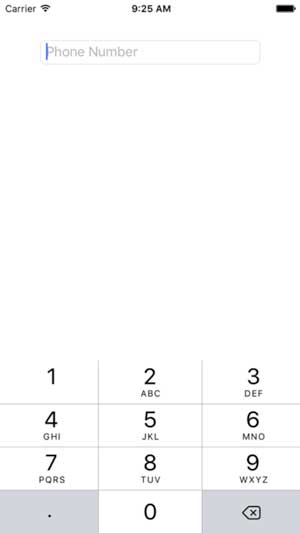
To demonstrate behaviors, I'm going to build out a simple screen that just has a single text entry field where the user can enter a phone number (see Figure 1):
 [Click on image for larger view.]
Figure 1. Initial Phone Number Entry UI
<?xml version="1.0" encoding="utf-8"?>
<ContentPage xmlns="http://xamarin.com/schemas/2014/forms"
  xmlns:x="http://schemas.microsoft.com/winfx/2009/xaml" xmlns:local="clr-namespace:VSMDemo"
  x:Class="VSMDemo.VSMDemoPage">
  <StackLayout Orientation="Vertical" VerticalOptions="FillAndExpand"
    HorizontalOptions="FillAndExpand" Padding="50">
    <Entry Placeholder="Phone Number" Keyboard="Numeric" />
  </StackLayout>
</ContentPage>
Validation
This is a good starting point, but wouldn't it be great if you could layer in some validation to show the user if the phone number is valid or not by changing the text color? There are many different ways you could go about doing this, of course. One way would be to go into the codebehind for this screen, hook into the event that fires when the entry's value changes and update the color of the text based on the new value. That would certainly work, but it's pretty intrusive to the application code and could quickly turn into a mess as the complexity of the app grows.
Instead, I'll define a behavior that specifically implements this, as shown in Listing 1.
Listing 1: Changing Color Based on Changing Value
using System.Text.RegularExpressions;
using Xamarin.Forms;

namespace VSMDemo
{
  public class PhoneNumberValidatorBehavior : Behavior<Entry>
  {
    protected override void OnAttachedTo(Entry bindable)
    {
      bindable.TextChanged += onTextChanged;

      base.OnAttachedTo(bindable);
    }

    protected override void OnDetachingFrom(Entry bindable)
    {
      bindable.TextChanged -= onTextChanged;

      base.OnDetachingFrom(bindable);
    }

    void onTextChanged(object sender, TextChangedEventArgs args)
    {
      var isValid = isValidPhoneNumber(args.NewTextValue);

      ((Entry)sender).TextColor = isValid ? Color.Default : Color.Red;
    }

    private bool isValidPhoneNumber(string input)
    {
      var digitsRegex = new Regex(@"[^\d]");
      var digits = digitsRegex.Replace(input, "");

      return digits.Length == 10;
      }
  }
}
For the sake of simplicity, this is only implemented to cover U.S. phone numbers. When the behavior is attached to the entry it hooks into the TextChanged event and updates the text color accordingly. The great thing here is that this class is entirely built around this specific behavior, so the logic doesn't need to be mixed with other unrelated logic.
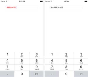
With the behavior defined, it just needs to be added to the entry's collection of behaviors and the functionality will light right up (see Figure 2):
 [Click on image for larger view.]
Figure 2. Phone Number Being Validated by the Behavior
<Entry Placeholder="Phone Number" Keyboard="Numeric">
  <Entry.Behaviors>
    <local:PhoneNumberValidatorBehavior />
  </Entry.Behaviors>
</Entry>
Formatting
Now that the app displays validation feedback for the phone number, I'd also like to extend it to automatically format the number like a U.S. phone number. This will make it easier for users to visualize the number as they're entering it without making them actually enter anything but the digits themselves. One way to do this would be to add in a little more functionality into the existing behavior defined in the last section, but in the spirit of behaviors and composability, I'll create a brand-new behavior instead, shown in Listing 2.
Listing 2: Formatting a U.S. Phone Number
using System.Text.RegularExpressions;
using Xamarin.Forms;

namespace VSMDemo
{
  public class PhoneNumberFormatterBehavior : Behavior<Entry>
  {
    protected override void OnAttachedTo(Entry bindable)
    {
      bindable.TextChanged += onTextChanged;

      base.OnAttachedTo(bindable);
    }

    protected override void OnDetachingFrom(Entry bindable)
    {
      bindable.TextChanged -= onTextChanged;

      base.OnDetachingFrom(bindable);
    }

    void onTextChanged(object sender, TextChangedEventArgs args)
    {
      var entry = (Entry)sender;

      entry.Text = formatPhoneNumber(entry.Text);
    }

    private string formatPhoneNumber(string input)
    {
      var digitsRegex = new Regex(@"[^\d]");
      var digits = digitsRegex.Replace(input, "");

      if (digits.Length <= 3)
          return digits;

      if (digits.Length <= 7)
          return $"{digits.Substring(0, 3)}-{digits.Substring(3)}";

      return $"({digits.Substring(0, 3)}) {digits.Substring(3, 3)}-{digits.Substring(6)}";
    }
  }
}
The boilerplate here is pretty similar to the previous behavior, except in this case it adds some formatting to the number based on its current length. Just as before, to add this behavior to the entry, I'll just add a single line to the XAML:
<Entry Placeholder="Phone Number" Keyboard="Numeric">
  <Entry.Behaviors>
    <local:PhoneNumberValidatorBehavior />
    <local:PhoneNumberFormatterBehavior />
  </Entry.Behaviors>
</Entry>
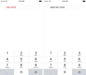
By implementing these as separate behaviors, I have the option of easily picking which pieces of behavior I want for the application, and can also take any of them and apply them to other applications. Nothing about the behavior is specific to this particular app, so it's completely reusable. With both of these behaviors composed together, the app will both validate and format the number based on the input (see Figure 3).
 [Click on image for larger view.]
Figure 3. Validating and Formatting Working Together by Composing the Behaviors
Effects
With those behaviors defined, now I'll add some platform-specific customization to the iOS app via an effect. In this case, I'll use an effect to customize the font and size of the entry on iOS. There are, of course, other ways to accomplish this without needing effects, but this should help give you an idea of how you can leverage effects for this class of customizations.
First, in the iOS project I'll define the effect's implementation with the code in Listing 3.
Listing 3: Define iOS-Specific Behavior for Customizing Text Font and Size
using UIKit;
using Xamarin.Forms;
using Xamarin.Forms.Platform.iOS;

[assembly: ResolutionGroupName("VSMDemo")]
[assembly: ExportEffect(typeof(VSMDemo.iOS.FontEffect), "FontEffect")]

namespace VSMDemo.iOS
{
  public class FontEffect : PlatformEffect
  {
    protected override void OnAttached()
    {
      var textView = (UITextField)Control;

      textView.Font = UIFont.FromName("Avenir-LightOblique", 24);
    }

    protected override void OnDetached()
    {
    }
  }
}
If you've worked with custom renderers before, this should feel somewhat familiar. The advantage here over custom renderers is that you can get the same level of access to the rendering pipeline without having to completely take over the renderer to do it. When the effect is attached, it simply updates the font on the text field to be a 24-point Avenir Light Oblique. The other key things to note are the assembly attributes at the top of the file, which define the namespace and effect name that this effect will be exported as. These are important for exposing the effect to the rendering pipeline, as you'll see shortly.
Back in the shared layer of the Xamarin.Forms application I'll define a routing effect based on the iOS effect I just created:
using Xamarin.Forms;

namespace VSMDemo
{
  public class FontEffect : RoutingEffect
  {
    public FontEffect() : base("VSMDemo.FontEffect")
    {
    }
  }
}
A routing effect is simply a wrapper around the platform-specific effect so that it can be easily referenced in the shared layer. At runtime it will take care of calling out to the platform-specific implementation so that everything comes together as expected.
Just like with behaviors, wiring up an effect is as simple as adding it to the effects collection in XAML:
<Entry Placeholder="Phone Number" Keyboard="Numeric">
  <Entry.Behaviors>
    <local:PhoneNumberValidatorBehavior />
    <local:PhoneNumberFormatterBehavior />
  </Entry.Behaviors>

  <Entry.Effects>
    <local:FontEffect />
  </Entry.Effects>
</Entry>
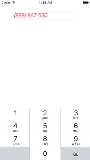
Now, in addition to the validation and formatting introduced by the behaviors, on iOS it will also display with the customized font settings (see Figure 4).
 [Click on image for larger view.]
Figure 4. Font Effect Working Together with the Previously Defined Behaviors
Wrapping Up
These examples only scratch the surface of what you can do with behaviors and effects, but hopefully they help to demonstrate the power of defining customizations in this way. By keeping the implementations in small classes specific to that behavior, the impact on the app itself remains minimal, with the added benefit of creating customizations that are portable across any Xamarin.Forms application. By composing them together you can create complex and rich experiences for your users without having to reinvent the wheel every time, and while still maintaining control over what you do and don't want to use in a particular scenario.