News
New Visual Studio Code Icons Unveiled
Risking the wrath of recalcitrant developers, Microsoft is changing the icon scheme for its Visual Studio Code editor.
Finicky coders in the past have been known to rise up in verbal arms upon any tweaking of the appearance of their IDEs and code editors, as witnessed by the uproar following Microsoft's imposition of ALL-CAP menu items in the Visual Studio IDE several years ago.
 The Existing VS Code Icon (source: Microsoft).
News about new VS Code icons came in a GitHub issue last week. The issue was started in May of last year as a proposal for a new VS Code icon for Mac OS X. Microsoft's Chris Dias chimed in to say the team was already working on a new icon for VS Code everywhere.
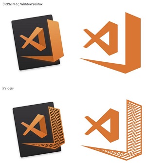 [Click on image for larger view.] The New VS Code Icons (source: Microsoft).
Last week, he updated the issue, unveiling new orange icons for Mac, Windows and Linux, with a slight variation for Windows Insiders.
"We feel that the icon denotes 'openness,'" Dias said. "It conveys that VS Code is (in a good way) a subset of our big brother, the Visual Studio IDE. And, if you look hard enough, you'll find a small tribute to a great mind.
"The new icons will appear in Insiders shortly and will be in Stable when we release the August iteration in early September."
Dias pointed to a March post titled "Iterations on Infinity" that detailed the company's rollout of new icons for the entire Visual Studio product family.
"Ultimately, the reason we put so much time and energy into refreshing these icons was to make your job easier," said designer John Lea in that post. "We always want you to be confident when you click on one of our icons, so you can get down to coding and focus on what you really want to focus on: making the best software in the world."
Lea asked for user input on the effort, and readers of Dias's post were already quick to comply, with comments such as:
- "Why orange? Why not blue as same? I think blue is look better than orange."
- "The old green Icon was much more minimalistic, is there somewhere I can get it to swap it out manually? This new one doesn't stand out and just blends in with the rest making it harder to see."
- "It's also really difficult to tell the two icons apart at small sizes, especially on MacOS. I like the concept, and I think the two icons look fantastic, but I don't think they are an improvement."
Dozens of other opinions were voiced on Lea's post, also, before comments were closed off about four months ago.
While many developers are likely to not be pleased with any Microsoft design decision, they at least got more freedom to tweak and customize their individual Visual Studio IDE setups with the recent introduction of a new color theme editor for Visual Studio 2017.
And for VS Code, there are also dozens of icon-related extensions available in the Visual Studio Marketplace.
About the Author
David Ramel is an editor and writer at Converge 360.