News
Visual Studio Team Seeks Help with Help (Menu, That Is)
Microsoft's Visual Studio dev team is seeking help to revamp the IDE's help menu.
The team is experimenting with different versions of the "age old" help menu while seeking developer feedback on the options. The goal is to connect users to resources to better unlock Visual Studio, including:
- Documentation
- Getting started material
- Social media
- Developer Community
- Subscription information
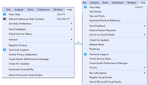
 [Click on image for larger view.] The New Help Menu in VS 2019 v16.11 (source: Microsoft).
Thus, as the above graphic depicting before and after screenshots of the help menu in Visual Studio 2019 v16.11 shows, the first experiment worked up by the dev team expands the number of items from 13 to 17. New items include:
- Get Started
- Tips and Tricks
- Keyboard Shortcut Reference
- Explore Feature Requests
- Join Us on Social Media
- Release Notes
- Roadmap
- My Subscription
Some menu items were just tweaked, like "Online Privacy Statement" becoming just "Privacy" and "Register Product" becoming "Register Visual Studio." Others were removed completely, like "Keyboard Accessibility" and "Xamarin."
While the changes may seem minor at first glance, the dev team's announcement shows how much thought goes into each one. Take, for example, the last item in the first list presented above: subscription information under the "My Subscription" help menu item.
"Most users who've purchased Visual Studio Professional or Enterprise (or have had it purchased by their organization) have a Visual Studio subscription," explained Jason Chlus, program manager, in a blog post. "If you have a Visual Studio subscription you may not know about the broad collection of additional benefits that are included! This menu item will give you access to:
Developers are notoriously picky about the exact setup of their IDEs, paying close attention to colors, icons, layouts and so on, so it was no surprise that they weighed in with their opinions in the comments section of the announcement.
One reader expressed reasoned concern about the size of the menu with the new additions, preferring that it be as small as possible to narrow the focus on the main topic: help.
Here is the reply by Chlus: "Due to this being our first experiment with the help menu we added lots of new items to see how users would like the new options. We will be looking to make adjustments in upcoming releases. Please leave specific feedback you have on the Developer Community ticket: https://developercommunity.visualstudio.com/t/We-want-to-make-Help-all-you-need-Help/1529022?from=email&space=8&entry=suggestion."
About the Author
David Ramel is an editor and writer at Converge 360.