Mobile Corner
Changing Page Layout Using Visual States
Nick Randolph walks through how to use visual states to dynamically change the layout of pages in your Windows Phone application.
- By Nick Randolph
- 07/22/2011
A typical Windows Phone application is made up of a series of pages through which the user navigates. However, there are times when you don't necessarily want to navigate to a new page in response to a user interaction. For example you might have a page that displays profile information about the user, which includes an edit button. When the user clicks the edit button, rather than navigating to a separate edit page, the application could exchange the display controls with edit controls (eg replace TextBlock elements with TextBox elements that allow the user to modify the text). Such a page has two states; one for displaying information, the other for editing the information. These states can be expressed as VisualStates in XAML and then switched between using the VisualStateManager.
In this column, we'll use a simple example of a page that displays a photo. When the user clicks the photo it will flip over, revealing information about the photo. The relevant XAML for the photo and corresponding information is as follows:
<Grid x:Name="ContentPanel" Grid.Row="1" Margin="12,0,12,0">
    <Image x:Name="PhotoImage" Source="/Desert.jpg" VerticalAlignment="Top"/>
    <TextBlock x:Name="PhotoInfoText" TextWrapping="Wrap"
               Text="Some random image taken from the Windows 7 Sample Pictures folder"
               Style="{StaticResource PhoneTextNormalStyle}"/>
</Grid>
Currently this XAML overlays the information across the photo, so we need to create two VisualStates that will show either the photo or the information. In Expression Blend open the page in the designer and locate the States window. Click the Add state group button in the top right corner of the States window and name the group PhotoStates. A VisualStateGroup is used to group mutually exclusive VisualStates.
If you look at the Button control it actually has two VisualState groups, CommonStates and FocusStates. A Button can be in the Pressed and Focused states, since these states belong to different groups. However a Button cannot be in both the Normal and Pressed state, since both these states belong to the CommonStates group.
We'll create two VisualStates, Photo and Information, by clicking the Add state button alongside the newly created VisualStateGroup and assigning the VisualState a name. As you create a new VisualState you will notice that the designer surface gets a red border (Figure 1). This indicates that you are currently in state recording mode. Any changes you make to the layout will only apply to the state that is currently selected. The selected state has a red bullet alongside it in the States window.
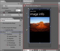
[Click on image for larger view.] |
| Figure 1. |
To exit state recording mode, you can either select the Base state from the States window or you can click the red dot in the top left corner of the design surface. In Figure 1 you can also see that the PhotoInfoText node has a red dot against it. This indicates that one or more properties on this control have been changed in the selected state. In this case it is the Visibility property (indicated by the Visibility child node) that has been set to Collapsed in order to hide the information text in the Photo state. Conversely in the Information state, the PhotoImage element would be Collapsed.
If you examine the XAML you will see that the two VisualStates exist and that they comprise a Storyboard. The Storyboard defines what properties should be changed, the new value of those properties and the time, or key frame, at which the change should be effected.
<VisualStateManager.VisualStateGroups>
    <VisualStateGroup x:Name="PhotoStates">
    	<VisualState x:Name="Photo">
    		<Storyboard>
    			<ObjectAnimationUsingKeyFrames Storyboard.TargetProperty="(UIElement.Visibility)" Storyboard.TargetName="PhotoInfoText">
    				<DiscreteObjectKeyFrame KeyTime="0">
    					<DiscreteObjectKeyFrame.Value>
    						<Visibility>Collapsed</Visibility>
    					</DiscreteObjectKeyFrame.Value>
    				</DiscreteObjectKeyFrame>
    			</ObjectAnimationUsingKeyFrames>
    		</Storyboard>
    	</VisualState>
    	<VisualState x:Name="Information">
    		<Storyboard>
    			<ObjectAnimationUsingKeyFrames Storyboard.TargetProperty="(UIElement.Visibility)" Storyboard.TargetName="PhotoImage">
    				<DiscreteObjectKeyFrame KeyTime="0">
    					<DiscreteObjectKeyFrame.Value>
    						<Visibility>Collapsed</Visibility>
    					</DiscreteObjectKeyFrame.Value>
    				</DiscreteObjectKeyFrame>
    			</ObjectAnimationUsingKeyFrames>
    		</Storyboard>
    	</VisualState>
    </VisualStateGroup>
</VisualStateManager.VisualStateGroups>
To transition between the two VisualStates, all you need to do is to call the static GoToState method on the VisualStateManager class. The following code wires up an event handler, the MouseLeftButtonDown event on the PhotoImage control, in order to invoke the GoToState method specifying the Information VisualState. It also overrides the OnBackKeyPress method in order to intercept the hardware back key being pressed, returning to the Photo VisualState if the PhotoImage is Collapsed (which occurs when the page is in the Information state).
public MainPage() {
    InitializeComponent();

    PhotoImage.MouseLeftButtonDown += PhotoClick;
}

private void PhotoClick(object sender, MouseButtonEventArgs e) {
    VisualStateManager.GoToState(this,"Information",true);
}

protected override void OnBackKeyPress(CancelEventArgs e) {
    base.OnBackKeyPress(e);

    if (PhotoImage.Visibility == Visibility.Collapsed) {
        VisualStateManager.GoToState(this, "Photo", true);
        e.Cancel = true;
    }
}
You'll notice that the GoToState method accepts three parameters. The first is the control whose state you want to change. In this case the states have been defined on the page, so you pass in a reference to the page itself. The second parameter is the name of the state that you wish to transition to. Rather than using string literals you might want to define an enumeration for the states and use it to specify the state changes, for example:
private enum States {
    Photo,
    Information
}

VisualStateManager.GoToState(this,States.Photo.ToString(),true);
The last parameter indicates whether transitions should be used. If this value is false, no animation sequences will be played and the new state will take effect almost instantaneously. In the case of the states we've defined, despite specifying true, the state changes happen immediately. This is because we haven't actually defined any transitions.
Let's return to the States window and delete the existing states. Create two new states using the same names, Photo and Information. Select the Photo state, then in the Objects and Timeline window, select the PhotoInfoText node. On the Properties window, locate the Transform - Projection section and set the RotationY value to 90 (you should see the PhotoInfoText control rotate into a thin line). Next, select the Information state, then in the Objects and Timeline window, select the PhotoImage node. This time set the RotationY value to -90. Change the Default transition to 1s in the States window. Lastly in the top right corner of the States window click the Turn on transition preview button. Now when you select between the Photo and Information states in the States window, you should see a 1 second animation that rotates the controls in and out of view.
In watching the animation between the two states, you'll notice that the animation feels wrong because the text overlays across the image for a portion of the sequence (Figure 2). In defining the transition all we did was allow the VisualStateManager to determine the transition to be applied over the 1 second duration.
Click the drop down alongside the Photo state and select Photo Information. This will create a custom transition from the Photo state to the Information state.
Next, in the Objects and Timeline window drag the right end of PhotoImage - RotationY bar in the timeline back to 0.5 seconds, and the left end of the PhotoInfoText – RotationY bar to the 0.5 seconds. This will allow the PhotoImage to rotate to vertical before the PhotoInfoText is rotated onto screen, preventing the overlapping you saw with the default transition.
In this post you've seen how to create VisualStates for pages within your Windows Phone application and transition between them. You also saw how you can override the default transition in order to tailor the animation sequence.
About the Author
Nick Randolph runs Built to Roam, a consulting company that specializes in training, mentoring and assisting other companies build mobile applications. With a heritage in rich client applications for both the desktop and a variety of mobile platforms, Nick currently presents, writes and educates on the Windows Phone platform.