Mobile Corner
Windows Phone 7 Data Binding with Templates
Nick Randolph walks through Windows Phone 7 data binding and how you can use templates to create customized lists.
- By Nick Randolph
- 09/01/2011
Coming to Windows Phone 7 from a traditional Windows Forms background, one of the things that took me some time to become familiar with was the Model-View-ViewModel (MVVM) design pattern. It seemed that there was a lot of rhetoric on the Web about this pattern, without there being an official definition. I'd like to propose that the MVVM pattern is, at its heart, the use of data binding.
Essentially, the Model refers to any classes/objects that you load into memory that represent the state of the application; the View is what you're presenting to the user, which in most cases is a page; and the ViewModel is little more than the current state of the View. While there's a multitude of different ways to wire these three components together, the essence of MVVM is that at some point you'll set the DataContext of one or more elements on your View to be the ViewModel, and then you'll set properties on those elements through data binding. If this doesn't make sense now, fear not! This article will illustrate data binding and show you just how much you can do without resorting to writing copious lines of code.
To illustrate the use of data binding, we're going to start with a new application that's going to display a list of customers. You can create this using the Windows Phone Application template in either Visual Studio 2010 or Expression Blend 4. One of the great features of Expression Blend is the ability to create design-time data. This enables a designer to create sample data to work with during design time, so they can see the visual layout without having to run the application.
In Expression Blend you can create design time data from the Data window by selecting the New Sample Data option from the Create Sample Data drop-down. Give the data set a name -- for example, DesignData -- and click OK. You should see a set of new nodes appear in the Data window starting with DesignData. Rename the Collection node to CustomerList; as you can probably guess, this is a collection property, which will represent the list of customers to be displayed. Select Property1 and rename it to Name, then click the drop-down type selector on the far right and change the Format to Company Name. Select Property2 and rename it to IsActive. You've just created a design-time set of customer objects, each of which has a Name string property (populated using the Company Name template) and an IsActive Boolean property.
You can view this data by clicking the Edit Sample Values button on the CustomerList node. Figure 1 illustrates the Data window on the left and the corresponding Edit Sample Values window where you can view and edit the generated design-time data.
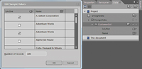
[Click on image for larger view.] |
| Figure 1. The New Project dialog includes entries for Silverlight and XNA Windows Phone development. |
Now that we have a set of design-time data, we can use this to design our page layout. Start by dragging the CustomerList node from the Data window across into the main area of the design surface. When you move over the design surface you should see a text balloon appear near your cursor saying "Create a [ListBox] and bind its ItemsSource property to CustomerList." Because we're going to be using a ListBox initially, this sounds like what we want. To accept this prompt, simply release the mouse button over the design surface and a ListBox will be created, displaying the list of customers we just created in the design time data. One thing you'll notice is that the list only takes up a small portion of the page. If you right-click on the ListBox and select Auto-Size | Fill, the ListBox will be resized to fill the available area on the page.
You'll notice that for each customer in the ListBox there's a CheckBox, which displays the IsActive property, and a TextBlock, which displays the Name property. However, we don't actually want to see the IsActive property. Instead, we just want to hide those customers who aren't currently active (in other words, IsActive is false). To do this, we can go in and edit the template that's used to define how each item is displayed. This is done by right-clicking on the ListBox and selecting Edit Additional Templates | Edit Generated Items (Item Template) | Edit Current. You'll notice that the contents of the Objects and Timeline window changes to show just the contents of the ItemTemplate, in this case a StackPanel with a CheckBox and TextBlock nested within it. If you open the XAML view of the page you'll see the corresponding markup for the template:
<DataTemplate x:Key="CustomerListItemTemplate">
  <StackPanel>
    <CheckBox IsChecked="{Binding IsActive, Mode=TwoWay}"/>
    <TextBlock Text="{Binding Name}"/>
  </StackPanel>
</DataTemplate>
In this case we're going to simplify the template to just display the Name of the customer:
<TextBlock Text="{Binding Name}" Style="{StaticResource PhoneTextLargeStyle}"/>
You'll notice that we've also applied one of the Windows Phone 7 styles, which will define the font and size of the text. However, we're still going to see all of the customers in the list, irrespective of whether they're active or not. To hide those customers that have IsActive as false, we need to data bind the Visibility property of the TextBlock to the IsActive property on the customer. Unfortunately, these properties are of different types, which means we can't bind them directly. Luckily, we can use a value converter to translate between the different types. Add the following class to your application, which will convert from bool to Visibility and vice versa:
public class BoolVisibilityConverter : IValueConverter {
  public object Convert(object value, Type targetType,
    object parameter, CultureInfo culture) {
    if (!(value is bool)) return Visibility.Collapsed;
    return ((bool) value) ? Visibility.Visible : Visibility.Collapsed;
  }

  public object ConvertBack(object value, Type targetType,
    object parameter, CultureInfo culture) {
    if (!(value is Visibility)) return false;
    return (Visibility) value == Visibility.Visible;
  }
}
Now all you need to do is add the data binding to the Visibility property of the TextBlock element. In Expression Blend (make sure you rebuild the project after adding the value converter) locate the Visibility property on the TextBlock. Click the small square next to the value drop-down and select Data Binding. The Fields list will initially only contain the CustomerList node, but if you change the Show drop-down (on the right side of Figure 2) to All Properties, you should be able to select the IsActive property. You'll also need to select a value converter. Because you won't already have an instance of the BoolVisibilityConverter, you'll need to click the ellipsis button, which will open a dialog where you can locate and create a new instance of the converter. You should end up with the Create Data Binding dialog that looks similar to Figure 2.
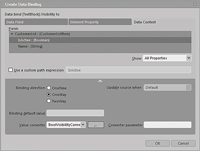
[Click on image for larger view.] |
| Figure 2. The Properties tool window in Expression Blend. |
When you click OK and exit template-editing mode (click on the ListBox marker at the top of the design surface), you'll see that a number of the customer records are now no longer displayed.
While you now have a list of customers, they're currently not sorted and are in one potentially very long list. Windows Phone 7 has a useful list control that allows the user to jump to different letters in the alphabet as a way of quickly navigating over a large number of items (for example, the list of contacts in the People hub). This control is available in the Silverlight for Windows Phone Toolkit (silverlight.codeplex.com), and is called the LongListSelector. We're going to replace the ListBox in our current layout with this control. To follow along you'll need to download, install and reference the Silverlight for Windows Phone Toolkit in your application.
Start by selecting the existing ListBox and deleting it. From the Assets window, find, select and drag an instance of the LongList-Selector onto the design surface. Again, you'll most likely need to right-click on the newly created control and select Auto-Size | Fill to resize the list to take up the available space on the page. The LongListSelector is slightly different than your usual list controls in that the list items need to be grouped. This means that if you attempt to data bind the existing design-time data, you won't see any data. Unfortunately, there's no way to group the design-time data using the designer in Blend. Luckily, there isn't that much code involved in grouping the design-time data, and it can be done in a way so that you still have the design-time experience within Blend.
The first thing that you'll need is a generic Group class. This reusable class, shown in Listing 1, can be used whenever you use the LongListSelector.
Next, you'll need a class that will hold the grouped customers. The GroupedCustomers class creates an instance of the design time data set and groups it according to letters of the alphabet, as shown in Listing 2.
The only thing left to do is to actually create an instance of the GroupedCustomers class. This can be done in XAML in the same way that the original design-time data was done by Blend. In the App.xaml file, add a GroupedCustomer element within the Application.Resources node. You'll need to add the appropriate .xml namespace to the opening Application node, as well, as shown in Listing 3.
Make sure you do a project rebuild in Blend and close and reopen the page you've been working on. You should see that there's a Customers node in the Data window. Expand this node and locate the CustomersByLetter node. Drag this node across onto the [LongListSelector] node on the Objects and Timeline window. This will prompt you to select the property to data bind; select the ItemsSource property. As there's no template defined, all you should see is a list of type names. Right-click on the control and select Edit Additional Templates | Edit ItemTemplate | Apply Resource | CustomerListItemTemplate. This will set the template for each of the customers being displayed in the list using the template we created earlier for the ListBox.
You'll notice that while the customers are grouped by starting letter, there's no group header. Again, this is because there's no template defined for the group headers. Select Edit Additional Templates | Edit GroupHeaderTemplate | Create Empty; give the template a name, GroupHeaderItemTemplate; and select the LongListSelector from the "Define in" drop-down. Modify the XAML of the group header to the following:
<DataTemplate x:Key="GroupHeaderItemTemplate">
  <Border Background="{StaticResource PhoneAccentBrush}"
           HorizontalAlignment="Left"
           Margin="0,0,0,12" MinWidth="78" MinHeight="78">
    <TextBlock TextWrapping="Wrap"
                 Style="{StaticResource PhoneTextLargeStyle}"
                 Text="{Binding KeyName}" VerticalAlignment="Bottom" />
  </Border>
</DataTemplate>
The LongListSelector also requires you to define the GroupItemTemplate, which defines how the group headers will appear in the list that allows the user to jump quickly through the list. By default these items will appear in a list, but in our case we want to override this to display them in a series of square tiles. To do this we also need to define the GroupItemsPanel to use the WrapPanel, which is also found in the Silverlight for Windows Phone Toolkit:
<ItemsPanelTemplate x:Key="GroupPanelTemplate">
  <toolkit:WrapPanel Orientation="Horizontal" />
</ItemsPanelTemplate>

<DataTemplate x:Key="GroupItemTemplate">
  <Border Width="99"
           Height="99"
           Margin="6"
           IsHitTestVisible="{Binding HasItems}"
           Background="{StaticResource PhoneAccentBrush}">
    <TextBlock Text="{Binding KeyName}"
                 Foreground="{StaticResource PhoneForegroundBrush}"
                 VerticalAlignment="Bottom"
                 Style="{StaticResource PhoneTextExtraLargeStyle}"
                 Margin="6,0" />
  </Border>
</DataTemplate>
And there you have it. You should see the grouped customers at design time in Expression Blend, and when you run the application you should be able to jump through the list of customers (see Figure 3).
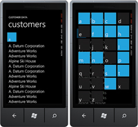
[Click on image for larger view.] |
| Figure 3. A simple application layout |
You might notice that, unlike the right-hand image in Figure 3, the jump list in your application has the background of each group header item set to the accent color. One task for you as the reader is to adjust the background of the group header items in the jump list, so that if there are no items for a particular letter, the background is dimmed (hint: adjust the Background property of the Border in the GroupItemTemplate using a value converter).
About the Author
Nick Randolph runs Built to Roam, a consulting company that specializes in training, mentoring and assisting other companies build mobile applications. With a heritage in rich client applications for both the desktop and a variety of mobile platforms, Nick currently presents, writes and educates on the Windows Phone platform.