Papa's Perspective
5-Minute Tour of CSS3 Background Gradients
Major browsers support CSS3 gradients (including Internet Explorer 10), but with different rendering engines, it's still good to have fallbacks.
Designing the presentation layer of an HTML5 application requires some familiarity with Cascading Style Sheets (CSS). You might want to set the background of an element or set of elements using the latest standard definition of the language, CSS3. The CSS3 background property sets the background for an element, but some of its features behave differently based on the CSS parsing by various browsers' rendering engines. This is where vendor prefixes and a little knowledge of how to apply them can be very handy. First I'll demonstrate how the CSS background property works; then introduce some tools you can use for gradients and show you how to make them work across different browsers. You can find the complete source code for this sample here.
Simple Scenario
Figure 1 shows a simple Timer in Microsoft Internet Explorer 9. The numbers should use a background to give it a little bit of depth. In this example, the background image is 1px wide and 72px tall.
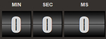 |
| Figure 1. Background image in Microsoft Internet Explorer 9. |
By default a background is placed at the top-left corner of an element. The background is repeated both vertically and horizontally over the entire space the element covers.
Using an image is perhaps the easiest and most supported way to set the background. The syntax is quite simple, as shown in the bg CSS class here:
.bg
{
  background: url(/images/bg.png);
}
This approach is the recommended way to use backgrounds in Internet Explorer because it doesn't support gradients (unless you're using Internet Explorer 10).
Gradient Fallback Color
However, if you don't have a background image prepared or you need your background to be flexible enough to change later, you could use gradients. The browser does not have to request and download the background image -- not a huge file, but still one more thing to download.
The catch with gradients is the major browsers all implement them differently.
It's important to first create a fallback color for the gradient for that "just in case" scenario. You might have missed the proper syntax that a specific browser requires, or the browser might not support gradients at all. In the following CSS example, the background color is set first as a fallback. Then if the browser supports the gradients and it finds the valid CSS syntax, it will use the gradient instead:
.bg
{
  /* fallback color */
  background-color: #000000;

  /* begin listing gradients */

}
Creating a Gradient in Chrome and Safari
There are a few ways you can write vendor-specific prefixes to handle gradients. One common way is to simply hand-type them. Another approach is to find a Web page that generates the CSS.
For example, take a look at the syntax to define a gradient using the latest version of the Google Chrome browser. Chrome looks for the vendor prefix for WebKit, in this case –webkit-gradient. You can then define the type of gradient, the coordinates for the angle of the gradient and any stop points to change the color:
/* chrome gradient syntax */
background: -webkit-gradient(
  type,
  x y,
  x y,
  color-stop(percentage, color),
  color-stop(percentage, color),
  color-stop(percentage, color)
  );
You can create a gradient from bottom to top, using a shade of blue for the background of the numbers with multiple color stops.
The following CSS declares that browsers supporting WebKit should use a linear gradient starting from the left bottom and angling to the left top. Effectively, this paints the gradient from the bottom to the top, which is what you want. Next, a series of color stops are defined. In this example, each color stop indicates the position in a percentage between 0.00 and 1.00 and the color. The first color at the bottom is defined by the stop at 0, which indicates that the start color is black using rgb(0,0,0). The next color stop is defined at 46 percent of the way up from the bottom and uses a shade of blue with rgb(11, 111, 211). The color will gradually change from black to blue between the bottom and the stop at 46 percent:
background: -webkit-gradient(
  linear,
  left bottom,
  left top,
  color-stop(0, rgb(0, 0, 0)),
  color-stop(0.46, rgb(11, 111, 211)),
  color-stop(0.46, rgb(0, 0, 0)),
  color-stop(0.50, rgb(0, 0, 0)),
  color-stop(0.50, rgb(11, 111, 211)),
  color-stop(1, rgb(0, 0, 0))
  );
The next color is also at 46 percent and goes back to black. Because there are two stops at the same point, this effectively tells the browser to switch colors immediately at that stopping point. The next color is at 50 percent. It's also black, which creates a thin, solid black line in the middle. Finally, there are two more color stops in which the color will gradually change from blue to black again from 50 percent all the way to the top at 100 percent. The net result is shown in Figure 2, which is using Chrome (but the CSS example also works in the WebKit-based Safari browser).
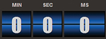 |
| Figure 2. Gradient in Google Chrome 16. |
Creating a Gradient in Firefox
The latest versions of Mozilla Firefox also support gradients, but using a slightly different syntax. WebKit expects the type of gradient (for example, linear) to be indicated as a parameter while Mozilla requires the type to be defined in the vendor prefix:
background: -moz-linear-gradient(
  angle location,
  color percentage,
  color percentage,
  color percentage
  );
The angle and location don't indicate a starting and ending point, which was the case with WebKit. Instead, they simply indicate the angle (such as center) and where to start (bottom). Finally, multiple color stops are supported using colors and percentages (instead of decimals):
background: -moz-linear-gradient(
  center bottom,
  rgb(0, 0, 0) 0%,
  rgb(211, 111, 111) 46%,
  rgb(0, 0, 0) 46%,
  rgb(0, 0, 0) 50%,
  rgb(211, 111, 111) 50%,
  rgb(0, 0, 0) 100%
  );
This CSS example shows the exact same gradient as the previous example for WebKit, except the colors. It creates a red and black gradient for the background in Firefox, as shown in Figure 3.
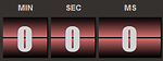 |
| Figure 3. Gradient in Mozilla Firefox 9 |
Putting It Together
When you put all of this together, the CSS class might look like the code in Listing 1.
Notice the fallback color is indicated first, so if the user's browser doesn't support any of the other options, then the background color will default to black with no gradient. Next, the background image is set, which will be used by browsers that don't support gradients. Finally, WebKit and Mozilla browsers will use the gradient syntax. So what you end up with is Internet Explorer 9 rendering the background image, Chrome and Safari rendering a blue/black gradient, and Firefox rendering a red/black gradient. I used different colors here simply to point out the differences when you run them in the browsers. I recommend that you use similar colors in your renderings in real-world apps.
What Else?
Tools can be very helpful in creating gradients. Several Web sites help you create gradients and even generate the vendor-specific syntax for the CSS. The following two sites are a good place to start:
Both of these Web sites generate the CSS for the different browsers I discussed. They also generate the syntax for the Internet Explorer 10 beta, which supports gradients.
As a side note, Visual Studio extensions such as Web Essentials will help you generate vendor-specific prefixes. If you've already defined some of the prefixes, Web Essentials will skip those and generate any missing ones. This extension does not support CSS3 background gradients, but the creator (Mads Kristensen) tells me he has it high on his list of upcoming features. Web Essentials does support CSS3 border-radius, among other standard definition features. It'll also fill in extensions for –moz, –webkit, –ms and –o. And that's Papa's perspective.
About the Author
John Papa is a Microsoft Regional Director and former Microsoft technical evangelist. Author of 100-plus articles and 10 books, he specializes in professional application development with Windows, HTML5, JavaScript, CSS, Silverlight, Windows Presentation Foundation, C#, .NET and SQL Server. Check out his online training with Pluralsight; find him at johnpapa.net and on Twitter at twitter.com/john_papa.