UI Code Expert
Putting Metro Style Design Principles to Work
"Metro" is the term for apps running on Windows 8/ARM. But what does it mean in terms of design?
The term "Metro style" is a little ambiguous, as it refers both to a Windows Runtime (WinRT) application targeted at Windows 8 and an application or Web site that has a particular look and feel. In this article, I'll discuss the latter, drilling into the details of the style that characterizes a Metro-style application or Web site.
To get started, it's important to understand the vision and purpose of the Metro style. This is outlined in a set of Metro design principles, which can be found here and are displayed in Figure 1 as a mind map.
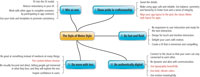
[Click on image for larger view.] |
| Figure 1. Metro-style design principles. |
Even if you only glanced over the list, you'd come away with the strong sense that the Metro style isn't just about UI, and it certainly isn't simply a list of rules (for instance, "Use this font," or, "Ensure the title bar is x pixels"). Rather, the principles are about inspiring quality -- about moving UI engineering from an afterthought to a primary activity. Even the principles themselves exemplify the principles: they're self-referentially coherent.
The principles indicate a pride in the craft of UI design; they inspire confidence and motivate toward accuracy (detail) that in turn builds a sense of safety and reliability. The principles are devoid of redundancy and are written as a series of bullet points (rather than paragraphs) to achieve the functional minimalism they advocate.
However, in spite of the quality of the principles themselves, they're too high-level to give rubber-meets-the-road guidance on what it means, in UI design, to create a Metro application or Web site. The details for that are instead found in the UX guidelines for Metro apps. Let's consider some of the guidelines focused on the UI look of the Metro style:
- Layout and navigation
- Typography
- App bars (toolbars)
Layout and Navigation
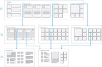
The first area of detail included in the UX guidelines is the navigation design for Metro apps. Using a hierarchical approach, the Metro navigation design enables a flow from top-level down to detail, but it also supports flat navigation (a wizard, for example). Figure 2 shows a hierarchical navigation example.
[Click on image for larger view.] |
| Figure 2. Hierarchical Metro navigation. |
In addition to the navigational flow presented in Figure 2, also notice the layouts of each page. They're comprised of tiles, and the tiles themselves are defined within tile templates. However, in keeping with "the sweat the details, fit into the UI model, and use balance, symmetry and hierarchy" principles, the tiles themselves need to align with 20x20 pixel grid units (possibly broken further into a 5x5 pixel grid subunits). In addition, the left and top margins have specifications; the content itself should start at six units from the left and seven units from the top.
Typography
Another area given significant attention in the Metro UX guidelines is the typography -- the arrangement of text so as to accentuate the meaning of the content (consider the on-tech example). In keeping with the "content before chrome" principle, the typography's role is not to distract but rather augment the content -- to make it come alive and be immersive and compelling. To this end, Microsoft recommends specific fonts for roles:
- Segoe UI for Controls and UI Elements
- Calibri for Read/Write (for instance, a multiline text box)
- Cambria for Reading
And, more specifically, only four sizes of these fonts (none of which should be displayed italic):
- 11 pt. Segoe UI Semilight for most text
- 9 pt. Segoe UI for short text elements, such as button captions
- 20 pt. Segoe UI Light for text elements that need to be clearly visible and draw user attention, but are short and fit on a single line
- 42 pt. Segoe UI Light for prominent UI elements that consist of one or two words on a single line
Application Bars (Toolbars)
When it comes to the toolbar -- called the app bar in Metro -- there are guidelines, too. Icons are to be 48x48 pixels with a center graphic not to exceed 26x26 pixels, and generally without color. (There are several large Metro app bar icon packs available for free, including those from Syncfusion Inc., metro.windowswiki.info and icons8.com.) For some, this might seem overwhelmingly restrictive and creativity-stifling.
However, consider the purpose. Imagine a graphic like the one presented in Figure 3. Signs like this are intentionally succinct, crisp, internationally understood, unambiguous and intuitive. They follow the Metro principle of "bold, vibrant colors" and "content before chrome" in such a way as to inspire confidence. Rather than an oil painting whose goal is to communicate art, signs like this are about communicating purpose. So following the app bar guidelines will not only build an association of the page or application with Metro, it will also result in increased usability.

[Click on image for larger view.] |
| Figure 3. Clean, simple, bold typography should be a goal of your graphics. |
Guidelines, Not Rules
Although there's much more to cover in the world of Metro UX guidelines, you might already be feeling overly restricted by the constraints discussed. How, you might wonder, do you create a distinctive application that expresses creativity?
It's important to understand that the Metro style is comprised of guidelines, not rules. The guidelines are there to establish a framework for people to build and expand on; they're not a legal document to constrain creativity. To emphasize this, note that there are specific areas where freedom of expression is explicitly enabled.
For example, if your logo font isn't Segoe UI, and the logo appears elsewhere on the page, designers are explicitly granted the freedom to use a font that integrates with the logo. Similarly, if you're designing a game, you're not required to use one of the official Metro layouts or restrict color expression in ways unnatural to your application.
In other words, the Metro style is a collection of guidelines; as such, when there's a good reason for an exception, make that exception. This doesn't mean the guidelines should be ignored; they emerged from strong principles, which in turn were based on significant research. Therefore, follow them wherever possible to create something cohesive -- but cohesive within the platform.
About the Author
Mark Michaelis (http://IntelliTect.com/Mark) is the founder of IntelliTect and serves as the Chief Technical Architect and Trainer. Since 1996, he has been a Microsoft MVP for C#, Visual Studio Team System, and the Windows SDK and in 2007 he was recognized as a Microsoft Regional Director. He also serves on several Microsoft software design review teams, including C#, the Connected Systems Division, and VSTS. Mark speaks at developer conferences and has written numerous articles and books - Essential C# 5.0 is his most recent. Mark holds a Bachelor of Arts in Philosophy from the University of Illinois and a Masters in Computer Science from the Illinois Institute of Technology. When not bonding with his computer, Mark is busy with his family or training for another triathlon (having completed the Ironman in 2008). Mark lives in Spokane, Washington, with his wife Elisabeth and three children, Benjamin, Hanna and Abigail.