In-Depth
New Views on Windows 8 Metro-Style Development
FlipView, ListView and GridView are new controls for Windows 8 Metro-style applications. They'll become key tools for building great-looking UIs.
- By Michael Crump
- 08/03/2012
With Windows 8 and Visual Studio 2012 getting closer to general availability, Microsoft-focused developers are starting to pay closer attention. They're not only trying to understand the ins and outs of Windows 8, but are also wrapping their heads around a new runtime called Windows Runtime (WinRT).
WinRT is the new Microsoft programming model to build Metro-style apps using Windows 8. One of the challenges developers face with WinRT is learning how to use the new controls introduced with the release: FlipView, ListView and GridView.
While the controls sound similar, they're different in many ways. Read on to learn how and when to use each.
Setting Up
Before getting started, you need to download the following items:
- The Windows 8 release preview from the Windows 8 Download Center. You can run Windows 8 on actual hardware or install it onto a virtual machine (VM) or virtual hard disk (VHD).
- The Visual Studio 2012 release candidate is required to build Metro applications and comes with several templates to jump-start your development efforts.
- I also recommend downloading some Metro app samples for cross-reference. The samples pack is licensed for public use, so feel free to use it in your own applications.
Before diving into the controls, let's take a moment to define each one:
FlipView: An item control that displays one item at a time, and which enables "flip" behavior for traversing its collection of items.
ListView: Very similar to a standard ListBox, but it's optimized for Windows 8 touch. It displays a collection as a stack of items.
GridView: Allows creation of a grid-based layout and supports grouping of items. It displays items in a grid.
FlipView
We'll begin with the FlipView control first. This control lets you flip through a collection of items, one at a time. It's typically used for displaying a gallery of images, making it perfect, for example, for a photo album.
Let's begin by creating our first FlipView control. We'll add several items through XAML, then add items by binding to a data source.
While the most common scenario for adding items to a FlipView is adding images, it can also accept any UI element, such as a rectangle. Our first sample instantiates a FlipView control, then adds several FlipViewItems to the FlipView control, as shown in Listing 1.
Running this sample and flipping to the second item results in the image in Figure 1.
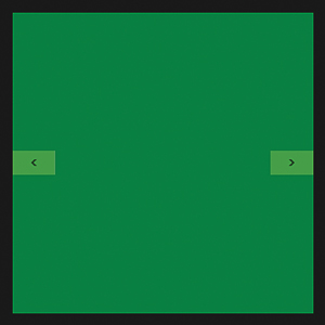 |
| Figure 1. The FlipView control from Listing 1, showing the second item. |
You should have noticed the backward and forward button appear. You can continue navigating through the items; at the last item, the forward button will be removed. The logic of toggling the visibility of these buttons happens automatically.
You're not limited to adding the items through XAML; you can also bind to the ItemSource Property of the FlipView control. Let's look at another sample of binding through the ItemSource Property through codebehind:
<FlipView x:Name="FlipView1" Width="500" Height="500" >
  <FlipView.ItemTemplate>
   <DataTemplate>
     <UserControl>
       <TextBlock Text="{Binding}" VerticalAlignment="Center"
         HorizontalAlignment="Center" FontSize="26.667" Foreground="White" />
     </UserControl>
   </DataTemplate>
  </FlipView.ItemTemplate>
</FlipView>
We first created our FlipView control and then added a FlipVi- ew.ItemTemplate, which will define how the data will be presented when displayed on the screen. In this case, we added a TextBlock inside of a UserControl and set the Text to be binding to the data stored in the ItemSource property.
Our codebehind file contains a simple List<T> with four names and finally binds that List to the FlipView ItemSource property:
List<string> lstNames = new List<string>();
lstNames.Add("Jesse Liberty");
lstNames.Add("Michael Crump");
lstNames.Add("Atley Hunter");
lstNames.Add("Burke Holland");
FlipView1.ItemsSource = lstNames;
If you run the application now, you'll see your list of names inside the FlipView, with the ability to navigate through them as shown in Figure 2.
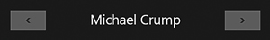 |
| Figure 2. Items being added to the ItemSource property through codebehind. |
The FlipView by default uses the horizontal orientation. You can easily switch this by adding a StackPanel inside the FlipView ItemsPanel, and giving it a vertical orientation:
<FlipView.ItemsPanel>
  <ItemsPanelTemplate>
    <StackPanel Background="Transparent" Orientation="Vertical"/>
  </ItemsPanelTemplate>
</FlipView.ItemsPanel>
Notice the backward and forward buttons are now vertical, as shown in Figure 3.
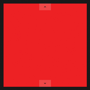 |
| Figure 3. Vertical orientation of the FlipView control. |
ListView vs. GridView
Both the ListView and GridView are able to display data collections efficiently. While the functionality of each is similar, they display their data differently.
The ListView displays data stacked vertically; it's typically used to show an ordered list of items. Typical applications might include an e-mail client or the results of a text search.
The GridView also stacks data vertically by default, but typically you would use this control to stack data horizontally to show an item that takes up more screen space.
It's typical to use both ListViews and GridViews in the same application. You might use a ListView when your application is Snapped, and a GridView when the application is running in the full screen. As a matter of fact, the default Grid and Split Templates that come with Visual Studio 2012 do this out of the box.
ListView Control
Let's begin by looking at a simple example of the ListView control that displays a rectangle, along with a TextBlock detailing the color name. As shown from the XAML in Listing 2, you first instantiate a ListView control. Next, you'll need to add several ListViewItems similar to what you did with the FlipView; first, though, you need to add them to the ListView.Items collection.
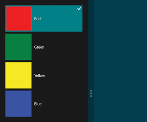
Running the application in the standard full-screen mode, you should get the result shown in Figure 4.
[Click on image for larger view.] |
| Figure 4. ListView control with an item selected in full-screen mode. |
If you select an item you'll see it highlighted, and you'll see a checkbox in the right-hand corner. This functionality is added automatically with the control.
If you snap the application by dragging it into the left- or right-hand side of the screen, you'll see what's shown in Figure 5.
 |
| Figure 5. The ListView control in the Snapped mode view. |
Good News with GridView
The XAML you just created for ListView can be easily converted into a GridView by simply swapping out the word "ListView" with "GridView." You can also change the StackPanel orientation from vertical to horizontal for a more consistent look with this control.
This application stacks items vertically by default, but as mentioned before, you'd typically use it to display data horizontally to show additional information about an item.
You can easily add this functionality by adding the following code snippet to the GridView control:
<GridView.ItemsPanel>
  <ItemsPanelTemplate>
    <WrapGrid Orientation="Horizontal"/>
  </ItemsPanelTemplate>
</GridView.ItemsPanel>
Notice that inside the GridView ItemsPanelTemplate a WrapGrid has been added, and the orientation set to horizontal. The WrapGrid class positions child elements sequentially from left to right or top to bottom. It's also worth noting that you can add the WrapGrid class inside of a ListView as well. Figure 6 shows the new orientation.
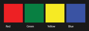 |
| Figure 6. The GridView displaying several items in a horizontal layout.
|
You can also limit the amount of items to display with the WrapGrid by setting the MaximumRowsOrColumns property:
  <WrapGrid Orientation="Horizontal"
    MaximumRowsOrColumns="3"/>
The change results in Figure 7. If you snap this application, a scrollbar is automatically added if everything can't fit on the screen.
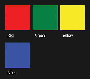 |
| Figure 7. The MaximumRowsOrColumns property being set on the WrapGrid class. |
Interacting with ListView and GridView
Having learned how to create the ListView and GridView controls, it's time to learn how to interact with them. By default, both allow users to select a single item. You can override this behavior by changing the SelectionMode property to None and IsItemClickedEnabled property to True:
<ListView SelectionMode="None" IsItemClickEnabled="True" />
You'll also need to add a name and event handler, along with some ListViewItems:
<ListView x:Name="lstView1" SelectionMode="None" IsItemClickEnabled="True"
  ItemClick="lstView1_ItemClick_1">
  <ListView.Items>
    <ListViewItem>Jesse Liberty</ListViewItem>
    <ListViewItem>Michael Crump</ListViewItem>
    <ListViewItem>Atley Hunter</ListViewItem>
    <ListViewItem>Burke Holland</ListViewItem>
  </ListView.Items>
</ListView>
Now, when a user clicks on an item in the ListView or GridView control, you can see which item was chosen by reviewing the e.ClickedItem Property, as shown in Figure 8.
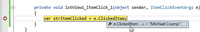
[Click on image for larger view.] |
| Figure 8. Notice that the e.ClickedItem maps to the user named "Michael Crump" that was selected from the ListView control. |
Semantic Zoom
Now that you've seen what the ListView and GridView controls are capable of, let's explore using them both with the Semantic Zoom control, as Windows 8 has touch-enabled slates in mind.
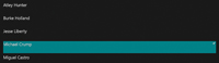
Semantic Zoom is basically a pinch gesture associated with an optical zoom. It's typically used to switch between different views of the same data. The most common scenario is switching from a more detailed view to a top-level view. A perfect use-case scenario for this would be a list of Persons in the detailed view and the first character of the Person's name in the top-level view. This allows the end user to quickly navigate items in the list by clicking the first character of the Person's name they wish to see. Before creating it, take a look at the screenshots of the completed project.
The app loads a list of Persons in the ListView control, which resides inside the ZoomedInView of the Semantic Zoom control (seen in Figure 9). After a user zooms out with a pinch gesture, a list of items sorted alphabetically appears that includes the first character of the Person's name in the GridView control, as shown in Figure 10. After a user selects a letter, it will zoom in and select the first name that matches that character, as shown in Figure 11.
 |
| Figure 9. The list of Persons a user can select using the ListView and Semantic Zoom controls. |
 |
| Figure 10. List of first characters of a Person's name that the user can select using the GridView and Semantic Zoom controls. |
[Click on image for larger view.] |
| Figure 11. The name is automatically selected after the user selects the first character of the name. |
The XAML to create this UI is shown in Listing 3. You should find this familiar, with the only differences being in the Semantic Zoom declaration. After declaring a Semantic Zoom control, you need to add your ListView and GridView to the ZoomedInView and the ZoomedOutView properties. You're also using an ItemTemplate to specify the visualization of the data objects. The last thing to note is the additional Button Event Handler to help navigate the data when the user selects an item.
Once the XAML is in place, you can begin adding the codebehind. You'll first need to declare a public List<T> outside your constructor:
List<string> lstNames = new List<string>();
You can then add several items to the List<T> under the InitializeComponent method inside the constructor, and bind that List to the FlipView and the GridView ItemSource property. Notice that before the List binds to the ListView you're using a simple LINQ statement to order the data alphabetically. On the GridView control, you're doing the same thing, except you're only selecting the first character of the string to display and you only want unique values:
lstNames.Add("Jesse Liberty");
lstNames.Add("Michael Crump");
lstNames.Add("Miguel Castro");
lstNames.Add("Atley Hunter");
lstNames.Add("Burke Holland");
lstView.ItemsSource = lstNames.OrderBy(x => x.Substring(0,1));
grdView.ItemsSource = lstNames.Select(
  x => x.Substring(0, 1)).Distinct().OrderBy(x => x.Substring(0,1));
On the button click event handler, you need to cast e.OriginalSource as a FrameworkElement to get the data contained in the button's "Content" property. You can then set the SelectedItem on the ListView to the first item found in the List<T> collection. In this case, if the user selected the letter "M," it would automatically scroll to "Michael Crump" in the ListView:
private void btnZoomedOutView_Click(object sender, RoutedEventArgs e)
{
  object selected = (e.OriginalSource as FrameworkElement).DataContext;
  lstView.SelectedItem = lstNames.First(x => x.StartsWith(selected.ToString()));
}
Keeping the Promise of Windows 8
These three controls are available only in Metro applications and are essential for most of your programs, whether they're photo-based apps, e-mail clients or social media applications. Experiment with them and you'll find they're flexible, powerful, and help deliver on the promise of Windows 8 and mobile computing.