Mobile Corner
Windows Phone and Windows 8.x: Designing Once for Both with XAML
How to define common XAML resources to improve the consistency of your applications.
- By Nick Randolph
- 08/06/2014
With each iteration of the Windows Phone OS, it's getting nearer to converging with the Windows desktop OS (Windows 8.x). The most recent Windows Phone update includes support for universal applications, where a much larger set of APIs are shared across the Windows Phone and Windows development platforms. In fact, for the first time you can now develop UI elements, such as pages and controls, which can be shared between both platforms.
This article looks at how to define XAML resources that can be used throughout your application. Common XAML resources include colors, brushes, converters, styles and templates, but can really be any object instance that can be declared in XAML and placed in a resource dictionary. I'll look at how you can declare XAML resources and how they can be scoped for use, and you'll learn how you can use XAML resources to ensure consistency throughout your application.
I'll start with how XAML resources are declared, illustrating how attributes for a TextBlock can be converted into XAML resources. For this I'll use a universal application based on the Blank App (Universal Apps) project template. This project template creates both Windows 8.1 and Windows Phone 8.1 head applications and a Shared project where assets to both applications can be defined.
Switching to Blend for Visual Studio
I'll add a TextBlock to the MainPage for both Windows and Windows Phone applications, with the Text of "Hello World!" After adding each TextBlock, I need to right-click and select Layout, Reset All -- this will remove any of the unnecessary default attributes applied by Blend.
I'll select the TextBlock on the MainPage for the Windows Phone application and set the Foreground color explicitly using the Properties window to a light blue, resulting in the following XAML:
<TextBlock Text="Hello World!" Foreground="#FF77BBFF"/>
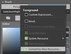
In order to reuse this color elsewhere on the page, I'll need to promote the value into a XAML resource. I can do this by clicking on the white square alongside the Foreground property in the Properties window and selecting Convert to New Resource, as shown in Figure 1.
 [Click on image for larger view.]
Figure 1. Creating a XAML Resource from a Property Value
[Click on image for larger view.]
Figure 1. Creating a XAML Resource from a Property Value
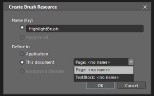
This will launch the Create Brush Resource dialog shown in Figure 2, where I can specify the name of the resource, HighlightBrush, and where the resource should be defined.
 [Click on image for larger view.]
Figure 2. Creating a Resource Dialog
[Click on image for larger view.]
Figure 2. Creating a Resource Dialog
According to the dialog, the resource can be defined in either Application or This document, with a choice between the Page or TextBlock. These options define the scope where the resource can be used. A resource defined in the Application can be referenced by any element in any page or user control within the application. If it's defined in This document, with the Page option, it will be accessible to any element on the page. Choose This document, with the TextBlock option, it will be accessible only to that element and any of its nested child elements. As you can see, I've chosen This document with the Page option.
Taking a look at the XAML, you'll notice there's a new Page.Resources element that contains a SolidColorBrush -- that's the newly created resource. This is then referenced by the TextBlock:
<Page.Resources>
  <SolidColorBrush x:Key="HighlightBrush" Color="#FF77BBFF" />
</Page.Resources>

<TextBlock Text="Hello World!" Foreground="{StaticResource HighlightBrush}" />
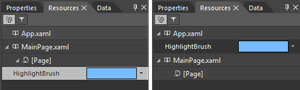
The HighlightBrush resource can be referenced when setting any attribute, on any element contained on the Page, which expects a Brush. In order to make this resource available to elements on other pages or user controls, it needs to be moved to the Application level, where it's defined in the App.xaml file. This can be easily done using the Resources window in Blend. Note that the Resources window is only available when a XAML page is the active document in designer mode (that is, not code-only mode). Figure 3 shows the HighlightBrush before and after it has been dragged from MainPage.xaml to App.xaml.
 [Click on image for larger view.]
Figure 3. Moving the HighlightBrush Resource
[Click on image for larger view.]
Figure 3. Moving the HighlightBrush Resource
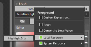
An interesting side effect of moving the HighlightBrush resource into the App.xaml file is that it's now accessible to both the Windows and Windows Phone applications. This is because the App.xaml is in the Shared project where all files are included in both applications. In Blend I can open the MainPage of the Windows application, select the TextBlock and then select the HighlightBrush from the list of Local Resources. Figure 4 shows the list of Local Resource available for use as the Foreground Brush, which can be found by clicking on the grey square alongside the Foreground property in the Property window.
 [Click on image for larger view.]
Figure 4. Selecting an Existing Resource
[Click on image for larger view.]
Figure 4. Selecting an Existing Resource
Currently, the HighlightBrush is defined in App.xaml, making it available everywhere across both applications. Instead of setting foreground, background or border colors inline in XAML this resource can be referenced instead. Referencing it ensures the same color is used throughout the application, and when you need to change the color, you only need to make the change in one location.
So far I've shown that resources can be declared at different levels, such as the Application (in App.xaml) or the Page. It's important to note that any element that derives from FrameworkElement can have resources associated with it and those resources will be accessible from any child control. For example, you can declare resources for a Grid within the Grid.Resources element; these resources would be available to any element placed within that Grid.
As the application grows the number of resources will also grow, causing the App.xaml file to grow. It might be necessary to move resources into separate files in order to better manage them. In the Projects window, I right-click the Shared project and add a new folder called Resources. I then right-click on the folder and select Add New Item. From the New Item dialog I select Resource Dictionary and give it a name, ColorsBrushesConverters.xaml, and select OK. This adds a resource dictionary to the application, and it also adds the necessary XAML to the App.xaml in order to merge the resources declared in the resource dictionary into the Application resources, like so:
<Application.Resources>
  <ResourceDictionary>
    <ResourceDictionary.MergedDictionaries>
      <ResourceDictionary Source="ms-appx:///Resources/ColorsBrushesConverters.xaml"/>
    </ResourceDictionary.MergedDictionaries>
    <SolidColorBrush x:Key="HighlightBrush" Color="#FF77BBFF"/>
  </ResourceDictionary>
</Application.Resources>
The ColorsBrushesConverters resource dictionary will be used, as the name suggests, to hold any Color, Brush or Converter resources that need to be accessible across the entire application. Again, using the Resources window the HighlightBrush can be relocated into the ColorsBrushesConverters resource dictionary.
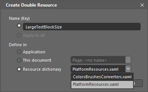
Both the Windows 8 and Windows Phone applications share the same value for the HighlightBrush. In some cases you may want to define a single XAML resource that has different values for each platform. Suppose I want to specify a different font size for the TextBlock on each platform. To do this I add a folder called Resources, and another resource dictionary to each application with the same file name, PlatformResources.xaml. I select the TextBlock on the MainPage in the Windows Phone application and create a new resource from the font size property in the Properties window, using the same process as before, except this time I create the resource in the PlatformResources.xaml using the Resource dictionary option. It should now be enabled in the Create Resource dialog, shown in Figure 5.
 [Click on image for larger view.]
Figure 5. Creating a Resource in a Resource Dictionary
[Click on image for larger view.]
Figure 5. Creating a Resource in a Resource Dictionary
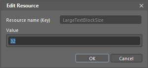
The font size property in the Properties window should have a green border. If I click the green square alongside the property I can select Edit Resource, which presents an editor, shown in Figure 6, to allow me to update the value of the resource.
 [Click on image for larger view.]
Figure 6. Editing a Resource
[Click on image for larger view.]
Figure 6. Editing a Resource
I will repeat the same process for the TextBlock on the MainPage in the Windows application, this time setting the font size to 94 instead of 32.
At this point you might wonder why it's relevant that the LargeTextBlockSize has the same Key and is located in a resource dictionary with the same file name in both Windows 8 and Windows Phone projects, given it's only referenced by elements located in pages specific to the relevant platform. There are at least two cases where this becomes important. First, you might decide you want to define a page or user control in the Shared project. In order for the page/control to reference the resource it has to exist in both platform projects. The second scenario is when you use the resource as a building block for more complex resources. I'll show this in the next step where I create a Style resource.
So far I've been creating simple XAML resources that consist of single elements such as a SolidColorBrush or a Double. These resources have been applied individually to the TextBlock, as shown in the following XAML:
<TextBlock Text="Hello World!" Foreground="{StaticResource HighlightBrush}"
  FontSize="{StaticResource LargeTextBlockSize}" />
As the number of attributes grows, it's necessary to make sure all of them are applied to each TextBlock. An alternative is to combine them into a Style resource that then can be set via a single attribute.
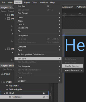
I'll create a Style resource by selecting the TextBlock on the MainPage in the Windows application and from the Object menu selecting Edit Style, Create Empty (see Figure 7).
 [Click on image for larger view.]
Figure 7. Creating a Style Resource
[Click on image for larger view.]
Figure 7. Creating a Style Resource
The Style resource will be called DefaultTextBlockStyle and placed in the Application. After clicking OK, I can specify any number of property values that will be defined in the Style by setting the appropriate value in the Properties window. In this case I'll change the Foreground to use the HighlightBrush and the FontSize to use the LargeTextBlockSize. This will define a Style in the App.xaml as follows:
<Style x:Key="DefaultTextBlockStyle" TargetType="TextBlock">
  <Setter Property="Foreground" Value="{StaticResource HighlightBrush}"/>
  <Setter Property="FontSize" Value="{StaticResource LargeTextBlockSize}"/>
</Style>
The TextBlock element in MainPage of the Windows 8.x application has the Style attribute set instead of both Foreground and FontSize:
<TextBlock Text="Hello World!" Style="{StaticResource DefaultTextBlockStyle}" />
Switching to the MainPage of the Windows Phone application I can update the TextBlock element to be the identical XAML. Note how, despite referencing the same XAML resource, the TextBlock is a different size on each platform thanks to the platform-specific resource dictionary.
Consistent to the End
Without defining resources it's very easy to have a mishmash of colors, fonts, font sizes and so on throughout your application. As you get started with resources, you'll find that it feels like more work initially, but as your application grows you'll find the effort involved in making your application consistent far outweighs the minimal effort required to define reusable resources.
About the Author
Nick Randolph runs Built to Roam, a consulting company that specializes in training, mentoring and assisting other companies build mobile applications. With a heritage in rich client applications for both the desktop and a variety of mobile platforms, Nick currently presents, writes and educates on the Windows Phone platform.