Mobile Corner
Tips for Creating Windows Phone Apps Using Blend for Visual Studio 2015
Nick looks at the preview release of Blend for Visual Studio 2015 and demonstrates some tips and tricks that will save you time and help you build better looking Windows Phone applications.
- By Nick Randolph
- 12/09/2014
Microsoft recently revealed the first public preview of the new look Blend for Visual Studio 2015. In this article, I'll provide a quick overview of some of the changes, as well as looking into a variety of tips and tricks that can be used to build high (visual) quality applications, rapidly. While I will present these tips and tricks in the context of building a Universal application targeting both Windows and Windows Phone, most of them apply to using Blend for building them using any XAML technology, for example, Silverlight or WPF.
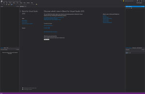
One of the most striking differences is just how similar to Visual Studio it appears. While Blend has retained the default dark theme, a number of the tool windows have been replaced with those from Visual Studio, including their default positions. Figure 1 illustrates the default layout of the tool windows.
A summary list of changes:
| Previous Blend Version |
Blend for Visual Studio 2015 |
| Modal startup dialog -- New or open existing project |
Start page -- Links to recent projects, creating new projects and lots of related content and news |
| Projects (left side) -- Lists projects and files |
Solution Explorer (right side) -- Lists projects, folders and files |
| Properties -- Blend-style layout |
Properties -- Switched to using Visual Studio-like layout |
| Devices -- For shared files, ability to switch designer context between Windows and Windows Phone designer view |
Code editor -- To switch context, use the dropdown that’s available when the XAML or in the code behind. |
| Code/XAML editor -- No IntelliSense support |
Code/XAML editor -- IntelliSense across both code window and XAML |
|
While these layout changes felt almost cosmetic, they point to an underlying unity between Blend and Visual Studio, which should mean that developers can move easily and with familiarity between the two products.
 [Click on image for larger view.]
Figure 1. The New-Look Blend
[Click on image for larger view.]
Figure 1. The New-Look Blend
Wireframes to Page Navigation
One of the primary outputs of the initial design phase of an application should be the page hierarchy and/or a navigation architecture of the application. In the case of Universal applications, this is of particular importance as the navigation architecture needs to allow for the continuum of screen real estate, ranging from low resolution Windows Phone devices all the way through to potentially multi-window desktop machines. Some applications use the same set of pages to target Windows and Windows Phone, but this only works for simple applications or results in design compromises where the user experience suffers at one or both ends of the device spectrum.
Part of the user experience design process needs to determine at what point it makes sense to transition between layouts and navigation paths in order to provide an optimum experience across all devices. Layout changes may result in different pages or simply the use of different visual states. The choice of navigation path may be based on device type, resolution, orientation or a combination of these factors.
Note that the requirement for a navigation architecture is an absolute, even for development teams that lack the support of a designer or user experience consultant. By defining what pages make up your application and how the application should flow between pages you're both validating that the core use cases for your application are going to work, and you're establishing the scope of what you have to develop.
With the list of pages, and the corresponding flow between them, the easiest place to start with development is to generate each of the pages and stitch them together using simple Button elements on the screen. This process should take no more than a day, even for the most complex applications, since you're simply creating pages and connecting them to the other pages adjacent to it in the navigation architecture. Once done, you should have your first buildable, runnable, application -- even at this early stage the team can walk through each of the core use cases and again validate that they're going to work.
Next, you need to add in all the functional elements onto the page, according to the wireframes. At this point the wireframes and/or visual designs for each page should be refined enough so that you know what controls need to be added to each page. In this pass through the application you're not interested in how each element looks, only that the user can interact with it. You should be using design-time data at this point to make your application look more real. Design-time data can also be enabled at runtime to allow you to run your application, stepping through each page, all the while seeing mock data being displayed.
After all the functional elements have been added to the appropriate page, the work load for each page can be divided up into applying the visual design and wiring up the logic for the page. This provides a great way to separate an application into discrete pieces of work that can easily be distributed among a team of developers.
Designs as Background
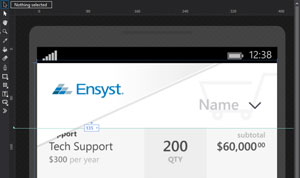
A trick I often use when attempting to re-create the beautiful design that a designer has prepared for an application is to place an image of what each page should look like as the background of the page. In fact, sometimes we'll even do this as part of the initial phase of creating and connecting the pages up (previous section), thereby giving the application a finished look almost immediately.
Guidelines
Having the designs as a background means that you can easily adjust sizes and positions by simply adjusting heights, widths, margins, etc., until the elements align with the background image. However, sometimes you may want a higher level of precision, particularly when aligning items across or down a page. This is where a little-known yet extremely useful feature of Blend, called guidelines, is used, as shown in Figure 2.
 [Click on image for larger view.]
Figure 2. Guidelines for Aligning Content
[Click on image for larger view.]
Figure 2. Guidelines for Aligning Content
Guidelines are created by clicking with the mouse in either the horizontal ruler at the top, or the vertical ruler on the left side of the design surface, and dragging either down or across to position the guideline. As you drag the line, an indicator appears indicating the distance from either the top or the left side of the page; in this case, it's 135 from the top. The indicator can be toggled to show the distance from the bottom or right side by clicking on the dropdown next to the numeric value. The guidelines that you add to a page are persisted along with the project and can even be checked into source control so that they're available to your entire team.
Design-Time Data
Despite the sharing of a significant number of features, Blend and Visual Studio still do service different developer audiences. Well, at least they serve different developer mindsets: code-oriented business logic creation vs. user experience, design and layout focus. To this end, Blend still has some feature exclusives, such as design-time data and visual states.
Design-time data is particularly useful during both development and maintenance phases of an application. In fact design-time data can make performing maintenance tasks, such as adding/removing elements or adjusting layout and design, much simpler since you can see immediately on the design surface what the application looks like without having to run it.
Often referred to as sample or mock data, design-time data comes in a couple of different formats within Blend:
Sample data generated from a class hierarchy -- This is great if you have an existing class hierarchy which isn't likely to change and has all the necessary properties required by the design. It's hard to adjust the sample data and the only way to add properties is to modify the underlying classes.
Sample data loaded from JSON file -- As the sample data is going to be loaded from a JSON file it makes it very easy to adjust or modify the contents of the sample data. In fact if your application is going to be connecting to a service which returns JSON, you can simply include the response from that service as sample data within your application. Unfortunately the flip side is that you have to either maintain a separate class hierarchy or align the JSON sample data with the classes used by your application.
Sample data created in Blend -- In this model you create a new project or page-level data source into which you can create a collection of object, a complex object or simple properties. For each object in the collection, or complex objects, you can then define what properties it has. Properties can be of String, Number, Boolean or Image data type, and you can then provide additional input on how the sample data is created (for example a string property might have sample data that looks like an address). The advantage of this model for sample data is that it is completely disconnected -- except through the data binding attributes-- from the classes that you'll use within your application. This makes it easy and quick to modify the sample data, allowing you to build out your application much quicker. Obviously at some point you'll have to then adjust the classes and their properties to align with the sample data.
Visual States
XAML developers who have become proficient with Blend are easy to identify as they often tend to favor using Visual States over data binding to the Visibility or Opacity properties of elements. Take a common example such as a progress bar that would appear while data is loading. One way would be to data bind the Visibility property of the progress bar to an IsLoading property on the data context of the page. The data is being loaded the logic in the application would switch the IsLoading property to true, and then back to false once the data had been loaded. Alternatively, two visual states could be defined on the page: Loading, NotLoading, with the former having the progress bar Visibility set to Visible and the latter with the same property set to Collapsed. In this case the logic of the application would trigger a visual state change to Loading before attempting to load data, and then to NotLoading after data loading had completed.
There are two distinct advantage of Visual States that make Blend one of the most advanced application design tools available:
- Rather than having to adjust the design time data for the page in order to see the alternate view, there is a Visual States tool window in Blend that allows each Visual State to be viewed and edited at design time.
- Data binding to the Visibility property makes it hard to animate the transition between the two views. With Visual States, it is possible to create an explicit transition between states, making it straight forward to fade content in and out, or slide content in or off the page.
Reusable Content Templates
One of the things that frustrates me is seeing repeated blocks of code. This is true both in C# and in XAML. Unfortunately with XAML developers often get lazy and think that it's going to be simpler and quicker to just copy and paste the XAML rather than think about creating a reusable component.
There are a couple of ways to create reusable XAML. The two that we often use are creating a UserControl or using a ContentControl with a DataTemplate. The former is easier since Blend makes it easy to create a new UserControl, layout content and then add that new control to a page, or in fact into another UserControl. However, this is often more than is necessary, particularly if you just interested in reusing the layout. This is where the ContentControl approach is useful. Let's say we have the following piece of XAML which we want to use multiple times, perhaps with a different bit of text in the TextBlock:
<Grid Width="200" Height="200" >
  <Ellipse Fill="#FFF4F4F5" Stroke="Black"/>
  <TextBlock TextWrapping="Wrap" Text="TextBlock"
    HorizontalAlignment="Center" VerticalAlignment="Center"
      TextAlignment="Center" Foreground="Black"/>
</Grid>
In this case we create a ContentControl which look like the following:
<StackPanel>
  <StackPanel.Resources>
    <DataTemplate x:Key="TextInACircleTemplate">
      <Grid Width="200" Height="200" Margin="100,0" >
        <Ellipse Fill="#FFF4F4F5" Stroke="Black"/>
        <TextBlock TextWrapping="Wrap" Text="{Binding}"
        HorizontalAlignment="Center" VerticalAlignment="Center"
        TextAlignment="Center" Foreground="Black"/>
      </Grid>
    </DataTemplate>
  </StackPanel.Resources>

  <ContentControl Content="Text1" ContentTemplate="{StaticResource TextInACircleTemplate}"/>
  <ContentControl Content="Text2" ContentTemplate="{StaticResource TextInACircleTemplate}"/>
</StackPanel>
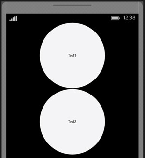
In this example the DataTemplate defines the layout of each circle with text in the middle. The Text attribute of the TextBlock is data bound to the current data context. There are then two ContentControls, with different Content set, but use the same ContentTemplate. The result is illustrated in Figure 3.
 [Click on image for larger view.]
Figure 3. Reusing XAML
[Click on image for larger view.]
Figure 3. Reusing XAML
In this article you've seen a high level overview of Blend for Visual Studio 2015 and some tips and tricks that will make your time with Blend more productive. Don't stop here -- start building all your pages and controls in Blend; get familiar with the extra tool windows such as Visual States and Data, and see how it will help you build better looking applications, quicker than ever before.