Mobile Corner
Debugging XAML with Live Visual Tree and Live Property Explorer Windows
In this article Nick Randolph breaks down XAML for the Universal Windows Platform using the Live Visual Tree and Live Property Explorer tool windows in Visual Studio 2015.
- By Nick Randolph
- 08/25/2015
The development of XAML-based applications is made easier using design tools such as Blend for Visual Studio, which can provide a design surface where the application can be viewed during development without having to run the application. However, at runtime it can be difficult to diagnose misplaced elements, incorrect animations, data-binding errors or other layout-related issues.
Visual Studio 2015 brings with it two new tool windows, the Live Visual Tree and Live Property Explorer that can be used to diagnose and adjust layouts at runtime. I'll walk through a simple application and explore the visual tree that's generated at runtime using the Live Visual Tree.
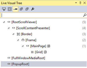
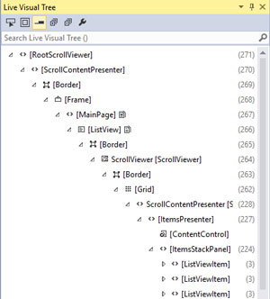
I'll start by creating an application using the Blank App (Universal Windows) project template. This template generates a minimal application, with a single page that contains a single Grid element. However, when run, the application contains many more elements in the visual tree, as shown in Figure 1.
 [Click on image for larger view.]
Figure 1. The Visual Tree of a Basic Application
[Click on image for larger view.]
Figure 1. The Visual Tree of a Basic Application
The out-of-the-box styles and templates that come with the Universal Windows Platform (UWP) include a number of elements that a typical application will require. In some cases you might want to adjust these styles to remove excess items. For example, in Figure 1, the Frame contains a ContentPresenter which is used to host the MainPage. The Frame style can be adjusted to eliminate the ContentPresenter by setting the Template for the Frame to x:Null, as shown in the following XAML and in Figure 2:
<Application.Resources>
  <Style TargetType="Frame">
    <Setter Property="HorizontalContentAlignment"
            Value="Stretch" />
    <Setter Property="IsTabStop"
            Value="False" />
    <Setter Property="VerticalContentAlignment"
            Value="Stretch" />
    <Setter Property="Template"
            Value="{x:Null}" />
  </Style>
</Application.Resources>
 [Click on image for larger view.]
Figure 2. Reduced Visual Tree
[Click on image for larger view.]
Figure 2. Reduced Visual Tree
Next, I'll add some basic content to the page including a ScrollViewer, a StackPanel and a series of Borders:
<ScrollViewer>
  <StackPanel>
    <Border Background="Red" Height="50" VerticalAlignment="Stretch" />
    <Border Background="Orange" Height="50" VerticalAlignment="Stretch" />
    <Border Background="Green" Height="50" VerticalAlignment="Stretch" />
    ... <!-- these three Border elements are repeated 20 times -->
  </StackPanel>
</ScrollViewer>
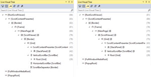
In this case, adding the ScrollViewer again added many more elements, some of which aren't used because the content will only ever scroll vertically (Figure 3, left).
 [Click on image for larger view.]
Figure 3. Reduced ScrollViewer Template
[Click on image for larger view.]
Figure 3. Reduced ScrollViewer Template
The ControlTemplate for the ScrollViewer can be simplified to remove elements that aren't going to be used, as shown in Listing 1.
Lising 1: The Simplified ControlTemplate
<ControlTemplate x:Key="ScrollViewerControlTemplate1"
                 TargetType="ScrollViewer">

  <Grid>
    <VisualStateManager.VisualStateGroups>
      <!-- Visual States omitted for readability -->
    </VisualStateManager.VisualStateGroups>
    <Grid.ColumnDefinitions>
      <ColumnDefinition Width="*" />
      <ColumnDefinition Width="Auto" />
    </Grid.ColumnDefinitions>
    <ScrollContentPresenter x:Name="ScrollContentPresenter"
                            ContentTemplate="{TemplateBinding ContentTemplate}"
                            Margin="{TemplateBinding Padding}" />
    <ScrollBar x:Name="VerticalScrollBar"
               Grid.Column="1"
               IsTabStop="False"
               Maximum="{TemplateBinding ScrollableHeight}"
               Orientation="Vertical"
               Visibility="{TemplateBinding ComputedVerticalScrollBarVisibility}"
               Value="{TemplateBinding VerticalOffset}"
               ViewportSize="{TemplateBinding ViewportHeight}"
               HorizontalAlignment="Right" />
  </Grid>
</ControlTemplate>
Figure 3 (right) shows the updated ScrollViewer visual tree, which no longer has elements such as the HorizontalScrollBar and ScrollBarSpacer.
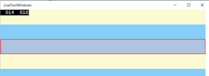
At the top of the Live Visual Tree window there are a series of buttons that are useful when exploring the visual tree of a running application. The first button on the toolbar will "Enable selection in the running application" which, when enabled, will show a red dashed border around the element selected on the running application (Figure 4).
 [Click on image for larger view.]
Figure 4. Selection Border in Running Application
[Click on image for larger view.]
Figure 4. Selection Border in Running Application
The second button will "Display layout adorners in the running application," making it easy to identify which element in the running application has been selected in the Live Visual Tree; The third button, "Preview selection," will display the XAML for the selected element.
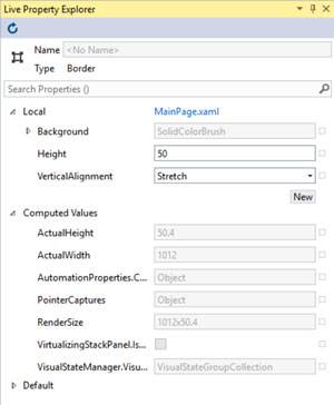
Detecting and eliminating unnecessary elements in the visual tree is just one use of the Live Visual Tree window. With an element selected in the Live Visual Tree, properties on that element can be modified via the Live Property Explorer (Figure 5). Properties are divided into three sections showing property values specified directly on the element (Local), inherited from explicit or implicit styles (Computed Values) and default values (Default).
 [Click on image for larger view.]
Figure 5. Live Property Explorer
[Click on image for larger view.]
Figure 5. Live Property Explorer
Existing Local values can be altered at runtime; alternatively clicking the New button allows other properties to be specified, as if they were defined directly on the selected element.
A topic that can often cause confusion among developers is how list controls reuse visual elements in order to improve scroll performance. I'll discuss this in the context of a ListView, which I will bind to 1,000 items, as illustrated in the XAML and code in Listing 2.
Listing 2: XAML and Code for Binding a ListView to 1,000 Times
<ListView ItemsSource="{Binding Items}">
  <ListView.ItemTemplate>
    <DataTemplate>
      <Grid>
        <TextBlock Text="{Binding}" />
      </Grid>
    </DataTemplate>
  </ListView.ItemTemplate>
</ListView>

public sealed partial class MainPage
{
  public MainPage()
  {
    InitializeComponent();

    DataContext = new MainViewModel();
  }

  public class MainViewModel
  {
    public List<string> Items { get; } = new List<string>();
    public MainViewModel()
    {
      for (var i = 0; i < 1000; i++)
      {
        Items.Add($"Item {i}");
      }
    }
  }
}
A common misconception is that when the data binding takes place all 1,000 items are added to the visual tree of the ListView. This clearly wouldn't scale and as more items are added to the ListView the page would get increasingly overladen with visual elements causing potential memory and rendering issues.
Instead, the behavior of the ListView is that it creates enough elements to populate the visible area on the screen, and then some additional elements so that as the user scrolls up and down items immediately come into view. When this application is run and the window takes up only part of the screen, Figure 6 shows the ItemsStackPanel, which is the child element within the ListView that hosts each of the cells in the list.
 [Click on image for larger view.]
Figure 6. ListView Cell Virtualization
[Click on image for larger view.]
Figure 6. ListView Cell Virtualization
The ItemsStackPanel contains 224 children. Each ListViewItem in this case is made up of a ListViewItemPresenter, a Grid and a TextBlock, making four items in total. This equates to 56 cells (that is, 224/4) and this number doesn't vary significantly as the user scrolls up and down the list. However, if the Window is increased in size, the number of cells within the ListView will, as well. For example, if I set the application to full screen on my monitor, the number of children under the ItemsStackPanel jumps to 468, which equates to 117 cells.
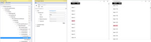
To demonstrate that cells are indeed reused, rather than being disposed and re-created, if I use the Live Visual Tree to drill into one of the ListViewItem elements and select the Grid, I can then specify the Background color in the Live Property Explorer (Figure 7, left).
Because the Background property isn't being specified for the Grid in the XAML of the application, nor in any applied Style, the Background property can be found under the Default group within the Live Property Explorer. In order to change it, I click the New button under the Local group, find the Background property in the dropdown and then specify the color I want. When defining the Background property, the Live Property Explorer displays only a single textbox for entering the color, which will accept either a color name (for example, Pink) or an ARGB value (for example, #FF112233). After defining the property, the display changes to show that the Background is a SolidColorBrush with the corresponding Color defined (see Figure 7, second from left).
After setting the Background, in this case on the third cell in the list, the background of the corresponding item in the list in the running application changes automatically. It's worth observing two things here: First, that even though I modified the third item in the Live Visual Tree it doesn't correspond to the third item in the list in the running application (Figure 7, second from right); second, that as I scroll through the list I see other items with the background set (Figure 7, right). Both of these observations come from the way the ListView assigns and reuses the generated cells in order to display items in the list. What you see in the Live Visual Tree in this case are all the cells that have been generated, not necessarily the order that they're appearing in the list.
 [Click on image for larger view.]
Figure 7. ListView Cell Reuse
[Click on image for larger view.]
Figure 7. ListView Cell Reuse
It's much more useful to use the Live Visual Tree and the Live Property Explorer to examine, modify and refine the visual elements of your application. Being able to observe the elements that are generated for your application makes it easy to identify layout issues and locate unnecessary elements or potential performance bottlenecks. These windows are a powerful addition to the toolset that XAML developers have at their disposal for building beautiful, yet high-performing applications.
About the Author
Nick Randolph runs Built to Roam, a consulting company that specializes in training, mentoring and assisting other companies build mobile applications. With a heritage in rich client applications for both the desktop and a variety of mobile platforms, Nick currently presents, writes and educates on the Windows Phone platform.