Mobile Corner
Building Universal Windows Apps for Universal Performance
With the Universal Windows Platform, developers can target a wide variety of devices with a single application, but it comes with performance ramifications. We look at ways to make those apps more efficient and highly performant.
- By Nick Randolph
- 01/08/2016
The Universal Windows Platform has been touted as nirvana for developers wanting to build applications that run anywhere. While it generally holds true that they do, many additional aspects of the build process need to be considered. Often the first point of discussion is how to design applications that scale across the wide variety of target devices. What is often forgotten, at least until very late in the development process, is how to build an application that is going to be both highly responsive and high performing.
In this article I'll demonstrate how a design decision can affect an application, and what measures can be taken to improve performance.
To set the scene, the application we'll look at is a simple photo viewer with images taken from the public Flickr feed shown in Figure 1. On a large screen the images are to be presented as tiles, with the title overlayed at the bottom of the image. Tapping on a tile displays a large version of the image in a pane to the right of tiles.
 [Click on image for larger view.]
Figure 1: Large Screen View
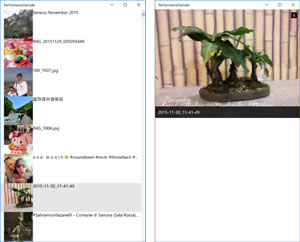
When the application window is reduced to a narrow width (Figure 2), or the application is run on a mobile device, the images are presented in a list. Tapping on an item in the list switches the view to display the image in full screen.
 [Click on image for larger view.]
Figure 2: Narrow View
Listing 1
 contains the XAML code, and includes three areas that contain a ListView, a GridView and a pane that displays details of the selected image.
Listing 1: Initial Page XAML
<Page x:Class="PerformanceSample.MainPage"
      xmlns="http://schemas.microsoft.com/winfx/2006/xaml/presentation"
      xmlns:x="http://schemas.microsoft.com/winfx/2006/xaml"
      xmlns:local="using:PerformanceSample"
      xmlns:d="http://schemas.microsoft.com/expression/blend/2008"
      xmlns:mc="http://schemas.openxmlformats.org/markup-compatibility/2006"
      mc:Ignorable="d">
    <RelativePanel Background="{ThemeResource ApplicationPageBackgroundThemeBrush}">
        <VisualStateManager.VisualStateGroups>
            <VisualStateGroup x:Name="LayoutStates">
                <VisualState x:Name="NarrowLayout">
                    <VisualState.Setters>
                        <Setter Target="NarrowView.(UIElement.Visibility)"
                                Value="Visible" />
                    </VisualState.Setters>
                    <VisualState.StateTriggers>
                        <AdaptiveTrigger MinWindowWidth="0" />
                    </VisualState.StateTriggers>
                </VisualState>
                <VisualState x:Name="WideLayout">
                    <VisualState.Setters>
                        <Setter Target="WideView.(UIElement.Visibility)"
                                Value="Visible" />
                        <Setter Target="Details.(RelativePanel.AlignLeftWithPanel)"
                                Value="False" />
                        <Setter Target="Details.(FrameworkElement.Width)"
                                Value="400" />
                    </VisualState.Setters>
                    <VisualState.StateTriggers>
                        <AdaptiveTrigger MinWindowWidth="640" />
                    </VisualState.StateTriggers>
                </VisualState>
            </VisualStateGroup>
            <VisualStateGroup x:Name="SelectionStates">
                <VisualState x:Name="ItemSelected">
                    <VisualState.Setters>
                        <Setter Target="Details.(UIElement.Visibility)"
                                Value="Visible" />
                    </VisualState.Setters>
                </VisualState>
                <VisualState x:Name="NoSelection" />
            </VisualStateGroup>
        </VisualStateManager.VisualStateGroups>
        <Grid x:Name="NarrowView"
              Visibility="Collapsed"
              RelativePanel.AlignTopWithPanel="True"
              RelativePanel.AlignBottomWithPanel="True"
              RelativePanel.AlignLeftWithPanel="True"
              RelativePanel.AlignRightWithPanel="True">
            <ListView  ItemsSource="{Binding Photos}"
                       SelectionChanged="ItemSelectionChanged">
                <ListView.ItemTemplate>
                    <DataTemplate>
                        <Grid Height="100">
                            <Grid.ColumnDefinitions>
                                <ColumnDefinition Width="100" />
                                <ColumnDefinition />
                            </Grid.ColumnDefinitions>
                            <Image Stretch="UniformToFill"
                                   Source="{Binding MediaUrl}">
                            </Image>
                            <Grid  Grid.Column="1">
                                <TextBlock Text="{Binding Title}"
                                           Foreground="Black"
                                           TextTrimming="CharacterEllipsis" />
                            </Grid>
                        </Grid>
                    </DataTemplate>
                </ListView.ItemTemplate>
            </ListView>

        </Grid>
        <Grid x:Name="WideView"
              Visibility="Collapsed"
              RelativePanel.AlignTopWithPanel="True"
              RelativePanel.AlignBottomWithPanel="True"
              RelativePanel.AlignLeftWithPanel="True"
              RelativePanel.LeftOf="Details">
            <GridView ItemsSource="{Binding Photos}"
                      SelectionChanged="ItemSelectionChanged">
                <GridView.ItemTemplate>
                    <DataTemplate>
                        <Grid Height="200"
                              Width="200">
                            <Image Stretch="UniformToFill"
                                   Source="{Binding MediaUrl}">
                            </Image>
                            <Grid VerticalAlignment="Bottom"
                                  MaxHeight="30">
                                <Border Background="Black"
                                        Opacity="0.8" />
                                <TextBlock Text="{Binding Title}"
                                           Foreground="White"
                                           TextTrimming="CharacterEllipsis" />
                            </Grid>
                        </Grid>
                    </DataTemplate>
                </GridView.ItemTemplate>
            </GridView>
        </Grid>
        <Grid x:Name="Details"
              DataContext="{Binding SelectedPhoto}"
              Visibility="Collapsed"
              RelativePanel.AlignLeftWithPanel="True"
              RelativePanel.AlignTopWithPanel="True"
              RelativePanel.AlignRightWithPanel="True"
              RelativePanel.AlignBottomWithPanel="True"
              Background="White">
            <Grid VerticalAlignment="Top"
                  MinHeight="200">
                <Image Stretch="Uniform"
                       Source="{Binding MediaUrl}">
                </Image>
                <Grid VerticalAlignment="Bottom">
                    <Border Background="Black"
                            Opacity="0.8" />
                    <TextBlock Text="{Binding Title}"
                               Foreground="White"
                               TextWrapping="WrapWholeWords"
                               Margin="10" />
                </Grid>
                <Border Width="20"
                        Height="20"
                        Background="Black"
                        VerticalAlignment="Top"
                        HorizontalAlignment="Right"
                        Margin="10"
                        Tapped="CloseTapped">
                    <TextBlock Text="X"
                               Foreground="White"
                               HorizontalAlignment="Center"
                               VerticalAlignment="Center"
                               TextAlignment="Center" />
                </Border>
            </Grid>
        </Grid>
    </RelativePanel>
</Page>
There are two visual state groups that switch between Narrow and Wide visual states, and switch between ItemSelected and NoSelection visual states. In the Narrow visual state, the ListView takes up the full screen; the Details pane is shown across the top of the ListView when the ItemSelected visual state is selected. In the Wide visual state, the GridView takes up the full screen. However, in the ItemSelected visual state is selected, the GridView reduces in width and the Details pane is shown on the right of the screen.
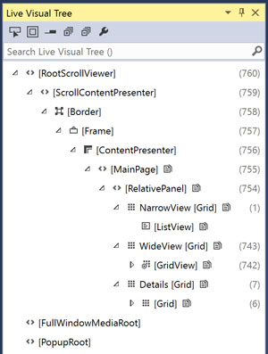
Examining the XAML, it would appear that I've done the right thing, setting the Visibility property on the NarrowView, WideView and Details Grid elements to Collapsed. However, using the Live Visual Tree tool window in Visual Studio (see Figure 3), it is clear that not only have these elements been created, their child elements have also been created and added to the visual tree.
 [Click on image for larger view.]
Figure 3: Live Visual Tree
When the application starts up, it will select either the Narrow or Wide visual state, which means the elements that are shown for the other states shouldn't exist in the visual tree until they are required (this is particularly true on mobile, where the Wide visual state is unlikely to ever be required). To achieve this I'm going to add the attribute:
x:DeferLoadStrategy="Lazy"
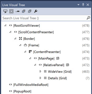
to the NarrowView, WideView and Details Grid elements. Figure 4 illustrates the updated Live Visual Tree, when the application is run with a starting window that triggers the WideLayout, where the NarrowView doesn't appear in the tree.
 [Click on image for larger view.]
Figure 4: Updated Live Visual Tree
What's interesting here is that the Details Grid is still in the visual tree, despite the DeferLoadStrategy attribute being applied. This is because the WideLayout visual state references the Details Grid in order to fix the width and the left alignment. If the launch window size is narrow, so the NarrowLayout visual state is triggered, only the NarrowView Grid would be visible in the Live Visual Tree.
In order to switch between the narrow and wide views, it is necessary to modify attributes on the Details Grid, which means that in one of the visual states, the Details Grid will be added to the visual state on startup. As the NarrowLayout visual state will be the predominant view on mobile, where there are less resources, it makes sense for the WideLayout to make the changes to the Details Grid. As shown in this example, in the NarrowLayout, the Details Grid isn't loaded until it's required.
The next area for investigation is the use of the Binding syntax. Anyone who's worked with XAML and data binding will appreciate that while it's really simple to build dynamic user interfaces, the reality is that data binding can be a bottleneck in the application.
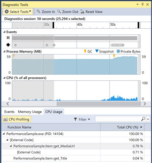
Figure 5 illustrates the new Diagnostic Tools window in action recording Events, Memory and CPU usage the running application. In this case, the only activity that's being carried out is scrolling the list of images. Examining the breakdown, there are calls to the Get operation of the properties MediaUrl and Title, but the majority of the CPU time is taken in the External Code that surrounds these calls.
 [Click on image for larger view.]
Figure 5: Databinding Performance
To try to work out what's going on I put a breakpoint in the Get operation of the MediaUrl property. When this breakpoint is hit, examining the Call Stack reveals the stack shown in Figure 6.
 [Click on image for larger view.]
Figure 6: Databinding Call Stack
In the call stack there are a couple of calls which point to the use of reflection in order to query the MediaUrl property. This is consistent with the use of the Binding syntax, which fundamentally relies on reflection in order to retrieve and update data values.
I'm going to replace each of the uses of the Binding syntax with the new x:Bind syntax. In most cases, there are no other changes to the XAML syntax. However, there are some points to note:
- x:Bind doesn't reference the DataContext of the current element, instead the context for data binding is the Page (or in the case of a UserControl, it's the UserControl itself), so the path has to be a sequence of properties that stem from the Page. Notably the Photos path becomes CurrentViewModel.Photos.
- As ListView and GridView controls don't know the type of items they are to display, in order to use x:Bind within an DataTemplate, it's necessary to specify the x:DataType attribute on the DataTemplate element.
After making these replacements and rerunning the application, when the same breakpoint is hit, Figure 7 illustrates the updated call stack, showing only three lines and interestingly no external code.
 [Click on image for larger view.]
Figure 7: Updated Call Stack
In addition to reducing the height of the call stack and eliminating external code, the larger impact is that there are no reflection calls, making this code significantly faster.
The final area of performance I'm going to look at is how images are loaded as the user scrolls through the list or grid of images. Currently, when the user does this, the application progressively downloads every single image, irrespective of whether the user stops with an image visible. This quickly leads to a large backlog of image downloads, most of which will never be seen. Using a tool, such as Fiddler, the large number of downloads can be easily seen. This has a negative impact both on the performance of the application as well as potentially chewing through valuable bandwidth.
The issue is really that every single image that is attempted to be downloaded, irrespective of whether the user has stopped at that image. In Windows 8 it was possible to wire an event handler to the ContainerContentChanging event on the ListView or GridView and then progressively reveal elements within a cell. The Universal Windows Platform provides a convenience attribute x:Phase which takes a positive integrer value which determines which phase of displaying the cell will that image be data bound.
In this case we want to delay the loading of photos until the user remains at a point in the list for a period of time. To do this, the x:Phase attribute with a value of 10, will be added to the Image element in both the ListView and GridView elements. Now, monitoring the Fiddler calls, there are still quite a high number, but they quickly fall away to a handful.
Listing 2 pulls each of these performance tricks together with the appropriate XAML attributes being applied.
Listing 2: Performance Tuning the XAML
<Page x:Class="PerformanceSample.MainPage"
      xmlns="http://schemas.microsoft.com/winfx/2006/xaml/presentation"
      xmlns:x="http://schemas.microsoft.com/winfx/2006/xaml"
      xmlns:local="using:PerformanceSample"
      xmlns:d="http://schemas.microsoft.com/expression/blend/2008"
      xmlns:mc="http://schemas.openxmlformats.org/markup-compatibility/2006"
      mc:Ignorable="d">
    <RelativePanel Background="{ThemeResource ApplicationPageBackgroundThemeBrush}">
        <VisualStateManager.VisualStateGroups>
            <VisualStateGroup x:Name="LayoutStates">
                <VisualState x:Name="NarrowLayout">
                    <VisualState.Setters>
                        <Setter Target="NarrowView.(UIElement.Visibility)"
                                Value="Visible" />
                    </VisualState.Setters>
                    <VisualState.StateTriggers>
                        <AdaptiveTrigger MinWindowWidth="0" />
                    </VisualState.StateTriggers>
                </VisualState>
                <VisualState x:Name="WideLayout">
                    <VisualState.Setters>
                        <Setter Target="WideView.(UIElement.Visibility)"
                                Value="Visible" />
                        <Setter Target="Details.(RelativePanel.AlignLeftWithPanel)"
                                Value="False" />
                        <Setter Target="Details.(FrameworkElement.Width)"
                                Value="400" />
                    </VisualState.Setters>
                    <VisualState.StateTriggers>
                        <AdaptiveTrigger MinWindowWidth="640" />
                    </VisualState.StateTriggers>
                </VisualState>
            </VisualStateGroup>
            <VisualStateGroup x:Name="SelectionStates">
                <VisualState x:Name="ItemSelected">
                    <VisualState.Setters>
                        <Setter Target="Details.(UIElement.Visibility)"
                                Value="Visible" />
                    </VisualState.Setters>
                </VisualState>
                <VisualState x:Name="NoSelection" />
            </VisualStateGroup>
        </VisualStateManager.VisualStateGroups>
        <Grid x:Name="NarrowView"
              x:DeferLoadStrategy="Lazy"
              Visibility="Collapsed"
              RelativePanel.AlignTopWithPanel="True"
              RelativePanel.AlignBottomWithPanel="True"
              RelativePanel.AlignLeftWithPanel="True"
              RelativePanel.AlignRightWithPanel="True">
            <ListView  ItemsSource="{x:Bind CurrentViewModel.Photos}"
                       SelectionChanged="ItemSelectionChanged">
                <ListView.ItemTemplate>
                    <DataTemplate x:DataType="local:Item">
                        <Grid Height="100">
                            <Grid.ColumnDefinitions>
                                <ColumnDefinition Width="100" />
                                <ColumnDefinition />
                            </Grid.ColumnDefinitions>
                            <Image Stretch="UniformToFill"
                                   Source="{x:Bind MediaUrl}">
                            </Image>
                            <Grid  Grid.Column="1">
                                <TextBlock Text="{x:Bind Title}"
                                           Foreground="Black"
                                           TextTrimming="CharacterEllipsis" />
                            </Grid>
                        </Grid>
                    </DataTemplate>
                </ListView.ItemTemplate>
            </ListView>

        </Grid>
        <Grid x:Name="WideView"
              x:DeferLoadStrategy="Lazy"
              Visibility="Collapsed"
              RelativePanel.AlignTopWithPanel="True"
              RelativePanel.AlignBottomWithPanel="True"
              RelativePanel.AlignLeftWithPanel="True"
              RelativePanel.LeftOf="Details">
            <GridView ContainerContentChanging=""
                      ItemsSource="{x:Bind CurrentViewModel.Photos}"
                      SelectionChanged="ItemSelectionChanged">
                <GridView.ItemTemplate>
                    <DataTemplate x:DataType="local:Item">
                        <Grid Height="200"
                              Width="200">
                            <Image Stretch="UniformToFill"
                                   Source="{x:Bind MediaUrl}">
                            </Image>
                            <Grid VerticalAlignment="Bottom"
                                  MaxHeight="30">
                                <Border Background="Black"
                                        Opacity="0.8" />
                                <TextBlock Text="{x:Bind Title}"
                                           Foreground="White"
                                           TextTrimming="CharacterEllipsis" />
                            </Grid>
                        </Grid>
                    </DataTemplate>
                </GridView.ItemTemplate>
            </GridView>
        </Grid>
        <Grid x:Name="Details"
              x:DeferLoadStrategy="Lazy"
              Visibility="Collapsed"
              RelativePanel.AlignLeftWithPanel="True"
              RelativePanel.AlignTopWithPanel="True"
              RelativePanel.AlignRightWithPanel="True"
              RelativePanel.AlignBottomWithPanel="True"
              Background="White">
            <Grid VerticalAlignment="Top"
                  MinHeight="200">
                <Image Stretch="Uniform"
                       Source="{x:Bind CurrentViewModel.SelectedPhoto.MediaUrl}">
                </Image>
                <Grid VerticalAlignment="Bottom">
                    <Border Background="Black"
                            Opacity="0.8" />
                    <TextBlock Text="{x:Bind CurrentViewModel.SelectedPhoto.Title}"
                               Foreground="White"
                               TextWrapping="WrapWholeWords"
                               Margin="10" />
                </Grid>
                <Border Width="20"
                        Height="20"
                        Background="Black"
                        VerticalAlignment="Top"
                        HorizontalAlignment="Right"
                        Margin="10"
                        Tapped="CloseTapped">
                    <TextBlock Text="X"
                               Foreground="White"
                               HorizontalAlignment="Center"
                               VerticalAlignment="Center"
                               TextAlignment="Center" />
                </Border>
            </Grid>
        </Grid>
    </RelativePanel>
</Page>
It's important to remember that while I've covered off a couple of important performance tips, it is likely that you'll need to track, monitor and react to how your application performs, in order to deliver the best quality application for your customers.