In-Depth
Add Custom Controls with Binding Properties to Your Xamarin.Forms App
In an app of any meaningful size, wrapping up common functionality in a composite control reduces the long-term effort needed to craft the app. Learn how to do just that right here.
Programmers spend a lot of time doing the same things over and over again. No amount of IntelliSense can overcome the number of for loops I need to write each year. But, sometimes, it's best to bundle up a set of frequently conjoined code elements into a single package, instead of constantly typing the full set of individual parts. This is what methods and classes are all about. And in the Xamarin.Forms world, composite controls fall into this category.
Building a more complicated control from constituent Xamarin-supplied parts is very straightforward, not much more work than extracting a bit of XAML from a full ContentPage and sticking it into another file. The problem is that the individual controls that make up the whole become trapped inside the new container, and their properties are not as easy to interact with when the entire composite control is placed on a page. In this article, I'll demonstrate how to endow a new complex control with its own bound properties and events that interact with the submerged parts of the larger control.
Xamarin.Forms is all about cross-platform, so create a new project using the Cross Platform App (Xamarin.Forms or Native) template in C#. When the New Cross Platform window appears, indicate a Blank App with the Xamarin.Forms UI technology, and the Portable Class Library (PCL) code sharing strategy. In a few moments, Visual Studio will generate the main project with distinct platform-friendly helper projects.
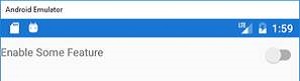
Consider a block of XAML markup that shows a switch (toggle) control, with an introductory label to its left (see Figure 1):
<Grid>
  <Grid.ColumnDefinitions>
    <ColumnDefinition Width="*"/>
    <ColumnDefinition Width="Auto"/>
  </Grid.ColumnDefinitions>
  <Label Grid.Row="0" Grid.Column="0" Text="Enable Some Feature" />
  <Switch Grid.Row="0" Grid.Column="1" />
</Grid>
 [Click on image for larger view.]
Figure 1. The Parts of a Future, Amazing Control
[Click on image for larger view.]
Figure 1. The Parts of a Future, Amazing Control
This is the kind of block that might appear, with varied text content, all throughout an app. Instead of dumping the entire block all over your XAML pages, its markup can be encapsulated into a custom control. Add a new Cross Platform | Forms ContentView item to the project named SwitchLabelControl.xaml (which adds both a XAML file and a C# codebehind file), and integrate the original content into the new XAML file, with some additional style embellishments. To assist with upcoming code, the two internal controls will have names assigned (SwitchText and SwitchValue), and an event handler will be connected to the Switch control's Toggled event. Replace the original XAML markup in the new control file with the content from Listing 1. (Change the namespace from "TestSwitchLabel" to your own namespace name, as needed, in the x:Class attribute.)
Listing 1: XAML Markup for Custom Control
<?xml version="1.0" encoding="UTF-8"?>
<ContentView xmlns="http://xamarin.com/schemas/2014/forms"
  xmlns:x="http://schemas.microsoft.com/winfx/2009/xaml"
  x:Class="TestSwitchLabel.SwitchLabelControl">
  <StackLayout Orientation="Vertical" Spacing="0" Padding="0">
    <BoxView HeightRequest="1" HorizontalOptions="Fill" Color="Teal" />
    <Grid>
      <Grid.ColumnDefinitions>
        <ColumnDefinition Width="*"/>
        <ColumnDefinition Width="Auto"/>
      </Grid.ColumnDefinitions>
      <Label x:Name="SwitchText" Grid.Row="0" Grid.Column="0" Margin="5"
        HorizontalOptions="Start" VerticalOptions="Start" />
      <Switch x:Name="SwitchValue" Grid.Row="0" Grid.Column="1"
        VerticalOptions="Start" Toggled="SwitchValue_Toggled" />
    </Grid>
    <BoxView HeightRequest="1" HorizontalOptions="Fill" Color="Teal" />
  </StackLayout>
</ContentView>
The new control markup is unexciting XAML content, but the real fun happens in the C# codebehind file. Adding a custom bound property to the new control involves three elements: a new property that defines the bound version of the property; another property that provides the public face of that feature on each class instance; and an event handler that responds to changes in the property value.
The SwitchLabelControl custom control will expose a Text property that provides access to the property of the same name on the internal Label control (SwitchText). First, create the bound property definition, a static edition of the Xamarin BindableProperty class:
// ----- Assumes: using Xamarin.Forms;
public static BindableProperty TextProperty = BindableProperty.Create(
  propertyName: "Text",
  returnType: typeof(string),
  declaringType: typeof(ContentView),
  defaultValue: string.Empty,
  defaultBindingMode: BindingMode.OneWay,
  propertyChanged: HandleTextPropertyChanged);
This static definition always includes "Property" at the end of its name by tradition (here, it's "TextProperty"), and identifies the managed data type through the returnType parameter. In this case, the Text property will be a string value, defaulting to string.Empty. The propertyChanged parameter identifies a static method (of type BindingPropertyChangedDelegate) that gets called whenever the property value is changed.
A word of warning about the defaultValue parameter: It indicates the starting value that will be associated with this property in the control's collection of bindable properties. But this initial setting doesn't trigger a call to the method defined through the propertyChanged parameter. If you wish to have that default value processed as the initial property setting, you’ll need to initiate that process manually in the instance constructor, or apply that same default value within your XAML markup on the related internal property.
The second thing needed for this bound property is the instance-level property that the other XAML pages and code blocks will interact with. It uses the data type and name defined earlier in the BindableProperty declaration:
public string Text
{
  // ----- The display text for the composite control.
  get
  {
    return (string)base.GetValue(TextProperty);
  }
  set
  {
    if (this.Text != value)
      base.SetValue(TextProperty, value);
  }
}
The custom control derives from ContentView, and this Text property uses features exposed by that base class to save and retrieve any value that passes through this property. The underlying GetValue and SetValue methods interact with the binding engine, the system that manages all of the data interactions between objects that ask to be bound together and notifies interested parties when a bound value changes.
Speaking of notifications, the third key feature for bound properties is an event handler that watches for changes in the property value. Like the BindingProperty instance added earlier, this handler is declared as static. When called, it accesses the target control instance and performs the necessary actions that are supposed to happen in the control when the value is updated. In the case of the Text property, any change will modify the Text property in the internal Label control:
private static void HandleTextPropertyChanged(
  BindableObject bindable, object oldValue, object newValue)
{
  // ----- Someone changed the full control's Text property.
  //       Store that new value in the internal Label's Text property.
  SwitchLabelControl targetView;

  targetView = (SwitchLabelControl)bindable;
  if (targetView != null)
    targetView.SwitchText.Text = (string)newValue;
}
The custom SwitchLabelControl now sports a Text property. If you add a copy of the control to the XAML content for the PCL project's MainPage, you can include a setting for this Text property, and it will propagate to the internal label's Text setting:
<local:SwitchLabelControl Text="New text set here" />
The SwitchLabelControl needs another property, Value, which provides access to the IsToggled property on the internal Switch control. The code in Listing 2 is added to the codebehind for the SwitchLabelControl class, right alongside the related code for the Text property.
Listing 2: Code for the Value Property
public static BindableProperty ValueProperty = BindableProperty.Create(
  propertyName: "Value",
  returnType: typeof(bool),
  declaringType: typeof(ContentView),
  defaultValue: false,
  defaultBindingMode: BindingMode.TwoWay,
  propertyChanged: HandleValuePropertyChanged);

public bool Value
{
  // ----- The toggle value of the internal Switch control.
  get
  {
    return (bool)base.GetValue(ValueProperty);
  }
  set
  {
    if (this.Value != value)
    {
      base.SetValue(ValueProperty, value);
    }
  }
}

private static void HandleValuePropertyChanged(
  BindableObject bindable, object oldValue, object newValue)
{
  // ----- Someone changed the full control's Value property. Store
  //       that new value in the internal Switch's IsToggled property.
  SwitchLabelControl targetView;

  targetView = (SwitchLabelControl)bindable;
  if (targetView != null)
    targetView.SwitchValue.IsToggled = (bool)newValue;
}
The code for the Value bindable property is nearly identical to the Text property's code, although it focuses on an underlying Boolean property instead of a string property. One key difference is the setting for the default binding mode. Because this property is meant to be initialized by the XAML that places the control, and other code will likely monitor any changes to the toggle control by the user, the default mode is set to BindingMode.TwoWay instead of the OneWay method used by the Text property.
External code might also wish to observe the Value property through a standard event. To enable this, add an event to the composite control that’s triggered whenever the Switch object's IsToggled value changes. A generic EventHandler delegate defines the signature of the OnValueToggled processing method:
public event EventHandler<ToggledEventArgs> ValueToggled;
protected virtual void OnValueToggled(ToggledEventArgs e)
{
  // ----- Event handler for value changes.
  ValueToggled?.Invoke(this, e);
}
To trigger this event whenever the bindable Value property changes, modify the set accessor in the Value instance property to call the event processor. That accessor currently includes this conditional statement:
if (this.Value != value)
{
  base.SetValue(ValueProperty, value);
}
Within the condition, just after the SetValue statement, add the code that activates the event:
// ----- Also notify by standard event handler.
this.OnValueToggled(new ToggledEventArgs(value));
At this point, the setting of the bindable Value property only occurs from the outside, such as when the initial values are set in XAML markup. Given the nature of this property, it's important to communicate taps on the visible control back to the binding engine. As you might recall from the control's XAML markup, I requested an event handler for the Switch control's Toggled event. When triggered, that event handler will update the Value property with its new control-based setting:
private void SwitchValue_Toggled(object sender, ToggledEventArgs e)
{
  // ----- Communicate the new value back to the property.
  this.Value = e.Value;
}
That completes the custom control. The only thing left to do is to insert it into an actual page and let the user be amazed. In the MainForm.xaml file, replace the internals of the ContentPage.Content tag with markup that employs the new control:
<StackLayout Orientation="Vertical" Spacing="10">
  <Label Text="Sign Up!" HorizontalOptions="Center"
    FontAttributes="Bold" FontSize="Large" Margin="5" />
  <Label Text="We have just what you are looking for.
    By signing up, you will be one step closer to receiving materials from us."
    HorizontalOptions="Center" Margin="5" />
  <local:SwitchLabelControl Text="Send me mountains of marketing materials"
    ValueToggled="SwitchLabelControl_ValueToggled" />
  <Label x:Name="Response" HorizontalOptions="Center" Margin="5" />
</StackLayout>
To test the control's ValueToggled event, add an event handler to the MainPage codebehind class:
private void SwitchLabelControl_ValueToggled(
  object sender, ToggledEventArgs e)
{
  // ----- Composite control event triggered. Be polite.
  if (e.Value == true)
    Response.Text = "Thank you.";
}
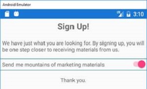
The app, when run, displays the content for the control on-page, and tapping the switch control displays a "Thank you" message through the page's event handler (see Figure 2).
 [Click on image for larger view.]
Figure 2. The Composite Control with All Its Connections
[Click on image for larger view.]
Figure 2. The Composite Control with All Its Connections
If you associated a view-model to your page via its binding context, the new control can now attach members of that view-model to its exposed properties:
<local:SwitchLabelControl Text="Send mail?"
  Value="{Binding SendMail}" />
This simple goal could have been accomplished by placing the constituent controls of SwitchLabelControl directly into the body of the MainPage markup. But in an app of any meaningful size, wrapping up common functionality in a composite control reduces the long-term effort needed to craft the app.
About the Author
Tim Patrick has spent more than thirty years as a software architect and developer. His two most recent books on .NET development -- Start-to-Finish Visual C# 2015, and Start-to-Finish Visual Basic 2015 -- are available from http://owanipress.com. He blogs regularly at http://wellreadman.com.