News
TypeScript v4.4 Ships, Gets New Home Page
TypeScript, Microsoft's type-optional take on JavaScript, has shipped in version 4.4, along with receiving a home page revamp.
As we reported last month in the v4.4 beta release, performance improvements have sped up operations like path normalization, path mapping, incremental builds, source map generation for big outputs, --force builds and more. Another performance improvement announced for the GA v4.4 release is faster declaration emit.
"TypeScript now caches whether internal symbols are accessible in different contexts, along with how specific types should be printed," said Daniel Rosenwasser, in an Aug. 26 announcement. "These changes can improve TypeScript's general performance in code with fairly complex types, and is especially observed when emitting .d.ts files under the --declaration flag."
Beyond the performance front, another new feature provides spelling suggestions in plain-vanilla JavaScript files, using the same customary "Did you mean ...?" prompts that appear in TypeScript files. This is possible because TypeScript is also used to power JavaScript editing functionality in the Visual Studio Code editor and Visual Studio IDE
"These spelling suggestions can provide a subtle clue that your code is wrong," Rosenwasser said. "We managed to find a few bugs in existing code while testing this feature!"
Here are some links to other improvements:
Just a couple days before v4.4 shipped, Microsoft announced a new TypeScript home page, following a complete revamp of the whole site undertaken about a year ago.
In looking at the messaging for describing TypeScript to newcomers, especially on the homepage, the dev team undertook a redesign to introduce the language and then explain the value proposition of using it after user tests revealed:
- There was not an obvious call to action at the top of the site
- You could not scan the text, because it was all the same visual weight
- We were probably using too much text explaining concepts
- There were not enough examples of code on the site
- People didn't connect our color usage to its intended meaning
- The site-wide footer was a distraction
- People didn't connect that TypeScript powered most JavaScript tooling
- There were parts of the site where people felt like they knew enough to make a decision, but didn't know where to go next
These items didn't seem to be an issue last year when Microsoft described the home page redo this way:
We decided on the design and copy for the homepage for TypeScript 6 years ago, but things have changed quite a lot since then. TypeScript has grown up and understands what it wants to be: a type layer above JavaScript that provides great tooling support.
This focus means explaining how the team works with JavaScript standard bodies, describing how DefinitelyTyped allows TypeScript to provide types to un-typed libraries, and teaching how adoption of TypeScript doesn't have to be an all or nothing choice.
Hopefully, the new homepage makes it easier to understand TypeScript's place in the JavaScript ecosystem.
Now, however, the team is emphasizing the "call to action," a trendy marketing phrase referring to telling a target audience what they should do once they land on a site.
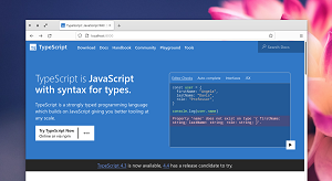
 [Click on image for larger view.] A Call to Action (source: Microsoft).
The call to action in the new home page is apparently "Try TypeScript Now" in a little white box.
"A lot of these changes would require substantial design exploration, but we felt like looking at the call to action for the headline could be applied to the existing design and then migrated into the new site," said Orta Therox, engineer on the TypeScript compiler team, in an Aug. 24 post. "What felt tricky is that we felt a tension because there isn't one single link we can always recommend. People either wanted to try TypeScript in the browser or learn how to run it locally on their computer. We ran A/B tests to see if there was a preference for new users to the homepage, but the results came up more or less 50/50. This led to a design where we have a single call to action in the headline -- but instead of taking you to either site, we provide a space explaining both potential options."
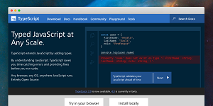
In last year's redesign, both potential options were presented in two little white boxes:
 [Click on image for larger view.] The 2020 Redesign (source: Microsoft).
Other highlights of the new home page redesign include:
- Reducing the amount of the text on the page. Each section now has key information bolded. This makes the page scannable, and the contrast added a hint of color given the next step.
- Limiting the colour palette to the blue from the TypeScript logo (a hue shift of the yellow from JavaScript) and shades of white and black.
- Creating a mid-way jump-off point, if you think you know enough about TypeScript there are probably 3 places you want to go: to documentation, the playground to try in your browser or learn how to run it on your computer.
- Replacing the footer content with jump-off point at the end of the page with the same links but tweaked design to fit the footer, removing distracting links for first-timers.
- Copy starts focused around the developer experience in using TypeScript, and then transitions to give you a further understanding of what sorts of primitives are in TypeScript and how they convert into JavaScript.
Feedback on the redesign can be submitted in the TypeScript-Website repo on GitHub.
About the Author
David Ramel is an editor and writer at Converge 360.