News
See What's Coming in Visual Studio 2022 UI Design Refresh
Microsoft announced a series of UI updates for Visual Studio 2022 aimed at improving visual cohesion, accessibility, productivity and customization of the IDE, as well as aligning it with the Microsoft Fluent design language.
The Microsoft Fluent Design System provides a unified framework to create and deliver more productive, consistent and accessible applications, and its design principles have been applied across products like Microsoft 365. Lately, the Visual Studio dev team has been using those principles to address problems in the IDE. Now, it's sharing some of those early designs so it can incorporate feedback to improve the UI revamp (the first since the disastrous 2012 introduction of ALL CAPS menus).
Microsoft said inconsistent visual design makes it harder to predict common control behaviors, potentially creating a difficult-to-navigate environment.
Some specific IDE problems being addressed include:
- Small and crowded controls that can be difficult to interact with
- Visual noise that makes it difficult to focus or identify the active area
- Inconsistent state indication that can cause distractions and confusion
Thus the UI updates include changes to the iconography, menus, toolbars, tabs and tool windows. Specifically:
- The icons have been redesigned to be more consistent, legible, and familiar, using meaningful and intuitive colors and shapes.
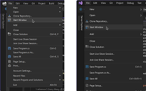
- The menus have been adjusted to reduce visual noise and cognitive load, making it easier to read and navigate through the options.
 [Click on image for larger view.] Left: Visual Studio 17.6 menu UI; Right: Proposed menu UI (source: Microsoft).
- The toolbars have been updated to use lighter weight controls and more spacing, making it easier to distinguish different actions and reduce accidental clicks.
 [Click on image for larger view.] Above: Visual Studio 17.6 toolbar, Below: Proposed toolbar (source: Microsoft).
- The tabs and tool windows have been enhanced to use colors and spacing more intentionally, making the active area stand out and reducing unnecessary distractions.
 [Click on image for larger view.] Above: Visual Studio 17.6 document tabs, Below: Proposed document tabs (source: Microsoft).
 [Click on image for larger view.] Left: Visual Studio 17.6 tool window chrome, Right: Proposed tool window chrome (source: Microsoft).
Microsoft said the UI updates are still a work in progress and will be available publicly soon. In the meantime, developers can follow the Developer Community Ticket for updates and discussion.
Developers are notoriously finicky about their IDE UI, and that robust community discussion, started April 28, is continuing with several posts made today.
More discussion is being carried out in the comments section of the announcement post, which has garnered an unusually large number of responses -- 78 at the time of this writing.
Those comments range from:
I don't have any specific feedback, but I am strongly in favor of this effort! I particularly encourage the distinctive highlighting for current tabs. I think I like the neon outline, but I also think there's room for more experimentation there.
to:
Bad ideas, not contributing anything useful. We already can customize with themes. Stop dealing with "fluff" (and come up with minor issues) and start working on the real issues, like the New Project dialog that is a fiasco since VS 2019.
and everything in between.
About the Author
David Ramel is an editor and writer at Converge 360.