News
Microsoft Boosts Terminal Performance in VS Code
After fulfilling developer demand for an integrated terminal within the Visual Studio Code editor, Microsoft has continued to incrementally improve the feature, boosting its performance by up to 45 times in the latest release.
Other improvements in Visual Studio Code 1.17 (September release) include support for the new Touch Bar in macOS, debugging enhancements, new online documentation, a preview of multi-root workspaces and much more.
An integrated terminal was the top-requested feature on the since-deprecated UserVoice site, garnering more than 6,000 votes and prompting 90 comments. It finally came in version 1.2.
Now, in v1.17, the integrated terminal has been improved.
"The rendering engine of the Integrated Terminal has been completely re-written with performance in mind for the upcoming version 1.17 of Visual Studio Code," Microsoft's Danile Imms said in a blog post just before v1.17 was released. "In this version, we move away from a DOM-based rendering system to using the HTML canvas element."
Imms explained the behind-the-scenes workings of the terminal improvements in his detailed post, noting that company coders had to rewrite the functionality of the DOM to fix various issues to do with selection of multiple content pages, misaligned characters, excessive garbage collection and poor performance.
Sidestepping the layout engine in favor of a new canvas-based rendering engine addressed the problems, especially relating to performance.
"Our benchmarks have measured that the Integrated Terminal now renders approximately 5 to 45 times faster than before, depending on the situation. Even if you don't notice the increased responsiveness and frame rate, faster rendering also means less battery usage!
Interested developers can read more about the "Render using canvas #938" pull request for the issue.
Terminal improvements weren't the only new features in v1.17, which also boasts:
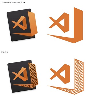
Also introduced in this update are new VS Code logos. We actually reported these in the article "New Visual Studio Code Icons Unveiled" in August after finding them in a GitHub issue. At the time, we provided this snapshot of the changes as they were then presented with different schemes for macOS/Linux stable and Windows Insiders editions:
 [Click on image for larger view.] The New VS Code Icons as Originally Presented in a GitHub Issue (source: Microsoft).
In the v1.17 release notes, however, they look a little different:
 [Click on image for larger view.] New Logos Introduced with v1.17 (source: Microsoft).
Probably no matter how they look, though, many developers won't be happy. The previously mentioned article about the new icons as displayed in the GitHub issue -- published in August -- drew multiple comments that are still coming in today, with all but one being negative in tone (example: "Went from a nice blue to rust-puke orange....").
Microsoft thanked dozens of community developers by name for contributing to the new release of the open source project in the exhaustive release notes that cover all of the above changes in great detail, along with many more.
About the Author
David Ramel is an editor and writer at Converge 360.