News
Angry Devs Persist on Visual Studio Blue Theme Revival: 'Once More, We Ask...'
Developers using Visual Studio 2026 really, really want Microsoft to bring the blue theme back to the IDE.
Two of the top three issues on Microsoft's Visual Studio Developer Community feedback site are requests to bring back the blue theme. After Microsoft nixed the issue last fall, it was brought up again early this year, garnering more votes than the first time.
"We closed this issue because it is out of scope with our general product direction," said Microsoft's Feedback Bot last November. "You can find more detailed information about our decision-making process here. If you disagree and feel that this issue is crucial: We are happy to listen and to reconsider."
 [Click on image for larger view.] Bring Back the Blue Theme (source: Microsoft).
Well, devs felt it to be crucial, they reopened a new issue, and Microsoft tagged it "Need More Info."
But first, feedback to the Feedback Bot was swift, voluminous and biting:
Some 32 commenters pushed back on both the substance and the framing of Microsoft's decision, with many saying the issue was not nostalgia for an old color scheme but a usability concern tied to contrast, eye strain and long coding sessions. Several said the newer Visual Studio 2026 themes lack the visual separation they relied on in earlier versions, while others questioned how one of the site's most-upvoted requests could be considered outside the product's direction.
The complaints also extended beyond color preference. Some commenters said the Blue theme had become part of their daily workflow over years or decades of Visual Studio use, and that its removal could affect whether they adopt Visual Studio 2026. Others said they were considering sticking with Visual Studio 2022 or moving to JetBrains Rider, CLion or other alternatives rather than working in an interface they find harder to read.
Several commenters also challenged Microsoft's accessibility rationale, arguing that reducing contrast and simplifying theme support may make the IDE less usable for developers with visual impairments, dyslexia or other needs. One commenter cited Microsoft's own older accessibility guidance on color and contrast, including advice to let users customize colors and ensure text and graphics stand out against backgrounds.
Among the more pointed comments:
- "When graphic designers tell programmers where to look at, we get these bad decisions..."
- "Your definition of what is 'in scope' seems increasingly detached from what actual users need."
- "This isn't an 'iMac moment' in Visual Studio's history; it's a 'Windows 8 moment,' where a team is so proud of its creation that it becomes unwilling to compromise for the users' benefit."
- "This is exactly the same kind of Microsoft blindness and self-centeredness that caused the Windows 8 disaster."
- "For the first time since v2008 it's time to skip a version. v2022 is a rock solid product that will keep perfoming fine."
- "However, there is nothing 'accessible' or 'inclusive' about this change."
- "Visually impaired users are struggling with the reduced contrast and are now effectively being left without a usable interface; they are left out in the cold."
- "I doubt your theme designers have ever used Visual Studio for prolonged periods."
- "Usability out of scope, good luck everybody!"
- "To say 'recreating the exact Blue theme is not practical' doesn't give me the impression that MS understands the appeal of the Blue theme."
- "For me, it doesn't need to be exact, it just needs to maintain decent color and contrast balance."
- "Its kind of like you decided to throw out the baby with the bathwater"
- "Please give your users an option."
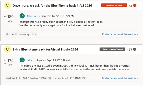
Now, the second-most voted issue on the VS Dev Community site is "Once more, we ask for the Blue Theme back in VS 2026."
It said: "Though this has already been asked and issue closed as out of scope. We the community once again ask for this to be reconsidered."
Going back to the start of things, the original post was titled "Bring Blue theme back for Visual Studio 2026."
It said:
I'm trying the Visual Studio 2026 insider, the new look is much better than the initial version in Visual Studio 2022 preview, especially the spacing in the context menu, which is now more compact, great job!
It's good to see there are many builtin themes, but I believe that many people, like me, are still more accustomed to the Blue theme, could you please bring it back?
That earlier thread drew the same basic response from developers: The Blue theme was not being treated as a nostalgic color preference, but as a usability feature tied to contrast, readability and long-term daily use of the IDE. Several commenters said the new Visual Studio 2026 light themes were too pale, too low-contrast or too difficult to use for extended coding sessions, while dark themes were not a workable alternative for everyone.
Commenters also repeatedly pointed to history, comparing the Visual Studio 2026 reaction to the Visual Studio 2012 redesign, when Microsoft also drew criticism for removing color, contrast and visual cues from the IDE. Others said the missing Blue theme was keeping them on Visual Studio 2022, preventing them from using the Visual Studio 2026 Insiders builds, or causing them to consider JetBrains Rider and other alternatives.
The thread also became a discussion of theming infrastructure itself. After Microsoft said Visual Studio 2026 reduced the number of color tokens by 87 percent and that recreating the exact Blue theme was "not practical," some commenters argued that the simplification had reduced customization and made it harder for community theme authors to recreate a high-contrast Blue-like experience.
Among the more pointed comments on the original issue:
- "For the love of god please bring blue theme back. I'll SWITCH TO EMACS IF YOU DON'T"
- "Why wouldn't you have this? It's been a part of every VS since 2010. It's been my daily driver in every version since then."
- "You are making the same mistakes as you did under development of Visual Studio 2012 when you redesigned the entire IDE around the new 'Metro'/Modern UI aesthetic of Windows 8."
- "Sometimes you just have to accept that this theme just works and is just good enough, and that you simply can leave it be and make the end user happy."
- "The lack of a decent light theme is genuinely what's stopping me using 2026 as my daily driver to properly test it out."
- "Another day, another update, still no blue theme. Don't Microsoft realise that by not putting this in, people are not use the insider version and therefore not providing any more feedback."
- "Please bring back the classic blue theme, among other things it is very hard for me (being colorblind) to see the difference between folders and files in the solution explorer."
- "Your teams suggestion to use 'blue steel' or other community themes is a lazy band-aid."
- "It's 'great' that you reduced the number of color properties by 87%. Why not go all the way and reduce it by 99.9% so that we only have one background and one foreground color?"
- "Why is the 'general product direction' more important than a good user interface? Visual Studio 2022 was better."
- "This isn't about rolling back UI modernization -- it's about preserving accessibility, productivity, and continuity for long-time power users."
Note that the last comment in the thread was posted less than a month ago, pointing to the new Dev Community item:
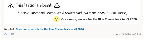 [Click on image for larger view.] Issue Closed, Go to New One (source: Microsoft).
The newer thread continued the same line of criticism, but with more focus on Microsoft's response process. Commenters objected to the first issue being closed, questioned the usefulness of a survey that said Microsoft was not planning to bring back the Blue themes, and argued that the problem was already clear: reduced contrast, weak visual separation and insufficient theming granularity in Visual Studio 2026.
Several commenters said the problem was not simply the missing Blue theme itself, but the inability to recreate a comparable high-contrast light theme because of the reduced color-token system. Others said they had moved back to Visual Studio 2022, were using Visual Studio 2026 only sparingly, or were considering alternatives such as JetBrains tools and CLion. The thread also broadened into complaints about SQL Server Management Studio, Visual Studio's theme infrastructure, dark-mode bias and Microsoft's broader handling of developer feedback.
Among the more pointed comments in the newer thread:
- "I really dislike having to squint to read text that does not have enough contrast to be easily legible! Please bring back the old theme..."
- "Please Microsoft, work on this and bring back some contrast. It's impossible to work for hours in VS 2026 with any provided light skin."
- "Even in the Visual Studio 2026 presentation video, there are only screenshots of a Visual Studio that looks more like VS 2022... with the Blue Theme during the 'Streamlined UI'."
- "From your survey page: 'While we are not planning to bring the Blue themes back, we do want to understand where the current experience is falling short.' What's the point of us filling out this survey then?"
- "Seriously??? WAKE UP!!! Bring back the theme capabilities of VS 2022, and all the complaints go away. Then we can all get back to writing software."
- "The feedback here is already quite clear: the new Light themes suffer from insufficient contrast."
- "This is not about nostalgia for a specific color scheme. It is about a regression in practical usability that was introduced by design decisions and is now structurally embedded."
- "Just do whatever it needs to be done to support the blue theme instead of talking about how you slashed color tokens by 87%."
- "This isn't about rolling back UI modernization -- it's about preserving accessibility, productivity, and continuity for long-time power users."
- "It's like looking into a snowstorm."
- "I kinda just want to be able to read UI without serious eyestrain."
- "There is no reason to use gray on white background when you have BLACK. This totally qualifies as enshittification of the VS, old and until now trusted product."
- "We're listening, we hear you, we're not going to do the thing you're asking for, but please fill out this survey."
- "Please just add the Blue one and resolve this. There's no need to keep debating this with the community."
- "The key takeaway should be to NOT BREAK."
Note that the last comment on the thread was just posted yesterday:
I'm also strongly considering switching to JetBrains's products once VS 2022 is too old to use anymore (no longer supporting the latest framework) as the lack of contrast in the VS 2026 light themes are so severe.
I've been using my own version of the blue theme that mimics VS 2010 for more than half a decade now (never released it to the public, but thought about doing so one day) as I think that version of VS had the best contrast and clarity of all. Not being able to use it, or any other blue-like theme for that matter, has really ruined this editor for me.
I, like many others here, have paid for Visual Studio and am using it daily for very long hours at a time, both professionally and personally.
Many of the comments posted screenshots in support of their arguments, and one really hit hard:
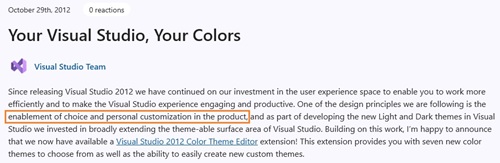 [Click on image for larger view.] User Customization (source: Microsoft).
For its part, Microsoft's Ruben Rios, who marked the item "Need More Info," acknowledged the frustration and pointed devs to a survey on the issue, but that survey is now closed.
Here's his response, dated Jan. 28:
We know the removal of the Blue and Blue Extra Contrast themes has been frustrating for many long-time Visual Studio users. From your feedback, this is often not just about color preference, but about being able to work comfortably and effectively in the IDE.
We understand that the current experience is falling short in ways that make real work harder. That is on us. Rather than closing this as a duplicate of the original request, we want to use this space to focus on understanding where and how things break down in day-to-day use.
If you're willing, we'd appreciate concrete examples through a short survey about your experience in Visual Studio 2026. Our goal is to focus on specific issues such as readability, contrast, and long-session comfort. Examples of where the IDE causes strain, confusion, or discomfort during real workflows are especially helpful.
Survey link: https://www.research.net/r/BWZ38P7
We'll review the responses and share a summary of the key themes along with potential next steps. Thank you for taking the time to share your experiences and help us improve the product.
Edit: The survey is now closed. We are in the process of evaluating the data and potential next steps.
Rios later followed up on Feb. 25, saying Microsoft had reviewed the survey data and found that the strongest signals were "not about color preference, but about reduced visual clarity during everyday use." He cited weak separation between IDE surfaces, difficulty identifying the active document or tool window, and increased eye strain during longer sessions. Microsoft then opened a second survey with before-and-after comparisons of proposed changes, though that survey also is now closed.
The broader issue appears to trace back to Visual Studio 2026's theming overhaul. In its current documentation on Visual Studio color themes, Microsoft lists Visual Studio 2026 themes including Light, Dark, Cool Breeze, Icy Mint, Mango Paradise, Bubblegum, Sunny Day, Silky Pink, Moonlight Glow, Spicy Red, Mystical Forest, Cool Slate and Juicy Plum. The classic Blue theme is not listed as a built-in Visual Studio 2026 option.
That differs from Visual Studio 2022, where Blue and Blue (Extra Contrast) were available as built-in themes. Microsoft now directs users to the new tinted themes and separate editor appearance controls, including editor-focused extra-contrast settings.
Theme Tokens Reduced by 87 Percent
Microsoft's theme-migration guidance explains that Visual Studio 2026 moved away from the older system of granular, feature-specific color tokens. The company says an out-of-box Visual Studio 2022 shell theme contained about 34 categories and roughly 1,806 color tokens, while Visual Studio 2026 consolidates shell theming into four top-level categories and 229 color tokens -- an approximately 87 percent reduction.
Microsoft says the change was intended to improve consistency, accessibility validation, maintainability and performance. Many Developer Community commenters, however, argue that the same reduction is what makes the old Blue experience difficult to reproduce, because multiple IDE surfaces now share broader semantic tokens that do not allow the same level of color separation.
Microsoft also maintains a Visual Studio theme color token reference for Visual Studio 2026. That reference describes the new semantic token system and lists shell colors and shell internal colors used for IDE surfaces such as the main window, title bar, status bar and tool-window headers.
Community Extensions Try To Fill the Gap
In the absence of an official Blue theme, several community extensions have appeared or resurfaced. The most prominent is Blue Steel Theme Pack by Microsoft's Mads Kristensen, principal product manager for Visual Studio. It's a Visual Studio 2026 theme pack with light, dark and solarized themes. Its GitHub repo says it includes "a version of the original Blue theme shipped in Visual Studio 2022, but updated with Fluent design elements and in two versions."
Another workaround is Blue Theme by TimePunch, described in the Marketplace listing as "Missing blue theme for Visual Studio 2026." The extension also has a GitHub repository.
Mark Downie, who blogs as PoppaString, has published A Kind Of Blue Theme Pack, a set of Visual Studio 2022+ themes "inspired by iconic 'blue' moods in jazz." The listing says it builds on the original Blue theme included with Visual Studio 2022 and refreshes it with Fluent design elements. Downie also wrote a related blog post, "A Kind of Blue," discussing the Visual Studio 2026 theme changes and the absence of the classic Blue theme.
There is also an older Original Blue Theme extension from Kristensen that brings the Visual Studio 2017 Blue theme to Visual Studio 2019. While that extension is not positioned as a Visual Studio 2026 fix, it underscores how long the classic Blue look has remained a preference for some Visual Studio users.
Why Extensions May Not End the Complaints
The extensions show that users and theme authors are trying to recreate the experience, but the Developer Community comments suggest they have not settled the issue. The recurring complaint is that Visual Studio 2026's new theme architecture limits how closely an extension can reproduce the contrast, visual separation and shell-level readability of the old built-in Blue theme.
That distinction is important. Many commenters are not asking only for a specific shade of blue. They are asking for a high-contrast light theme that works across the IDE shell -- menus, tabs, tool-window headers, Solution Explorer, status areas, borders and inactive surfaces -- not only inside the code editor.
That is also why references to editor appearance settings do not fully address the feedback. Microsoft documents editor appearance separately from the overall IDE theme, but the complaints are aimed largely at the surrounding Visual Studio chrome rather than the text editor's syntax-coloring surface.
Outside Coverage
The issue has also drawn some outside coverage. DevClass described developers as "still feeling blue" over the Visual Studio 2026 theme changes, tying the complaints to eye strain, reduced contrast and the 87 percent reduction in theme tokens.
The Register, in its coverage of the Visual Studio 2026 preview, noted the Fluent Design refresh and the new theme set, including names such as Mango Paradise and Juicy Plum. The publication framed the release as a major UX refresh arriving alongside deeper AI integration.
The historical comparison to Visual Studio 2012 also has support in Microsoft's own archives. In a 2013 Visual Studio Blog post on designing the Visual Studio 2013 user experience, Microsoft said Visual Studio had three built-in color themes -- Blue, Dark and Light -- and noted survey data showing strong developer preferences across all three. That history is why some commenters are casting Visual Studio 2026 as a repeat of an older Visual Studio redesign fight over contrast, icons and visual cues.
For now, Microsoft has not announced that the official Blue theme is returning. The latest public signal in the Developer Community thread is that the company has been reviewing survey feedback and exploring targeted contrast and clarity changes. Developers asking for Blue, meanwhile, continue to argue that the fix should be either restoration of the theme itself or enough theming granularity to make a comparable high-contrast light theme possible.