Practical .NET
UI Practicalities: Determining the User's Intent
After having a UI design invalidated during usability testing, Peter has to find a way to figure out what the user wants the application to do.
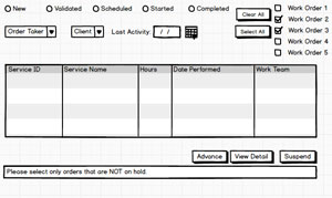
Last month, I discussed creating a Windows Form that allowed Schedule Managers (SMs) to manage work orders, with each work order consisting of multiple services. Initially, the user story we were supporting allowed SMs to advance selected services to the next state in the workflow. During usability testing, we discovered that SMs also needed the ability to advance whole work orders. Figure 1 shows the initial design that supported advancing services listed in the grid at the bottom of the form.
 [Click on image for larger view.]
Figure 1. The initial UI design as a wireframe mockup (done in Balsamiq).
[Click on image for larger view.]
Figure 1. The initial UI design as a wireframe mockup (done in Balsamiq).
My new problem was how to determine if the user wanted to advance a service or a work order. To advance a whole work order, I could ask a user to click on a work order in the list at the top of the form. Once the user had selected a work order, the user could then click the Advance button to process the selected work order. There are all sorts of problems with that plan, unfortunately.
First, the user's focus will be on the services list that dominates the form; if the user selects a work order and then gets distracted, they could easily forget that they had a work order selected in the list (which is, after all, buried in the form's upper right hand corner). But, wait, it gets worse: Because of the filtering options the user's applied, it's possible that the grid won't show all of the services for a work order selected in the work order checkbox list. My guess is that, even if the user selects a work order, they'll expect that only the filtered services shown in the grid will be advanced, not all of the services for the work order, including ones not currently displayed in the grid.
I can deal with some of those issues with the UI designer's best friend: providing feedback to the user. I enhance the confirmation dialog I display after the user clicks the Advance button to be clear what's about to happen. If I advance a work order, the confirmation message says, "Are you sure you want to advance Work Order 316 to…"; if I advance individual services, the message says, "You are about to advance 3 selected services to…." I made the format of the two messages sufficiently different so that a user wouldn't (while scanning the messages) mistake one message for the other.
But that leaves another problem: What if the user has both a work order selected in the list and one or more services selected in the grid? I can't reliably determine the user's intent, so I have to display an error message and ask the user to try again. As I said last month: I hate error messages. It's always better to not let the user do something that you're not going to let them do. And there's another problem: Just because no services are selected in the grid, it doesn't mean that the user doesn't want services to be processed. If there are no rows selected in the services grid, I suspect that many users will assume that all of the displayed services will be advanced.
Letting the User Express Their Intent
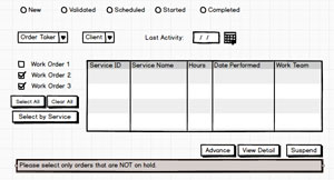
Since users wanted to work with both services and work orders, my first step is to give the work orders list the same visual precedence as the services grid. To do that, I move the work order list down from where it was buried in a corner of the form and put to the left of the services list.
My second step is to require the user tell me whether they're selecting by work or service. I do that by adding a button that allows the user to switch between selecting by service or selecting by work order. This makes the form modal (either you're in "work order selecting mode" or "services selecting mode"). That's too bad, but modal forms are often the natural fallout of having a form that handles many stories.
I now also started providing some visual feedback on which control (the work order list or the services grid) is driving the selection. Initially, the services grid allows the user to select by rows: Clicking a row highlights the whole row. The grid also initially displays the "row selector" column down its left side. The work order list, on the other hand, has its selection mode turned off: the user can check and uncheck work orders, but can't highlight any work orders.
When the user clicks the Select by Work Order button, the selection mode on the grid changes to SelectByCell, so that clicking in a row just highlights just the selected cell rather than the row (unfortunately, there is no SelectionMode.None option). I also suppress the row selector column in the services grid. The work order list, on the other hand, has its selection mode turned on, so that clicking in the list not only turns the checkbox on and off, it also highlights the work order. I also used a combination of "hot" colors (red/oranges) and "cool" colors (blue/green) to highlight whichever list was active.
Finally, I treat the Select by Work Order button as a toggle. Clicking the button the first time changes the button's caption to "Select by Service." Clicking the button a second time returns to selecting individual services and reverses the changes I just described. Figure 2 shows the form after the user has clicked the Select by Work Order button.
 [Click on image for larger view.]
Figure 2. The initial UI design as a wireframe mockup.
[Click on image for larger view.]
Figure 2. The initial UI design as a wireframe mockup.
Placing Buttons
Which leaves the question of where to put the Select All and Clear All buttons for the work order list. I don't want to put the buttons beside the list, because it will give me less horizontal room for the services grid, which may already be forcing the users to scroll horizontally to get at some low-value columns on the grid's right side. So the buttons will need to go either above or below the list.
For now, I assume that there are very few work orders listed at any one time, so I keep the list short and put the buttons where the user would expect them, based on Windows' conventions: below the control (very much like the buttons in the lower right-hand corner of the form, which are below all the controls in the form).
If it turns out, however, that there are often a lot of work orders, to save the user from having to scroll through the list, I'll need to make the work order list longer. If I do that and leave the buttons at the bottom of the list, the user will, when only a few work orders are displayed, have to move the mouse all the way up to the top of the list to get to the work order they want. even . So, if I do have to make the list longer, I'll probably move the buttons to above the list so that, when there are only a few work orders, the buttons will be close to those work orders.
And, if I have time, I'll add a context menu to the work order list and put Select All/Clear All on that menu. If I do create that menu, I may even put an "Advance Selected Items" choice on the menu. After all, if the user is clicking on the work orders list it's pretty clear they intend to advance a work order.
That is clear, isn't it?
About the Author
Peter Vogel is a system architect and principal in PH&V Information Services. PH&V provides full-stack consulting from UX design through object modeling to database design. Peter tweets about his VSM columns with the hashtag #vogelarticles. His blog posts on user experience design can be found at http://blog.learningtree.com/tag/ui/.