Practical .NET
Bridging the User Interface Design Gap
The best thing you can do in order to create a great UI is to stop thinking about UI design.
In previous columns, I've discussed personas, user stories and mental models. If you've been reading those columns, you have to be asking yourself: "How do I get from all of this nebulous, touchy/feely stuff to an actual screen?" Personally, I think part of the problem developers have in creating UIs is moving too quickly to the actual screen -- there are still a couple of stages worth going through before you start dragging controls onto a form.
As developers, you think of UI design as "putting controls on the form"; while that's certainly part of the process, it's also the last part of the process. First, you need to figure out what forms you need to have, and then, what controls those forms need.
For example, let's say there's a developer somewhere creating an application that helps me plan my next vacation. When I come to your site, I'll want to see vacation packages that reflect my preferences. "Great," the site's developer says, "let's create a user preferences page that lists the various categories for our vacation packages. The developer's first question is, "What does the user's Vacation Preferences page look like?" That's wrong.
The developer's first question should be: "How do I gather information about the user's preferences?" And there are a lot of answers to that question, including: Keeping track of the vacation packages that the user spends the most time looking at, providing a "My Kind of Vacation" checkbox on each package's page, or analyzing the packages that the user actually buys to support looking for "similar" packages. Only one of those choices (providing the "My Kind of Vacation" checkbox) actually involves dragging a control onto the page.
The problem? Asking the wrong question gets you to the wrong answer too soon.
Thinking About the Problem
The way to escape getting to the wrong answer too soon is to defer dragging controls onto a page until you can't avoid it any longer. Fortunately, there are lots of useful things you can do before you start dragging controls onto the page that will ensure that when you come to dragging controls, you'll drag the right controls onto the right forms. The most important thing you can do, for example, is stop thinking about UI design.
That's because thinking about UIs inevitably leads you to thinking about what controls go on your forms and pages. I find that thinking in terms of UX design helps back me away from thinking about forms and controls. I also find that taking my hands off the keyboard and picking up a paper and pen is a big help. That makes sense: Your application is going to be visual, so your design process also needs to be visual
Start sketching based on your user stories, but don't draw screens. Instead, draw all the inputs and outputs to your process. Then, find a way to draw the transformations/processes that join those inputs and outputs. What you want to develop is a conceptual sketch of what the UX looks like (providing inputs, getting outputs and interacting with the process), without getting involved in forms and controls.
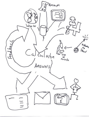
Figure 1 shows a conceptual sketch for a calculator that accepts inputs from typed-in numbers, from paper documents/databases/other applications and from locations on the Web.
 [Click on image for larger view.]
Figure 1. Conceptual Sketch of a Calculator
The calculator produces outputs that feed back into itself, that can be shown to a friend, that can be e-mailed and that can be fed to other applications. At this stage, because you're working with concepts, you don't have to worry about whether you could make it work -- that will come later. The next step would be to start adding transformation processes to this sketch.
It's unlikely your first idea is your best idea. In fact, your best idea will probably come from pulling together the best parts of several different concepts and generating a completely new concept. So, once you've got your sketch done, put it aside and do another. Try to forget what you did before and see what you can come up with by approaching the problem from a different angle. For the calculator, try looking at the problem from the point of the user mental models: How does the user envision the calculation process?
Teamwork is helpful here: Drag in other people and have a competing sketch-off where everyone generates sketches on their own, which you all gather together and synthesize.
There's at least one more thing you can do before it's no longer possible to avoid thinking about controls and forms … but I'll talk about that in my next column. After that, though, you'll be able to drag controls onto your forms. I promise.
About the Author
Peter Vogel is a system architect and principal in PH&V Information Services. PH&V provides full-stack consulting from UX design through object modeling to database design. Peter tweets about his VSM columns with the hashtag #vogelarticles. His blog posts on user experience design can be found at http://blog.learningtree.com/tag/ui/.