Mobile Corner
What's New with the Windows Universal Application Platform
Microsoft finally unveiled the Windows Universal Application Platform at Build in San Francisco. Nick Randolph takes the new controls -- and other changes that assist developers building adaptive layout applications -- out for a spin.
- By Nick Randolph
- 05/27/2015
For almost as long as I can recall there have been multiple versions of the Windows operating system targeting different devices. There was Windows CE, Windows Embedded, Windows Mobile, Windows (desktop) and Windows Server; plus there were a host of custom operating systems such as the one that sits under the Xbox gaming platform. Each operating system had its own developer tools and application development and deployment model.
With Windows 10, Microsoft is looking to finally realize a long term objective of rationalizing these countless systems into a single platform that developers can build and deploy applications for. Developers can now target the Windows Universal Application Platform (UAP).
Note that Microsoft's newest approach supersedes the Windows/Windows 8.1 Universal applications, which wasn't much more than marketing hype aimed at luring developers to build applications for the Windows platform offering an improved code-sharing experience. Windows UAP offers a true "build once, run on any Windows 10 device" experience.
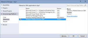
While Windows 10 is going to power a wide range of devices, they won't all have the same features. Developers building for Windows UAP can expect their applications to run across all these devices. However, in order to take advantage of specific device features they may want to target specific device families. There are a couple of important scenarios to consider here. The first is in code when a developer wants to access features that are only available on one or more device families. In this scenario the first step is to add a reference to the extension software development kit for the device families. Figure 1 illustrates adding the Windows Mobile Extension SDK.
 [Click on image for larger view.]
Figure 1: Adding a Reference to an Extension SDK
[Click on image for larger view.]
Figure 1: Adding a Reference to an Extension SDK
When accessing features that aren't part of the UAP it's important to determine whether the API exists on the device the application is being run on. The IsTypePresent method can be used to determine if a Type exists prior to accessing its members. For example the following code detects it the HardButtons class exists, before wiring up a handler to the back button pressed event:
var hardwareButtonsExist = Windows.Foundation.Metadata.ApiInformation.IsTypePresent("Windows.Phone.UI.Input.HardwareButtons");
if (hardwareButtonsExist)
{
    Windows.Phone.UI.Input.HardwareButtons.BackPressed += HardwareButtons_BackPressed;
}
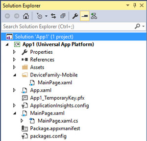
Another scenario where it's important to be able to detect and adapt to different device families is when designing the application user experience, such as when you want to use a different layout for when the application is run on a mobile device than when it's run on the desktop. In this scenario, in addition to providing the default XAML file for a page (e.g. MainPage.xaml), you can create a device family folder and add an alternative XAML file, with the same name, that will represent the layout for that device family. Figure 2 illustrates the project structure where an alternative layout for MainPage has been provided for the Mobile device family.
 [Click on image for larger view.]
Figure 2: An Alternative Mobile Layout
[Click on image for larger view.]
Figure 2: An Alternative Mobile Layout
In Visual Studio 2015 and Blend for Visual Studio 2015 the experience for developing applications has continued to evolve. As there is closer integration between the products, even more of the tool windows are now common across both. There is no longer a Projects window in Blend, as it's been replaced by the Solution Explorer from Visual Studio. Blend also now supports a much richer code editing experience for both code and XAML. There are still some Blend-only features, such as the Data and States windows. The Devices window has been completely removed, being replaced, in part, by a toolbar at the top of the designer. This toolbar makes it easier to toggle between different resolutions and orientations, without having to leave the design surface.
In the preview builds of Windows for both phone and desktop there have been a large number of changes to the user experience. This extends to the developer platform where instead of mandating a different experience to other mobile platforms, there has been an evolution of those experiences to what we will see as the new Windows 10 design language. This can be seen in a number of the new Microsoft-built applications such as Maps and Photos. As these applications are built using the same developer tools that third parties have access to, it was important that updates were made to existing controls, and where necessary, for new controls to be created to address any deficiencies. I'll touch on two such controls, the RelativePanel and the SplitView.
For developers who are familiar with XAML, whether it be Silverlight, WPF or Modern Windows or Windows Phone applications, they will know and understand the power of the Grid, StackPanel and Canvas controls. Most layouts can be achieved using a combination of one or more of these layout containers.
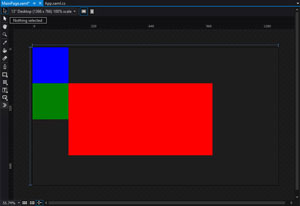
There are some cases where a particular layout can't, or is hard, to achieve. This is specifically true when migrating applications across from Android where elements can be positioned relative to each other. For this reason the UAP includes a control called the RelativePanel. As with other layout containers, such as the Grid and StackPanel, the RelativePanel accepts any number of child elements and through attached properties determine how those child elements will be rendered. As you can imagine, the way that the RelativePanel arranges its children is based on properties which indicate proximity to other controls. These form two groups being relative and alignment properties. The XAML in Listing 1 shows three Border elements, each with a different color and corresponding name.
Listing 1: XAML for RelativePanel
<RelativePanel >
    <Border x:Name="Blue"
            Background="Blue"
            Height="200"
            Width="200"
            />
    <Border x:Name="Green"
            Background="Green"
            Height="200"
            Width="200"
            RelativePanel.Below="{Binding ElementName=Blue}"
            />
    <Border x:Name="Red"
            Background="Red"
            Height="400"
            Width="800"
            RelativePanel.RightOf="{Binding ElementName=Green}"
            RelativePanel.AlignTopWith="{Binding ElementName=Green}"
            />
</RelativePanel>
The green block is located Below the blue block and the red block is located to the RightOf the green block. In addition the red block is aligned with the top of the green block. Figure 3 shows the design experience in Blend.
 [Click on image for larger view.]
Figure 3: Designing using the RelativePanel in Blend
[Click on image for larger view.]
Figure 3: Designing using the RelativePanel in Blend
One of the other new controls is the SplitView which makes creating a hamburger style menu, as seen in a lot of iOS and Android applications. In summary the SplitView hosts two views: one that hosts the main contents; and then a second which is a pane that slides out. For example to create a hamburger style menu the main contents of the page would be hosted in the Content (ie default child) of the SplitView and have a button that will invoke the menu, typically placed in the top-left or -right corner of the interface. Tapping the button would set the IsPaneOpen property on the SplitView to true, causing the contents of the Pane property to slide into view. The following XAML lists a SplitView with a Border added to the Pane property and a RelativePanel as the default child (ie the Content property):
<SplitView x:Name="Split">
    <SplitView.Pane>
        <Border Background="AliceBlue" x:Name="Menu"/>
    </SplitView.Pane>
    <RelativePanel >
        ...
    </RelativePanel>
</SplitView>
By default the contents of the SplitView.Pane isn't visible until the IsPaneOpen property on the SplitView is set to true. The following code will cause the SplitView.Pane contents to be appear:
private void Red_Tapped(object sender, TappedRoutedEventArgs e)
{
    Split.IsPaneOpen = true;
}
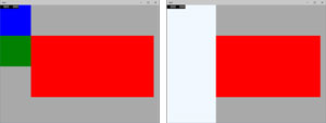
Figure 4 illustrates the SplitView in its default, or closed, view on the left and in the expanded, or open, view on the right. When IsPaneOpen is set to true the pane appears from the side with a sliding animation.
 [Click on image for larger view.]
Figure 4: SplitView States
[Click on image for larger view.]
Figure 4: SplitView States
Let me point out a number of the more interesting SplitView properties:
- CompactPaneLength: The width of the SplitView.Pane when shown as compact view (ie DisplayModes of CompactInline or CompactOverlay)
- DisplayMode Inline: When open, the SplitView.Pane appears adjacent to the main contents, causing a reduction in the size of the main content area.
- Overlay: When open, the SplitView.Pane appears as an overlay across the main contents area. It also has an auto-dismiss behavior where clicking outside the pane will cause it to close
- CompactInline: When closed, the SplitView.Pane is still visible with reduced width (ie compact view). When open, it behaves the same as Inline.
- CompactOverlay: When closed, the SplitView.Pane is still visible with reduced width (ie compact view). When open, it behaves the same as Overlay
- OpenPaneLength: The width of the SplitView.Pane when open
- PanePlacement: Whether the SplitView.Pane is position on the Left or Right of the screen
The last change that I'm going to cover are the changes to the visual state manager which again are aimed at building applications that can adapt to different layouts. In addition to having to run on different device families, there is the compounding factor of the windowed layout that is coming to Windows UAP applications.
Previously for Windows desktop, developers only had to validate that their application scales to different screen sizes, and that it behaved when running in split view. With Windows UAP applications can be resized to almost any size, making it more important to build an adaptive experience. Often this is done by breaking the continuum of sizes in to discrete blocks based on sizes; it's similar to the way that media queries can be used by adaptive Web sites to control how CSS is applied to handle different screen sizes.
The updates to the visual state manager includes the ability to set adaptive triggers that can automatically switch between visual states for different screen sizes. Listing 2 shows some XAML that defines three states, with each state as an AdaptiveTrigger defined that determines which visual state is chosen for a given application size.
Listing 2: XAML for Adapting to Three Visual States
<VisualStateManager.VisualStateGroups>
    <VisualStateGroup x:Name="AdaptiveStates">
        <VisualState x:Name="Compact">
            <VisualState.StateTriggers>
                <AdaptiveTrigger MinWindowHeight="0" MinWindowWidth="0" />
            </VisualState.StateTriggers>
        </VisualState>
        <VisualState x:Name="Default">
            <VisualState.StateTriggers>
                <AdaptiveTrigger MinWindowHeight="0" MinWindowWidth="600" />
            </VisualState.StateTriggers>
            <VisualState.Setters>
                <Setter Target="Split.(SpitView.DisplayMode)" Value="CompactOverlay"/>
            </VisualState.Setters>
        </VisualState>
        <VisualState x:Name="Extended">
            <VisualState.StateTriggers>
                <AdaptiveTrigger MinWindowHeight="0" MinWindowWidth="1400" />
            </VisualState.StateTriggers>
            <VisualState.Setters>
                <Setter Target="Split.(SpitView.DisplayMode)" Value="Inline"/>
                <Setter Target="Split.(SpitView.IsPaneOpen)" Value="True"/>
            </VisualState.Setters>
        </VisualState>
    </VisualStateGroup>
</VisualStateManager.VisualStateGroups>
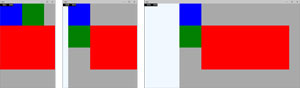
In this case the size continuum is broken into width below 600, between 600 and 1400, and above 1400. Figure 5 illustrates each of these visual states, showing the expansion from hidden, to compact, to open, of the SplitView.Pane, and the re-positioning on the color blocks to better accommodate for the change in application size.
 [Click on image for larger view.]
Figure 5: Visual States Using AdaptiveTriggers
[Click on image for larger view.]
Figure 5: Visual States Using AdaptiveTriggers
Note that we haven't had to write any code, other than the XAML, in order for the layout to change as the application size changes. The other thing to observe in the XAML is that it uses the new Setter syntax for adjusting properties, rather than having to Storyboard each change.
What Works, What Doesn't
Here, I discussed a number of techniques that you'll need to know when building adaptive layouts to get the most out of the device your application is running on. While Microsoft is talking up how great it is that Windows 10 will run across any device, it doesn't recognize that it's not as simple as building a single layout and expecting it to just work.
Windows 10 will bring some significant changes to the design language for building Modern applications. However, the core principle of designing and developing high quality applications hasn't changed significantly. It's important to consider the target user, what devices you're going to optimize for and. of course, how the user experience of your application will vary by device family, screen size, orientation and usage mode. As Microsoft lays down the pathway to the Windows 10 launch, now is the time to think about creating or migrating applications in preparation for its release.
About the Author
Nick Randolph runs Built to Roam, a consulting company that specializes in training, mentoring and assisting other companies build mobile applications. With a heritage in rich client applications for both the desktop and a variety of mobile platforms, Nick currently presents, writes and educates on the Windows Phone platform.