Cross Platform C#
Create Modern Android Apps with the Design Support Library
It's now easier than ever to create polished Android experiences. Greg Shackles shows how using Google's new Material Design style.
- By Greg Shackles
- 08/20/2015
With the release of Android 5.0, also known as Lollipop, Google introduced its new material design style.
Material Design is a huge step forward for Android apps, bringing with it a total overhaul of theming, as well as a bunch of new UI components you can use in your apps. To make things even better, Google also released the Android Design Support Library, which allows you to take advantage of material design in versions of Android going all the way back to Android 2.1.
In this article I'll walk-through some of the new components available in this library, and show how easy they are to introduce into an app.
NavigationView
Android has had the DrawerLayout component for some time now, which allows you to easily create "hamburger"-style menus in your apps. Hamburger-style menus have become ubiquitous in both Android and iOS in recent years. The most common use case for this is to expose a menu of links to different areas of the app. Included in the design support library is a new class called NavigationView that makes doing this even easier.
To get started, I'll set up a basic layout for the app that includes a DrawerLayout and the new NavigationView in Listing 1.
Listing 1: The New DrawerLayout and NavigationView in Android 5.0
<?xml version="1.0" encoding="utf-8"?>
<android.support.v4.widget.DrawerLayout xmlns:android="http://schemas.android.com/apk/res/android"
  xmlns:app="http://schemas.android.com/apk/res-auto"
  android:layout_width="match_parent"
  android:layout_height="match_parent"
  android:fitsSystemWindows="true"
  android:id="@+id/drawer">

  <FrameLayout
    android:layout_width="match_parent"
    android:layout_height="match_parent"
    android:id="@+id/Container">

      <LinearLayout
        android:orientation="vertical"
        android:layout_width="match_parent"
        android:layout_height="wrap_content"
        android:padding="10dip">
      </LinearLayout>

  </FrameLayout>

  <android.support.design.widget.NavigationView
    android:layout_width="wrap_content"
    android:layout_height="match_parent"
    android:layout_gravity="start"
    app:headerLayout="@layout/navigationheader"
    app:menu="@menu/drawer" />

</android.support.v4.widget.DrawerLayout>
Note that there are two resources referenced by our NavigationView that define the header layout and the menu. Because it's a common pattern to have some sort of header above the list in the drawer, Google baked that right into the view. For this example, I'll create a solid block (see Listing 2) that will sit above the menu and display the user's name.
Listing 2: Solid Block to Sit Above Menu to Display User's Name
<?xml version="1.0" encoding="utf-8"?>
<LinearLayout xmlns:android="http://schemas.android.com/apk/res/android"
  android:layout_width="match_parent"
  android:layout_height="150dp"
  android:padding="16dp"
  android:orientation="vertical"
  android:gravity="bottom"
  android:background="@android:color/holo_blue_dark">
  <TextView
    android:layout_width="match_parent"
    android:layout_height="wrap_content"
    android:textColor="@android:color/white"
    android:text="Greg Shackles" />
</LinearLayout>
Because this is just a standard Android layout file, you're free to use this header in any way you like. With that in place, the next step is defining the menu. Android has always had an easy way to define menus for the action bar through XML resources, and with NavigationView Google added the ability to leverage that system for defining your app's menu, as well (see Listing 3).
Listing 3: Defining the Menu
<?xml version="1.0" encoding="UTF-8" ?>
<menu xmlns:android="http://schemas.android.com/apk/res/android">
  <group android:checkableBehavior="single">
    <item
      android:id="@+id/item1"
      android:title="Item 1" />
    <item
      android:id="@+id/item2"
      android:title="Item 2" />
  </group>
  <item android:title="Sub Menu">
    <menu>
      <item
        android:title="Sub Item 1" />
      <item
        android:title="Sub Item 2" />
     </menu>
  </item>
</menu>
It's that simple, and even includes the ability to easily define submenus.
Finally, I'll set up the main activity for the app, and add a button to the action bar that can toggle the menu in addition to the built-in swiping gesture, as shown in Listing 4.
Listing 4: Menu with Built-In Swiping Gesture
using Android.App;
using Android.OS;
using Android.Support.V4.View;
using Android.Support.V4.Widget;
using Android.Support.V7.App;
using Android.Support.Design.Widget;
using Android.Widget;

namespace SupportLibraryDemo
{
  [Activity(
    Label = "Support Library Demo",
    MainLauncher = true,
    Icon = "@drawable/icon",
    Theme = "@style/Theme.AppCompat.Light.DarkActionBar")]
  public class MainActivity : AppCompatActivity
  {
    private DrawerLayout _drawerLayout;

    protected override void OnCreate(Bundle savedInstanceState)
    {
      base.OnCreate(savedInstanceState);

      SetContentView(Resource.Layout.Main);

      drawerLayout = FindViewById<DrawerLayout>(Resource.Id.drawer);

      SupportActionBar.SetHomeAsUpIndicator(Resource.Drawable.menu);
      SupportActionBar.SetDisplayHomeAsUpEnabled(true);
    }

    public override bool OnOptionsItemSelected(Android.Views.IMenuItem item)
    {
      switch (item.ItemId)
      {
        case Android.Resource.Id.Home:
          drawerLayout.OpenDrawer(GravityCompat.Start);
          return true;
      }

      return base.OnOptionsItemSelected(item);
    }
  }
}
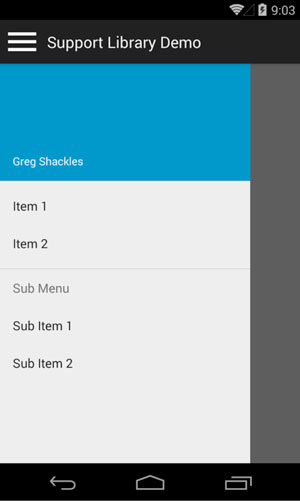
One key thing to notice here is that the activity class extends from AppCompatActivity. This base class is part of the Android support library, and lights up all the support functionality we're taking advantage of here. Running the app now will look like Figure 1.
 [Click on image for larger view.]
Figure 1. Using a NavigationView
[Click on image for larger view.]
Figure 1. Using a NavigationView
TextInputLayout
A UI pattern that's been making the rounds over the last couple years is a text entry box where the placeholder text floats up above the input text once the user starts typing in it.
Historically the placeholder text would just be hidden once text is entered into the box, and having it move to be a decoration above the input makes for a clean way to keep the context around what the input is for. There have been several implementations of this throughout the community, but Google decided to make this pattern a first class-citizen in Android and made it very simple to add to your apps.
All you actually need to do is wrap the normal EditText control in the new TextInputLayout control as shown in Listing 5, and you're good to go.
Listing 5: Wrapping the Normal EditText Control in the New TextInputLayout Control in Android 5.0
<android.support.design.widget.TextInputLayout
  android:layout_width="match_parent"
  android:layout_height="wrap_content">
  <EditText
    android:layout_width="fill_parent"
    android:layout_height="wrap_content"
    android:hint="First Name" />
</android.support.design.widget.TextInputLayout>

<android.support.design.widget.TextInputLayout
  android:layout_width="match_parent"
  android:layout_height="wrap_content">
  <EditText
    android:layout_width="fill_parent"
    android:layout_height="wrap_content"
    android:hint="Last Name" />
</android.support.design.widget.TextInputLayout>
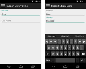
It's just that simple, and gives the experience seen in Figure 2.
 [Click on image for larger view.]
Figure 2. Using TextInputLayout To Provide a Nice Text Entry Experience
[Click on image for larger view.]
Figure 2. Using TextInputLayout To Provide a Nice Text Entry Experience
Floating Action Buttons
Another new pattern that's become a standard in Android is the floating action button. The idea behind the floating action button is to provide a persistent round button in the interface that denotes the primary action for that screen. Often these buttons will be pinned in the bottom right corner of the screen.
Adding a floating action button to a layout just requires a few lines of XML:
<android.support.design.widget.FloatingActionButton
  android:id="@+id/ActionButton"
  android:layout_width="wrap_content"
  android:layout_height="wrap_content"
  android:layout_gravity="end|bottom"
  android:layout_margin="10dip"
  app:backgroundTint="@android:color/holo_green_light"
  android:src="@drawable/check" />
Attaching a click handler for the button works the same way a normal button does:
var actionButton = FindViewById<FloatingActionButton>(Resource.Id.ActionButton);

actionButton.Click += (sender, e) =>
  Toast.MakeText(this, "FAB Tapped!", ToastLength.Short).Show();
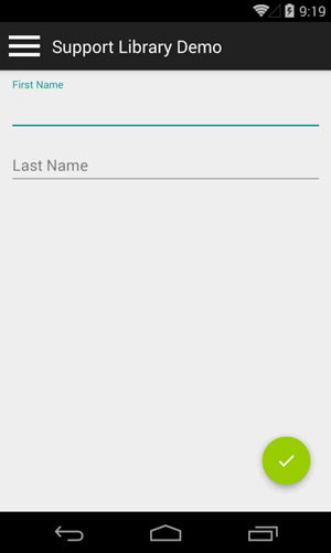
Figure 3 shows this button in action.
 [Click on image for larger view.]
Figure 3. Using a Floating Action Button
[Click on image for larger view.]
Figure 3. Using a Floating Action Button
SnackBar
In the past, toasts were a quick and easy way to provide a simple message to the user that disappears after a short while. An example of this can be seen in the last code sample for the floating action button.
Android 5.0 and the design support library introduce a new way to approach this, using a new control named SnackBar. This has a similar API to toasts but looks nicer, and also allows you to add an action to the bar.
To demonstrate this, I'll convert the previous toast example to use a SnackBar:
var container = FindViewById<FrameLayout>(Resource.Id.Container);
var actionButton = FindViewById<FloatingActionButton>(Resource.Id.ActionButton);

actionButton.Click += (sender, e) =>
  Snackbar.Make(container, "FAB Tapped!", Snackbar.LengthLong)
    .SetAction("Action", view =>
      Toast.MakeText(this, "Action tapped!", ToastLength.Short).Show())
    .Show();
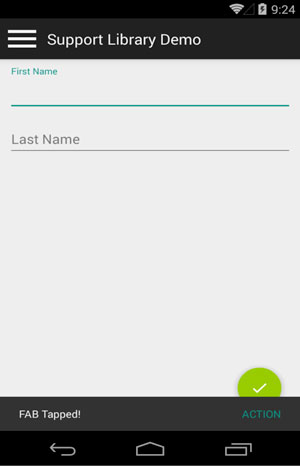
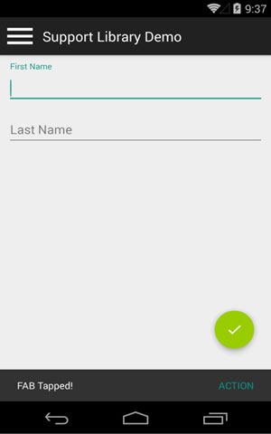
This makes for a nice alternative to toasts, and will feel familiar to users as they switch between apps (see Figure 4). Additionally, it also gives the user the ability to dismiss the bar with a swipe gesture for free.
 [Click on image for larger view.]
Figure 4. Using a SnackBar To Display a Message to the User
[Click on image for larger view.]
Figure 4. Using a SnackBar To Display a Message to the User
CoordinatorLayout
You may have noticed in Figure 4 that the snackbar is actually covering the floating action button. That's easy to fix, thanks to another new addition to Android 5.0 and the design support library: CoordinatorLayout. This is a new layout, based on the existing FrameLayout, that provides the ability to control and coordinate interactions and motion between its subviews. This allows you to create rich, fluid experiences in your apps without having to write a lot of code to do it.
To fix the floating action button issue here, all you actually need to do is swap out the FrameLayout for a CoordinatorLayout and it'll automagically fix itself:
<android.support.design.widget.CoordinatorLayout
  android:layout_width="match_parent"
  android:layout_height="match_parent"
  android:id="@+id/Container">

<!-- existing layout -->

</android.support.design.widget.CoordinatorLayout>
Also make sure to update the type in MainActivity accordingly. Now when the action button is tapped and the snackbar is shown, the action button will automatically animate itself to sit above the snackbar, and then animate itself back down when the bar is dismissed (see Figure 5). I've only scratched the surface of what you can do with a CoordinatorLayout.
 [Click on image for larger view.]
Figure 5. Using a CoordinatorLayout To Avoid Covering the Floating Action Button
[Click on image for larger view.]
Figure 5. Using a CoordinatorLayout To Avoid Covering the Floating Action Button
Wrapping Up
These are just a few of the tools included in the library, but there are many more worth exploring: new tab APIs, collapsing toolbars and more. Android 5.0 and material design marks a big milestone for Android UIs, and the design support library makes it easier than ever to deliver an enhanced and polished experience in your apps right now without having to wait for users to upgrade to it.