News
How Developer Feedback Shapes Visual Studio 2019 UI
Visual Studio developers -- notoriously finicky about their IDE's UI and quick to let their feelings be known -- have been provided a glimpse into how their feedback helps shape the Visual Studio 2019 experience.
A blog post published today provides that glimpse, detailing how developer feedback influenced the team to tweak several areas of the IDE's UI: a combined title/menu bar; blue theme changes; and new icons.
Visual Studio dev/design team members Jamie Young and Anthony Cangialosi explained how the three Visual Studio 2019 previews were shared to provide an open dialog with developers, who provided feedback via company blogs, the Developer Community site and other social media sites.
"We want to say thank you for sharing this feedback," the post said. "Everyone working on the team has read through all the comments and we've done our best to respond to the different themes discussed in the threads.
"Hopefully, by now you've had a chance to try the Visual Studio 2019 Preview. If not, we encourage you to try out some of the new experiences. There were a few popular themes in the feedback that we wanted to acknowledge and talk a bit about the changes we've already made based on your feedback."
The refreshed blue theme provides an example of how the process works. The refreshed blue theme was originally presented in a post last November that previewed UX and UI changes in VS 2019.
"More than half of you use the blue theme, but it's looked the same since Visual studio 2012," Young said at the time. "We focused our changes around a desire to declutter the Visual Studio UI. By softening the edges around our icon buttons and toolbars, as well as tool-windows, we can bring forward the focus of what you're working on."
This graphic illustrated the changes as they were presented in November 2018:
 [Click on image for larger view.] Blue Theme Changes (Refresh on Left, Current on Right) (source: Microsoft).
Today's post picks up on the story after noting the aforementioned first refresh of the scheme since 2012.
"What we found through the feedback is that some functional elements from the original Blue theme were lost with the first iteration of the theme update," the post said. "While most of you generally liked the new theme some customers gave us feedback that it removed some spatial definitions in the UI that helped navigate around the IDE quickly and intuitively. Comments also pointed out that the blue theme updates had gotten too bright adding eye strain over longer periods."
Tweaks made to address those issues included heightened overall contrast, reduced brightness of the base color and the addition of complementary and analogous accent colors.
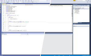
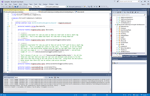
"These changes preserve an at-a-glance difference between versions while tackling the functional feedback," said the post, which featured an animated graphic as proof (click on the graphic below to open up an animated GIF that illustrates how the theme changed):
 [Click on image for larger view.] Blue Theme Changes from 2017 to 2019 (source: Microsoft).
The above graphic also shows changes to the title bar, which increases the vertical height available. The team combined the title bar with the menu bar in an early iteration and, again, tweaked the scheme in response to feedback.
"With the combined menu and title bar, we took an opportunity to give back valuable vertical space and update the layout of the upper shell controls," Microsoft said. "This also makes the new more accurate VS Search more discoverable and accessible. While we strived to do this without impacting your workflow many users highlighted the title bar was home to several information elements including solution name, administrator mode, experimental instance tag, and the preview badge the were important for navigating between multiple instances of Visual Studio running at the same time."
Based on that and other feedback detailed in today's blog post, the team experimented with different approaches in the first two previews before preview 3, which returns the solution name into the combined title/menu bar (after it had been removed in an earlier iteration). Surrounding controls were updated to reserve space for that solution name.
Finally, the company went into detail about the new icon for Visual Studio 2019 for Mac:
 [Click on image for larger view.]Visual Studio for Mac 2017 (left) Visual Studio for Mac 2019 Preview (Middle) Visual Studio for Mac 2019 (Right) (source: Microsoft).
As we've reported earlier, Visual Studio developers kicked up quite a fuss when icon schemes were changed for Visual Studio Code.
In explaining the latest icon tweak, Microsoft said: "One of the challenges with the icon for Visual Studio for Mac was how to create an icon that was closely tied to the Visual Studio Family line of products but that stood apart from the Windows version of Visual Studio so as not to confuse you into thinking they're the same (just on different platforms). We experimented with many ways of showing a differentiation between the two applications but settled on tying them together as a family, with a background shape that echoes the form of the Infinity Loop, and adds a macOS flavor to the icon."
Microsoft invited developers to weigh in with feedback on the Visual Studio 2019 previews -- including bug reports or feature suggestions -- at the Developer Community site.
The final fruit of all their feedback labors will be revealed on April 2.
About the Author
David Ramel is an editor and writer at Converge 360.